Quick answer
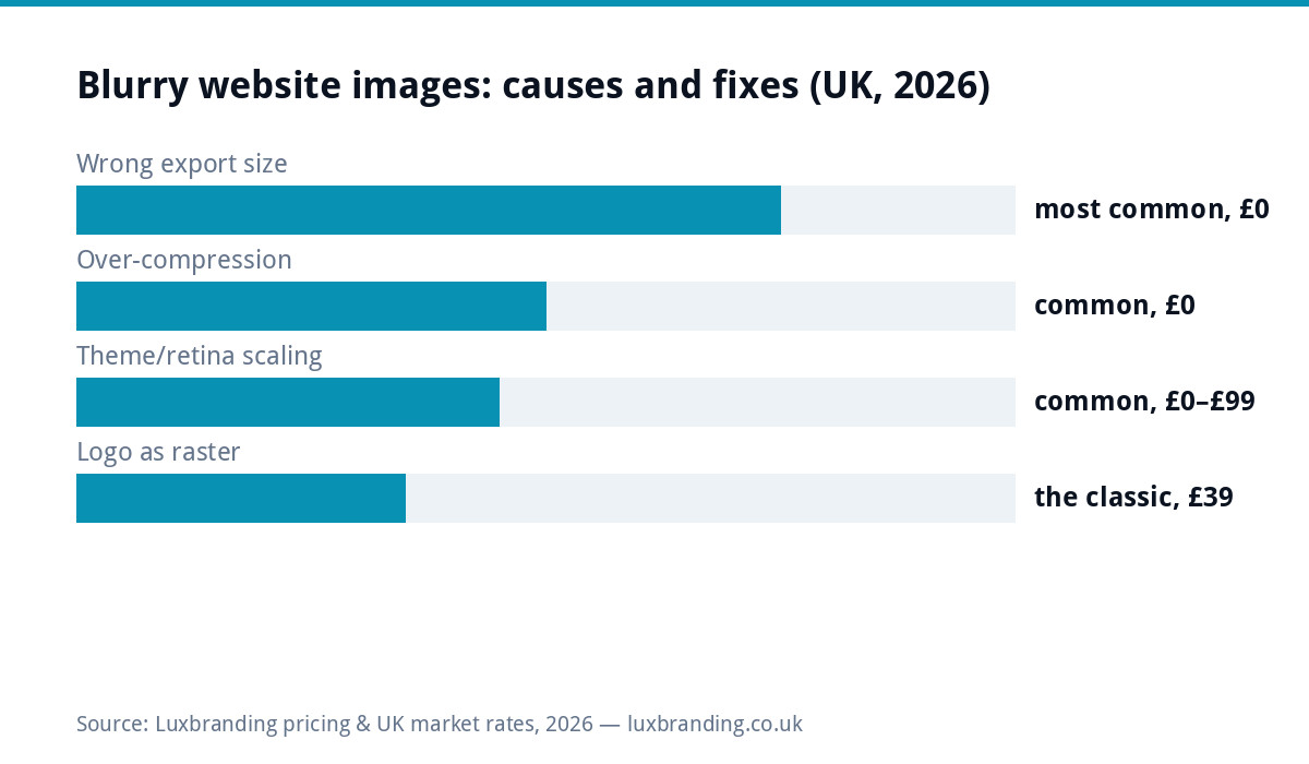
Blurry web images have four causes, all findable in minutes: uploaded too small for the space (the stretch blur), over-compression (the mush), retina screens demanding double the pixels your file has (sharp on old monitors, soft on every phone), and the raster logo where an SVG belongs. Fixes are free except the last, which is the £79 vector rebuild. The sizes to use are below; screenshots-of-images and WhatsApp-forwarded photos are disqualified before we start.
Diagnose in two minutes: which blur is yours?
| Symptom | Cause | Fix |
|---|---|---|
| Blurry everywhere, worse fullscreen | File smaller than its display slot; the browser stretched it | Re-export bigger (sizes below), re-upload |
| Crunchy artefacts, muddy colour | Compression stacked on compression | Fresh export from the original at ~80 quality; stop double-compressing |
| Fine on an old desktop, soft on phones | Retina: high-density screens want 2x data | Upload ~2x display size; theme serves variants |
| Photos fine, logo soft | Raster logo at 1x in a retina world | SVG logo; £79 rebuild if no vector exists |
| One image only | Bad source (screenshot, WhatsApp forward, tiny original) | Find the real original; messaging apps recompress brutally |
The sizes that work (pin this)
The balance is sharpness against the speed your visitors feel, and these land it: hero and full-width banners 1600 to 2000px wide; content and gallery images 800 to 1200px; logos as SVG (size becomes irrelevant), or failing that a PNG at double its largest display size; everything exported at quality ~75 to 85, landing roughly 100 to 400KB per image, compressed ONCE via a Squoosh-class tool or your export dialog. Above these sizes you are paying load-time for invisible pixels; below them, blur. WordPress generates its own responsive variants from a good master, which is why the master’s size is the only decision that matters.
Retina, plainly (why phones expose what desktops forgive)
Modern screens pack 2 to 3 device pixels per display pixel, so an image slot “400px wide” on a phone genuinely wants 800 to 1200px of data to look crisp; give it a 400px file and the screen invents the difference as softness. This is why the logo, the one image on every page, at the top, at a fixed small size, is the universal retina casualty: a 180px PNG that looked fine in 2015 reads slightly melted on every current phone. The professional answer is format, not size: an SVG logo is mathematics, sharp at any density forever, tiny to load, and standard in any complete logo file handover. Photos cannot be SVGs; for them the 2x-master rule above is the whole trick.
Fix the library without redoing everything
Triage, not archaeology: fix the images money looks at first (logo, hero, service-page leads, anything on the pages ads or the audit tool show earning traffic), then the rest as pages get touched. For each: find the ORIGINAL (camera roll, designer’s folder, the handover pack if it exists), export fresh at the sizes above, replace the file. Photographer-shot images usually have big clean originals; the unfixables are screenshots and forwards, which need re-sourcing. An hour does most small-business sites. If the theme itself mangles sizes (serving thumbnails into hero slots), that is the £99 technical pass territory, and it usually surfaces alongside the speed issues the same pass fixes.
While you’re in there: alt text (two birds, one library pass)
Since the fix pass has you touching every important image anyway, write the alt text at the same time: one honest sentence per image describing what it shows (“newly fitted grey kitchen with island, Stockport”), which serves accessibility, gives Google the context image search ranks from, and takes ten seconds per file while it is open. Skip the keyword-stuffing temptation; describe the picture like you would to someone on the phone. A library that is sharp AND described outperforms one that is merely sharp, and the second half costs nothing once the first has you in the media library, the same two-birds economics as the while-the-bonnet-is-open checks elsewhere in this series.
Formats in one paragraph (JPG, PNG, WebP, SVG, when)
The format question answered for good: photographs live as JPG (or WebP where your site serves it automatically, smaller at the same quality); graphics with flat colour and text (charts, diagrams, screenshots) live as PNG, where JPG’s compression smears edges; logos and icons live as SVG wherever the platform allows, raster only as the fallback; and nothing lives as BMP, TIFF or a 40MB camera original on a webpage. Modern WordPress setups convert and serve next-gen formats behind the scenes (ours does), which is why the master-size rule is your only real decision; on builders, check what the platform does with uploads, because several quietly recompress, and their compression stacked on yours is the mush from the diagnosis table.
When it is not the images at all
Two lookalike culprits worth thirty seconds before re-exporting a whole library: a display-scaling theme bug where the layout stretches whatever it is given (one image slot always blurry regardless of upload = the slot, not the file; the £99 technical pass territory), and aggressive optimisation plugins whose default settings brutalise images site-wide on upload, fixable by dialling quality settings up and regenerating. The tell for both: your exports look perfect on your machine and degrade only after upload. Diagnose with one test image at known-good size; if it degrades, the site is doing it, and no amount of export discipline upstream will out-run a mangler downstream.
Prevention: the upload habit
One rule going forward ends the category: never upload a raw camera file, a screenshot, or anything from a chat app; always a fresh export at the pin-list sizes, compressed once. Put the sizes in a note where whoever updates the site will see them, brief any designer with the template so web exports arrive alongside print files, and spot-check new pages on your own phone, where blur shows first. Sharp images are not aesthetics alone: they are the difference between “established business” and “someone’s nephew built this” in the three seconds before a visitor reads a word, which is why this free fix sits in the conversion column, not the polish one. Prices for the two paid escapes (£79 logo rebuild, £99 technical pass) live on the price list.
Sector notes: who suffers which blur
The causes cluster by business type, which speeds diagnosis: photographers and cafes suffer over-compression and giant-original problems (image-heavy libraries, the speed cost twin); trades and professional services suffer the raster-logo retina classic plus the Word-stretched letterhead at print time (the print version of this guide); e-commerce suffers marketplace-recompressed product shots re-uploaded from listings instead of originals; and everyone with a builder-era site inherits whatever the platform’s compressor did in 2021. Knowing your cluster turns the two-minute diagnosis into a thirty-second one, and the fix rules stay identical throughout: right size, compressed once, from the true original. Whichever cluster is yours, fix the money pages first and let the archive wait; sharpness triage follows traffic, not completeness, exactly like every other improvement queue on this site.
Get the UK Website Project Brief Template (free)
A two-page template for briefing any UK web designer: sitemap, integrations, audience and deliverables. Cuts revision rounds in half.
No spam. UK GDPR compliant. We only use your email to send this resource, unless you tick the box to hear from us.
Frequently asked questions
Why do my images look blurry on my website? +
Four usual causes: uploaded too small for the space they fill (stretched up = blur), over-compressed by you or a plugin, displayed at retina/2x sizes the file cannot supply, or a logo living as a small PNG/JPG where an SVG belongs. Each has a specific, mostly free fix.
What size should website images be? +
Match the display: hero/banner images around 1600 to 2000px wide, content images 800 to 1200px, thumbnails per their slot, exported at quality ~80 and lands 100 to 400KB. Bigger wastes speed; smaller invites stretching blur.
Why is my logo blurry on the website but photos are fine? +
Logos are the retina classic: a 200px PNG displayed at 200px looks soft on high-density screens that want 400px of data. The proper fix is the SVG version, sharp at every size and density; if you only have raster files, a £79 vector rebuild produces it.
Do image compression plugins make images blurry? +
Over-aggressive settings can: compression stacked on already-compressed uploads produces mush. Compress once, from a clean export, at sensible quality (~80); if existing images got mangled, re-upload from originals rather than re-compressing the damage.
Sharp on desktop but blurry on phones. Why? +
Phones have high-density screens demanding 2 to 3x pixel data for the same display size, and responsive themes may serve a small variant. Upload at roughly double the display size and let the site generate variants; the retina section below covers it.