Quick answer
Pin this page: every size your logo needs, grouped by where it lives. The two rules that generate the whole sheet: screens want 2× the display size (retina) or better an SVG (sharp everywhere, ends the question), and print wants vector or 300dpi at physical size. Small placements need the icon variant, not the shrunk full logo. If your files cannot produce these exports, that is a £79 pack rebuild, after which this sheet becomes ten minutes of exporting.
The cheat sheet
| Where | Upload/export | The gotcha |
|---|---|---|
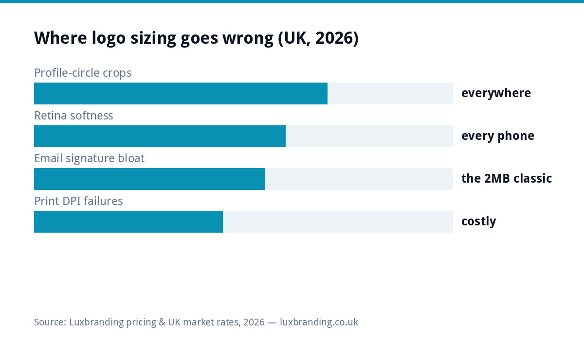
| Social profile (all platforms) | Square 1000×1000+, icon variant | Cropped to a CIRCLE: corners die, small text dies |
| Facebook/LinkedIn cover slots | Per current platform spec; design centre-safe | Different crops mobile vs desktop; keep the logo central |
| Website header | SVG ideally; else PNG at 2× display (display 150 to 250px → file 300 to 500px) | The 1× PNG reads soft on every modern phone |
| Favicon/app icons | Icon variant exported square: 512, 192, 48, 32, 16px (Google’s favicon guidelines cover search display) | Full logos become smudges; the icon exists for this |
| Email signature | Display ~100 to 160px; file ~300px, 20 to 50KB | The 2MB attachment-logo epidemic; compress once, properly |
| Documents/invoices | PNG ~600px for headers | Word stretching a small logo is the internal version of blur |
| Print (cards→banners) | Vector (EPS/AI/PDF); raster fallback = 300dpi at physical size | 90mm at 300dpi ≈ 1060px; web logos fail this silently |
| Embroidery/signage/vehicles | Vector, plus the simplified variant | Their machines follow paths; see the production guide |
The two rules behind every row
Screens: 2× or SVG. Modern displays pack multiple device pixels per layout pixel, so a slot shown at 200px wants ~400px of data; supply less and the screen renders the shortfall as softness, worst on the logo because it sits identically on every page (the full mechanics are in the blurry-images guide). SVG sidesteps it entirely: mathematics instead of pixels, sharp at any density, tiny files, and the reason it headlines every professional handover pack. Print: vector or 300dpi at size. Paper resolves detail screens never will, so raster logos need 300 dots per inch at PHYSICAL print size, which multiplies quickly (a modest 90mm letterhead placement already wants ~1060px). Vector formats print sharp at business-card and billboard alike from one file, which is why every printer’s first request is EPS or PDF, and why the blurry-print emergencies are always raster stories.
The icon variant: the missing file behind most sizing pain
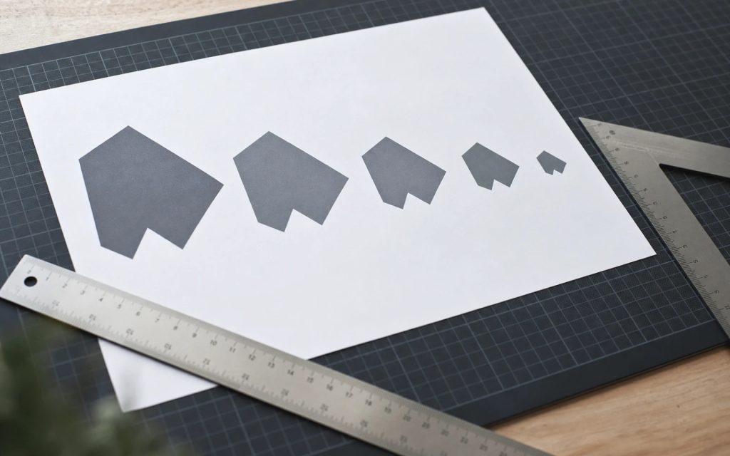
Half this sheet’s gotchas trace to one absence: businesses owning only the full logo lockup (symbol + name + strapline) and shrinking it into places built for marks. At 32px a lockup is noise; in a profile circle its edges amputate; embroidered small it knots. The professional answer is a designed simplified variant: the symbol alone, or initials, legible at 16px and bold in a circle, exported once into the favicon and social sizes above. Complete brand packs include it as standard; if yours predates the practice, a £50 logo edit creates one from your existing mark, and the whole export set falls out in minutes. It is the highest-leverage single file most UK small-business brands are missing.
Handing files to printers and makers (the last mile)
The sheet’s print rows earn their keep at handover moments, so the etiquette in brief: send the vector (EPS or print-PDF) plus a JPEG preview so both sides see the same thing; state the physical size the logo should appear at rather than making the printer guess; include the colour references (CMYK values, Pantone if you have them) from your brand sheet, because “match the website” is how vans end up the wrong blue; and for anything stitched, cut or engraved, send the simplified variant alongside and let the maker choose, per the production guide. Suppliers quote faster and err less when the files arrive labelled like this, and the habit costs one saved email template. That, plus the export folder, is the entire operational overhead of a brand that always looks right.
Platform specs drift; principles don’t (how to stay current)
Social platforms nudge their pixel specs yearly, which is why this sheet teaches ratios and rules rather than worshipping today’s numbers: square-and-big for profiles designed to the circle, 2×-or-SVG for screens, vector-or-300dpi for print, icon variant for anything small. When a new platform or spec arrives, those four rules answer it before any help-centre search. For the current exact numbers on a given platform, the platform’s own creator documentation is the only source worth trusting (third-party “2026 size guides” copy each other’s stale tables with confidence), and the one-minute check is: upload, view on a phone, zoom. If it survives that, the spec is satisfied whatever the blog posts say.
The brand-consistency dividend (why sizing discipline is brand work)
The sheet’s deeper payoff is not sharpness but sameness: when every surface (profile circle, site header, invoice, van, signature) carries correctly-sized exports from one master set, the brand reads as ONE thing everywhere, which is the entire mechanism of recognition for a small business. The blurry-here-cropped-there brand pays a subtle tax on every impression; the disciplined one compounds them. This is why sizing lives in the same family as the brief template and the handover checklist: unglamorous artifacts that quietly decide whether the £129 logo performs like a £1,000 one. Sharp, consistent, everywhere, from one folder of exports made in one afternoon: that is the whole game, and now you have the sheet for it.
Make the sheet automatic (one afternoon, once)
The end-state worth setting up: masters stored safely (SVG/AI/EPS plus the icon variant, two locations, per the handover checklist), a folder of the standard exports from this sheet generated once and reused everywhere, compression done at export (never by forwarding through chat apps, which re-crunch on every hop), and this page bookmarked for the next new platform’s spec. From that state, every future request, new hire’s signature, printer, van fitter, web developer, is a copy-paste rather than a scramble. If the masters do not exist, the £79 rebuild is the one purchase that unlocks the entire sheet; everything else here is free forever, which is rather the point of a cheat sheet. Prices for the paid escapes, as always, on the price list.
The 60-second self-audit (run it now)
While the sheet is open, grade your own brand in one minute: your site on your phone (logo sharp or slightly soft?), your social profile zoomed (circle-cropped or clean icon?), your last sent email (signature image crisp and small, or a 2MB stretch?), and the most recent print item on your desk (edges clean or fuzzy?). Each soft answer maps to one row above and one fix, most of them free exports from masters you may already have. Businesses run this audit expecting to pass and usually find two rows failing, which is the entire argument for cheat sheets: the problems are invisible until named, then trivial once seen. If the masters themselves are the missing piece, the £79 rebuild is the single unlock, and everything else on this page is an afternoon.
Get the UK Branding Budget Worksheet (free)
A printable worksheet: decide what your brand needs now and price it against fixed published prices and the IPO trademark fee.
No spam. UK GDPR compliant. We only use your email to send this resource, unless you tick the box to hear from us.
Frequently asked questions
What size should my logo be for social media profiles? +
Upload square at 1000×1000 or larger and design for the circle: platforms crop profile images round, so detail near corners dies. The icon version of your logo (symbol without small text) survives the circle; full lockups rarely do.
What size should a logo be on a website? +
Displayed 150 to 250px wide typically, uploaded at double for retina (or better, as SVG, which ends the sizing question). Favicon needs its own square icon exports; browsers use 16 to 48px, phones request larger touch icons.
What size should a logo be in an email signature? +
Displayed around 100 to 160px wide, file exported AT that display size (roughly 300px for retina) and compressed to 20 to 50KB. The 2MB full-logo-in-every-email remains the most common sizing crime in UK business.
What resolution does a logo need for print? +
Raster logos need 300dpi at the printed size: a 90mm letterhead logo needs ~1060px. But the real answer is vector (AI/EPS/SVG/PDF), which prints sharp at any size and is what printers ask for by name.
Why does my logo look wrong at small sizes? +
Detail and thin strokes vanish below ~48px, and text becomes noise. That is why complete logo packs include a simplified icon variant for small placements; if yours lacks one, a £50 edit creates it, or a £79 rebuild produces the full pack.