Quick answer
Most small businesses need three logo layouts and four colour versions. The layouts are horizontal (the main one), stacked and icon-only. The colour versions are full colour, one colour, white for dark backgrounds and black. That is twelve combinations, each saved in vector and PNG, so the logo fits a van, a profile picture and a quote.
A logo that exists in only one shape gets squashed, shrunk or cropped the first time it meets a round profile picture or a tall sign. This guide explains each version, where it goes, and how to get the missing ones without starting again.
Layouts and colour versions are two different sets
People use “logo versions” to mean two separate things, and a complete logo pack covers both:
- Layouts change the arrangement: where the symbol sits relative to the name, and whether the name is there at all.
- Colour versions change the colours of the same layout so it works on light backgrounds, dark backgrounds and in single-colour processes such as embroidery or vinyl.
File formats (SVG, EPS, PNG and so on) are a third layer on top. Our guide to logo file formats covers that side; this one is about the shapes and colours.
The four logo layouts
| Layout | Shape | Typical uses | Do you need it? |
|---|---|---|---|
| Horizontal | Symbol to the left of the name, wide | Website header, email signature, van sides, letterheads | Yes, it is usually the primary logo |
| Stacked | Symbol above the name, roughly square | Van rear doors, shop windows, workwear chest, square posts | Yes |
| Icon-only | The symbol without the name | Social profile pictures, favicon, app icons, stickers | Yes, if your logo has a symbol |
| Wordmark only | The name without the symbol | Long narrow spaces, small print, pens | Useful, not essential |
The horizontal layout: your everyday logo
The horizontal layout is wide and short, which matches most of the places a logo lives: website headers, email footers, the side of a van, the top of a quote. Because it is the version people see most, it is normally treated as the primary logo and the one your brand guidelines show first.
A wordmark-only variant, the name with no symbol, is a useful companion here. It fits long narrow spaces such as the spine of a folder, a pen or a footer strip, and it is often what printers fall back on when a symbol would be too small to read. It is not essential for every business, but it costs little to produce alongside the others.
Its weakness is height. Squeeze a wide logo into a square space and it shrinks until the name is unreadable. That is the job of the next layout.
The stacked layout: for square and tall spaces
In the stacked layout the symbol sits above the name, and longer names often break onto two lines. It fills square and portrait spaces properly, so it is the one to use on:
- van rear doors and tailgates;
- shop windows and A-boards;
- the left chest of a polo or jacket;
- square social posts and printed stickers.
A stacked layout is not just the horizontal one rearranged. The spacing and type size usually need adjusting so the two parts look balanced, which is why it should be designed rather than improvised by whoever is making the sign.
The icon-only layout: for small and round spaces
Profile pictures on Facebook, Instagram, WhatsApp Business and Google are cropped into small squares or circles. A full logo with a name becomes unreadable at that size; the symbol on its own does not.
Two places where a square icon is effectively required:
- Your favicon. Google’s favicon guidelines say it must be square, at least 8 x 8 pixels, with a larger size recommended. That tiny icon appears beside your site in search results.
- Your Business Profile logo. Google’s Business Profile photo guidance recommends images of 720 x 720 pixels, a square format.
If your logo is purely a name with no symbol, the icon version is usually the initial letter or letters set in your brand font, designed to sit inside a square or circle.
The four colour versions
Each layout should exist in four colour versions:
- Full colour. Your normal logo, for white or light backgrounds.
- One colour. The whole logo in a single brand colour, for embroidery, vinyl and promotional items priced per colour.
- Reversed (white). For dark vans, dark website headers and photographs.
- Black. For newspapers, forms, invoices printed in black and white and engraving.
The reversed version is the one most often missing, and its absence is behind the familiar white box around a logo on a dark van. When you test a reversed version, check the contrast against the actual background colour with a tool such as the WebAIM contrast checker; thin parts of a logo can disappear on mid-tone colours.
The one-colour version deserves the same care. Embroiderers and vinyl cutters often charge per colour, and gradients or soft shadows cannot be stitched or cut at all, so a clean single-colour version saves money on every workwear order and vehicle job.
Which version goes where
| Where it is used | Layout | Colour version |
|---|---|---|
| Website header (light) | Horizontal | Full colour |
| Website footer (dark) | Horizontal | Reversed |
| Social profile picture | Icon-only | Full colour or reversed on brand colour |
| Van side panels | Horizontal | Depends on van colour |
| Van rear doors | Stacked | Depends on van colour |
| Embroidered workwear | Stacked or icon-only | One colour |
| Quotes and invoices | Horizontal | Full colour or black |
| Favicon | Icon-only | Full colour |
Embroidery and signage have extra rules about fine detail and minimum sizes, which our guide to logos for embroidery and signage covers in depth.
Minimum sizes and clear space
Each layout has a size below which it stops working. Set a rough minimum for each, for example:
- horizontal logo: no narrower than about 30mm in print or 120 pixels on screen;
- stacked logo: no narrower than about 20mm;
- icon-only: works down to favicon size, which is why it exists.
Small sizes are where the icon-only layout proves its worth: on a pen, a till receipt or a browser tab, the full logo is simply too wide to read. The exact figures depend on your design, so treat these as starting points and test by printing. Clear space is the empty margin kept around the logo so nothing crowds it, commonly the height of one letter of the name. Write both rules down in one place, so signwriters and printers do not guess.
Naming and organising the version files
Twelve combinations in several formats quickly becomes a folder of fifty files, and the wrong one gets sent. A simple naming pattern prevents that. Put the business name, the layout, the colour version and the format in every file name, in the same order, for example:
- smithheating-horizontal-fullcolour.svg
- smithheating-stacked-white.png
- smithheating-icon-onecolour.eps
Then keep three subfolders: print (EPS and PDF), web (SVG and PNG) and source (AI). When a signwriter asks for “a white version for a dark van”, you can find and send it in seconds, and nobody screenshots the website header instead. Keep a copy of the whole set somewhere other than one laptop, such as a shared cloud folder the business controls, because the person who set the folder up will not always be around.
What to do if you only have one version
Many businesses discover the gap when a supplier asks for a white version or a square one. The fix depends on what files you hold:
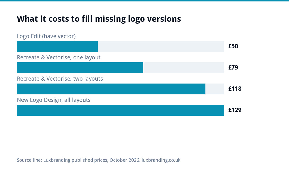
- You have a vector file (AI, EPS, SVG or vector PDF). Creating a stacked layout, a white version or a one-colour version is a layout and colour change. Our Logo Edit is £50, turned around in 24 to 48 hours, and keeps the mark recognisable.
- You only have a JPG or PNG. The logo first has to be rebuilt as vector. Recreate & Vectorise is £79 for one layout, plus £39 per additional layout, so a horizontal and a stacked version together is £118.
- The logo itself is the problem. If it is too detailed to shrink to an icon, a new design may cost less over time than patching it.
How we supply logo versions
Our Logo Design is £129 one-off, with stacked, horizontal and icon-only layouts all included, every file format, unlimited concepts, unlimited revisions within your brief, and a 3D mockup. Concepts arrive within 48 hours. If you are building a wider identity with colours, fonts and guidelines that set the version rules for everyone, Brand Identity Design is £299. All prices are on our pricing page, and you can order online or email support@luxbranding.co.uk.
Get the UK Branding Budget Worksheet (free)
A printable worksheet: decide what your brand needs now and price it against fixed published prices and the IPO trademark fee.
No spam. UK GDPR compliant. We only use your email to send this resource, unless you tick the box to hear from us.
Frequently asked questions
What is a stacked logo? +
A stacked logo places the symbol above the business name instead of beside it, giving a roughly square shape. It is used in square or tall spaces such as van rear doors, shop windows, workwear chests and square social posts, where a wide horizontal logo would have to shrink until the name is unreadable.
What is a reversed logo? +
A reversed logo is a version designed to sit on dark backgrounds, usually all white or with lighter colours swapped in. It is the version used on dark vans, dark website footers and over photographs. Without one, people often place the normal logo on a dark background inside a white box.
Do I need an icon version of my logo? +
Yes, if you use social media or have a website. Profile pictures are cropped into small squares or circles, and a favicon has to be square. A full logo with a name is unreadable at those sizes, while the symbol or initials on their own stay clear.
Can I get a stacked version made from my existing logo? +
Yes. If you have a vector file, creating a stacked layout or a white version is a Logo Edit, £50 with a 24 to 48 hour turnaround. If you only have a JPG or PNG, the logo first needs rebuilding as vector through Recreate and Vectorise at £79 for one layout plus £39 per additional layout.
Which logo versions come with Luxbranding Logo Design? +
Logo Design at £129 includes stacked, horizontal and icon-only layouts, every file format, unlimited concepts, unlimited revisions within your brief and a 3D mockup. Concepts arrive within 48 hours. You can order online or email support@luxbranding.co.uk with any questions before you start.