Quick answer
Screens and print can never match exactly, because screens mix light (RGB) and printers mix ink (CMYK), and ink’s colour range is smaller, but the dramatic mismatches that ruin flyer days have fixable causes: an RGB file the printer auto-converted, brand colours chosen outside ink’s range, and a monitor showing you an optimistic fiction. The workflow that gets professional consistency costs £0 in habits, or £49 once for a print-ready artwork pass that sets colour, bleed and resolution properly for any UK printer.
Light versus ink, in one honest paragraph
A screen starts black and ADDS glowing red, green and blue light; the more it adds, the closer to brilliant white. Paper starts white and ink SUBTRACTS: cyan, magenta, yellow and black layers absorb light, and what bounces back is the colour you see. Adding light can reach intensities that subtracting from paper never can, so a slice of what your screen shows (electric blues, neon greens, vivid purples) simply does not exist in ink; when those colours hit the press they land on their nearest printable neighbour, darker and duller. That physics is permanent, which is why professionals aim for predictable rather than identical: knowing what the file will do on paper, and choosing values that print the way the brand intends. Adobe’s colour-mode documentation covers the mechanics if you enjoy the deep end.
Diagnose your mismatch
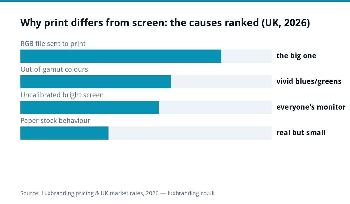
| Symptom | Likely cause | Fix |
|---|---|---|
| Everything came back duller and darker | RGB file auto-converted by the printer’s workflow | Supply CMYK artwork, or the £49 pass does the conversion deliberately |
| One brand colour shifted badly, rest fine | That colour is out of CMYK’s range | Define a printable CMYK recipe (and Pantone for critical use) |
| Print looks dark, screen looks luminous | Monitor brightness cranked; screens ship bright | Judge colour at moderate brightness; trust values over vibes |
| Same file, different results at two printers | No colour values supplied; each shop’s defaults differ | Send CMYK values/Pantone refs with every job |
| Colour fine, but muddy on this paper | Uncoated stock absorbs ink and softens colour | Expect it, or spec coated stock for punch |
The brand-colour fix: numbers, not screenshots
The permanent cure is defining brand colours as recipes: a HEX/RGB value for screens, a CMYK build for print, and, for colour-critical brands, a Pantone spot reference, the industry’s standard swatch language that lets any printer mix the same colour repeatably. These belong on the one-page brand sheet a complete logo handover includes, and they end the “match the website” era where every supplier guessed. Two practical notes: pick the CMYK build by how it PRINTS, not how it looks on your screen (a decent designer or the £49 pass does this with printed experience), and if your signature colour is an electric out-of-gamut blue, decide once whether print gets a Pantone spot (costlier, exact) or an agreed nearest CMYK (cheaper, consistent), rather than relitigating it per job.
Proofs, and what “approval” really approves
The PDF proof your printer sends approves layout, spelling and placement; on colour it approves almost nothing, because you are viewing it on the same lying screen that started this. For jobs where colour matters (a big run, brand collateral, first order with a new supplier), ask for a physical proof or a single printed sample before the run; small cost, and it converts colour from hope into evidence. When a proof does come back off-target, the productive conversation is numbers: “the logo should be C100 M80 Y0 K10, this looks like it ran heavier” gets a press adjustment, while “it looks wrong” gets a shrug. Printers are good-faith partners in this when handed values; the lesson our whole print series keeps teaching applies here too: files that speak the printer’s language get the printer’s best work.
The £0 workflow (and where the £49 pass earns it)
Habits first: design print jobs in CMYK from the start (or convert deliberately and REVIEW after converting, adjusting the colours that dulled); keep the brand sheet’s values beside you; moderate your screen brightness when judging colour; and supply values with every job. That workflow is free and covers most small-business printing. The £49 print-ready pass earns its fee when the artwork came from elsewhere (a template tool, an old designer, your nephew) and needs converting, colour-correcting and setting up with bleed and resolution in one professional pass; it pairs with the resolution rules as the two halves of arriving at any UK printer with files that behave. Screen-side colour consistency, meanwhile, is its own small discipline covered by the brand export habits; one master set of values feeds both worlds.
Worked example: the three-blues business
Composite from the print trenches: a firm whose van, business cards and banner each carry a different blue, the classic symptom. Archaeology finds the cause: the van fitter got a screenshot, the card printer got an RGB PDF and auto-converted, the banner house got “match the website”. Nobody erred; everybody guessed, differently. The £49 pass fixes it permanently: the logo’s blue gets a defined CMYK build and a Pantone reference, artwork is converted deliberately with the blue corrected after conversion, and a one-line colour spec joins the brand pack. The next reprint of each item comes back matching, and every future supplier gets values instead of vibes. Total time: a day; the mismatched-blues years it ends: several. Multiply this story across every small business whose brand grew supplier by supplier and you have most of the UK’s print-colour complaints.
Screens can behave better too (five minutes of monitor honesty)
Print is the truth-teller, but the screen can lie less: drop brightness to a moderate level when judging colour (ship-default brightness is a showroom setting), avoid judging against a window’s glare, and remember that your phone, laptop and client’s monitor are three different opinions, which is why values, not screenshots, travel between them. Professional calibration hardware exists for colour-critical trades; for everyone else, moderate brightness plus trusting the numbers gets ninety per cent of the benefit for free. The deeper habit is cultural: once a business starts speaking in C-M-Y-K and Pantone instead of “our blue”, every supplier conversation shortens, which is the same values-over-vibes shift the sizing cheat sheet makes for dimensions.
Expectations, calibrated (what pros actually promise)
Even done perfectly, screen-to-print is a translation, not a photocopy: paper stock shifts things (uncoated drinks ink and mutes it; coated pops), batches vary within tolerances, and two monitors in your own office disagree with each other right now. What professional practice delivers is consistency where it counts: the SAME blue on the van, the cards and the banner, run after run, because they all come from the same values. Chasing pixel-identical screen matching is the amateur trap that burns proof cycles; owning your numbers is the professional exit, and it costs a brand sheet. All prices for the paid escape hatches live on the price list.
The takeaway in one line: screens show light and printers lay ink, so stop chasing a perfect match and start owning your numbers, CMYK builds and a Pantone reference on one brand sheet, supplied with every job, and the mismatch era simply ends.
Get the UK Print-Ready Artwork Checklist (free)
A one-page checklist for any UK designer or printer covering CMYK, bleed, fonts and resolution. Saves you the pre-press fix-up fees.
No spam. UK GDPR compliant. We only use your email to send this resource, unless you tick the box to hear from us.
Frequently asked questions
Why do my printed colours look different from my screen? +
Screens mix glowing light (RGB) and can show vivid colours ink physically cannot reproduce; print mixes inks (CMYK) on paper that absorbs and reflects. Add an uncalibrated, over-bright monitor and an RGB file auto-converted by the printer, and the mismatch is guaranteed.
What is the difference between RGB and CMYK? +
RGB builds colour from red, green and blue light, adding up toward white: the screen model. CMYK builds from cyan, magenta, yellow and black inks, subtracting light from white paper: the print model. CMYK's range is smaller, which is why vivid screen colours dull in print.
Which colours change the most from screen to print? +
Vivid blues and purples, electric greens, bright oranges and neon-ish tones sit outside CMYK's range and shift most: they print darker and duller. Earthy tones, reds and blacks usually travel well. If your brand lives on a vivid blue, define its print recipe deliberately.
How do I make sure my brand colours print correctly? +
Define them as numbers, not screenshots: CMYK values for print and a Pantone reference for critical colour, alongside HEX/RGB for screens, all on one brand sheet. Supply those values with artwork and every printer can hit the same colour repeatably.
Should I ask for a printed proof? +
For big runs, brand-critical jobs and first orders with a new printer: yes, a physical proof (or at minimum one digital print sample) before the full run. Screen PDFs "for approval" approve layout, not colour; paper is the only honest preview of paper.