Quick answer
There is no true gold in CMYK, because the four process inks cannot produce a metallic shine. A flat gold is built mostly from yellow with some magenta and black, such as C0 M17 Y74 K17 converted from the web colour #D4AF37. For real shine, specify a metallic Pantone ink or foil, and always ask your printer for a proof.
Gold is one of the most requested colours for logos, business cards and packaging, and one of the most disappointing when it comes back from the printer looking like mustard or brown. This guide explains why CMYK struggles with gold, gives you starting values for common golds, compares flat gold with metallic ink and foil, and shows how to set up files so the printer gets it right first time.
Why CMYK cannot print real gold
CMYK printing builds colours from four transparent inks (cyan, magenta, yellow and black) laid down as tiny dots. That works for photos and most brand colours, but gold is not really a colour; it is a reflective finish. What makes gold look like gold is the way light bounces off it and changes as you move the page. Transparent process inks cannot do that, so any CMYK gold is a flat yellow-brown that suggests gold rather than shines.
The printing industry handles this with special inks and finishes. As Wikipedia’s article on spot colour notes, offset printers use the term spot colour for any colour made with a non-standard ink, and gives metallic and fluorescent inks as examples. Its article on the CMYK colour model adds that each colour model has its own range of reproducible colours, and that high-quality printing sometimes adds spot colours or metallic inks to the four process colours.
CMYK gold values to start from
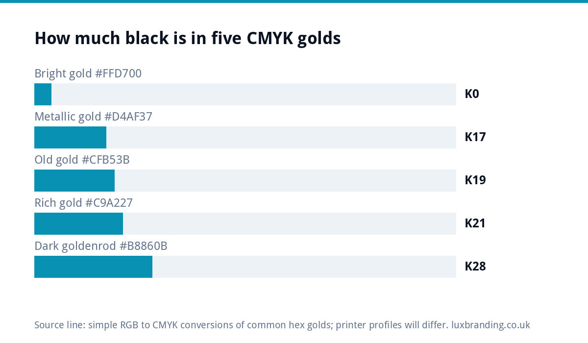
These are simple mathematical conversions of popular on-screen golds. They are starting points for a flat gold, not guaranteed results. Your printer’s colour profile, paper and press will change the final colour, so treat them as a brief and approve a printed proof.
| Gold | Hex | RGB | Simple CMYK conversion | Character |
|---|---|---|---|---|
| Metallic gold (web) | #D4AF37 | 212, 175, 55 | C0 M17 Y74 K17 | Classic, slightly warm |
| Bright gold | #FFD700 | 255, 215, 0 | C0 M16 Y100 K0 | Very yellow, can look cheap in print |
| Old gold | #CFB53B | 207, 181, 59 | C0 M13 Y71 K19 | Muted, works on cream stock |
| Rich gold | #C9A227 | 201, 162, 39 | C0 M19 Y81 K21 | Deeper, suits dark designs |
| Dark goldenrod | #B8860B | 184, 134, 11 | C0 M27 Y94 K28 | Bronze leaning, risk of brown |
Two practical notes. Too much black turns gold muddy and brown; too little leaves it looking like mustard. And a flat gold usually looks richer next to deep navy, black or forest green than on white, where it can read as plain yellow.
Flat gold, metallic ink or foil?
Pantone’s article on metallics in print and packaging lists the main ways to get a real metallic effect: cold and hot foil stamping, metallic Pantone inks, and digital embellishments with variable foil. It notes that the Pantone Matching System offers 655 metallic colours, and that metallics are widely used on luxury packaging, invitations and brand collateral such as business cards, folders and brochures.
| Method | What you get | Best for | Watch out for |
|---|---|---|---|
| Flat CMYK gold | A yellow-brown that suggests gold, no shine | Everyday print, short runs, tight budgets | Can look dull or mustard |
| Metallic Pantone ink | A soft metallic sheen | Litho print runs, stationery, packaging | Needs a printer who runs spot inks |
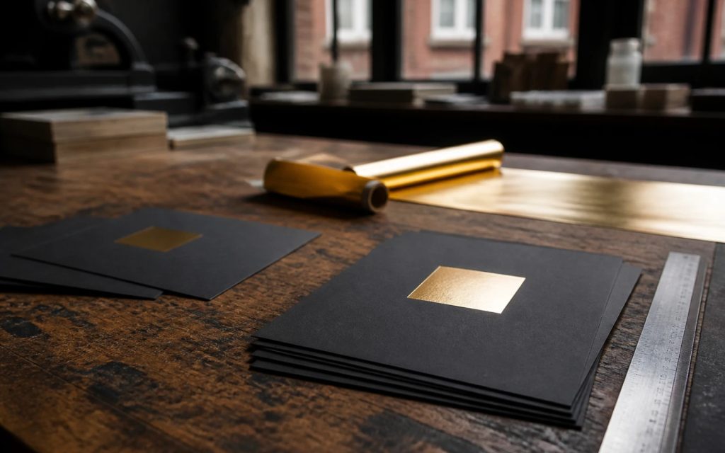
| Hot foil stamping | Bright, mirror-like gold pressed into the stock | Premium business cards, labels, boxes | Fine detail and tiny text may fill in |
| Cold foil | Metallic finish applied on press, can be overprinted | Labels and packaging in larger runs | Usually a larger-run process |
| Digital foil | Foil effect on digital presses | Short runs and personalised items | Finish varies by printer |
Prices for foil and metallic inks vary widely between printers and quantities, so ask for quotes on the exact item and run size.
Gold on screen is a different job
On websites and social media, gold is shown with light, not ink, so it can look brighter and even shimmer through gradients. That is why a gold that looks perfect on your laptop can disappoint on paper. Keep two versions of your brand gold: an RGB or hex value for screens, often with a subtle gradient, and a print specification that names the CMYK build, the Pantone metallic or the foil. Your brand guidelines should list both so every supplier uses the right one.
Designing a gold logo that survives every format
A logo that only works in shiny foil will let you down on a van, a website, a fax-quality PDF or an embroidered polo. Every gold logo needs:
- A flat-colour version using the CMYK or Pantone build
- A single-colour version in black and in white
- A screen version with the RGB or hex value
- A foil version with the foil areas on their own layer, if you plan to use foil
If your current logo was designed only as a gradient gold on screen, our Logo Edit at £50 can create the flat and single-colour versions while keeping the mark recognisable. If you only have a JPG or PNG, it needs rebuilding as vector first through Recreate and Vectorise at £79 for one layout. Our guide to logo file formats explains which versions go where.
Setting up artwork for foil or metallic ink
Foil and metallic inks need slightly different file setup from normal print. Most printers ask for:
- Vector artwork for the gold areas, not a photo or flattened image.
- A separate layer or spot colour for the foil or metallic areas, named clearly, such as “FOIL GOLD”.
- Solid 100% areas for foil, with no gradients, tints or shadows.
- Text converted to outlines and a sensible minimum line thickness for fine detail.
- A separate CMYK layer for everything that prints normally.
- A note of the exact Pantone metallic or foil colour you want.
Every printer has its own rules on minimum sizes and file formats, so download their specification sheet before you start. Our guide to print-ready artwork in the UK covers bleed, CMYK and fonts, and if a printer has already sent your files back, see printer rejected your artwork.
Testing a flat gold before the full run
If you are sticking with CMYK, a small test saves an expensive reprint. Ask your printer for a hard proof, or order a short run of the cheapest item, such as a few business cards, on the exact paper you plan to use. Print two or three variations side by side: your chosen build, one with slightly less black and one with slightly more. Look at them in daylight and under the lighting where customers will see them, such as a shop counter or a reception desk. Pick the one that reads as gold rather than yellow or brown, then record that exact build in your brand guidelines so every future job matches.
How to brief a printer about gold
Printers can only deliver what you ask for, and “make it gold” means different things to different people. A clear brief includes:
- The item, size, paper and quantity
- Whether you want flat CMYK gold, a named Pantone metallic or foil
- For foil, whether it is hot, cold or digital, and on which side
- Which parts of the design are gold and which print normally
- Whether you need a proof before the run, and in what form
Asking two or three printers to quote on the same brief is the quickest way to see which method suits your budget.
Where gold works for small brands
Gold signals premium, tradition or celebration, which makes it a strong choice for:
- Beauty salons, barbers and aesthetics clinics
- Jewellers, florists, bakers and wedding suppliers
- Restaurants, bars and hospitality
- Professional services that want to look established
- Premium trades, such as bespoke joinery or high-end kitchens
The most effective use is often restrained: a foiled logo on otherwise simple business cards, or a gold detail on a dark box. Our Packaging Design is £99.
Common gold printing mistakes
- Sending an RGB gold and letting the printer convert it automatically
- Expecting shine from CMYK and being disappointed by flat yellow
- Foiling tiny text that fills in and becomes unreadable
- Gold on white with no contrast, which reads as pale yellow
- Skipping the proof on a large or expensive run
- No flat fallback for embroidery, signage and digital use
Getting your gold right
Gold looks best when it is planned, not added at the end. Decide where you want shine and where flat colour will do, record both specifications in your brand guidelines and share them with every supplier. If you want the whole system done properly, our Brand Identity Design at £299 includes your logo, colours, typography, imagery and brand guidelines, so every supplier works from the same colour values. All our prices are on the pricing page.
Get the UK Print-Ready Artwork Checklist (free)
A one-page checklist for any UK designer or printer covering CMYK, bleed, fonts and resolution. Saves you the pre-press fix-up fees.
No spam. UK GDPR compliant. We only use your email to send this resource, unless you tick the box to hear from us.
Frequently asked questions
What is the CMYK code for gold? +
There is no single CMYK gold, because process inks cannot reproduce metallic shine. A common starting point is C0 M17 Y74 K17, a simple conversion of the web colour #D4AF37. Your printer's colour profile and paper will change the result, so treat any value as a brief and approve a printed proof before the full run.
Why does my gold print look brown or mustard? +
Usually the balance is off. Too much black makes a CMYK gold muddy and brown, too little leaves it looking like mustard yellow. Gold also loses its richness on bright white paper. Try adjusting the black slightly, test on the actual stock, or move to a metallic Pantone ink or foil for real shine.
Is foil better than metallic ink for a gold logo? +
Foil gives a brighter, mirror-like finish and suits premium business cards, labels and boxes, but very fine detail and tiny text can fill in. Metallic Pantone ink gives a softer sheen and suits stationery and packaging on litho presses. Ask printers to quote both on your exact item and quantity before deciding.
How do I set up a logo for gold foil printing? +
Supply vector artwork with the foil areas on their own layer or spot colour, named clearly, as solid 100% shapes with no gradients or shadows. Convert text to outlines, respect the printer's minimum line thickness and keep normal print on a separate CMYK layer. Download your printer's specification sheet first.
Can you make a flat version of my gold gradient logo? +
Yes. Our Logo Edit is £50 and can create flat-colour and single-colour versions of an existing logo while keeping it recognisable, returned in every format with colour codes. If you only have a JPG or PNG, it first needs rebuilding as vector through Recreate and Vectorise at £79 for one layout.