Quick answer
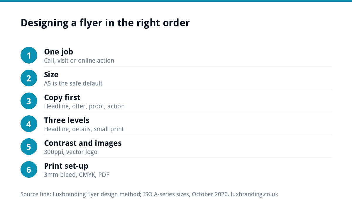
To design a flyer that gets read, give it one job, write the headline and offer before you touch the layout, and build three levels of size: headline, key details, small print. Use one strong image, high-contrast text and a single call to action. Then set up 3mm bleed, CMYK colour and a print-ready PDF.
Most flyers fail before anyone picks them up because they try to say everything. This guide walks through the order we use: purpose, size, copy, layout, images, print setup and a final check. It works whether you design it yourself or brief someone else.
Step 1: give the flyer one job
A flyer can do one thing well. Decide which before you open any software:
- Get a call or booking. Boiler services, gutter cleaning, a mobile valeting slot.
- Get a visit. A shop opening, an open day, a new menu.
- Get an online action. Book on the website, scan for a quote form, follow a page.
Write that job down as a sentence, for example “Get homeowners within three miles to book a boiler service before winter.” Every later decision gets tested against it. If a line of copy or a photo does not help that sentence, it goes.
Step 2: choose the size before the layout
The size decides how much you can say, so pick it first. These are the standard flat sizes used by UK printers.
| Size | Dimensions | Best for | Copy it can hold |
|---|---|---|---|
| A6 | 105 x 148mm | Door drops, counter piles, offers | Headline, offer, contact, one image |
| DL | 99 x 210mm | Price lists, menus, envelope inserts | A short list of services or prices |
| A5 | 148 x 210mm | Most door-to-door and event flyers | Headline, three benefits, proof, call to action |
| A4 | 210 x 297mm | Notice boards, detailed information | More text, but rarely read in full |
For a first flyer, A5 printed on both sides is the safe default. It is big enough for a clear message and small enough that people do not expect a brochure. If what you are making is more of a wall piece, read our poster design guide instead, because posters are read from a distance and follow different rules.
Step 3: write the copy before you design anything
Designing around placeholder text produces flyers where the words are squeezed into whatever space is left. Write the words first, in this order:
- Headline. The benefit or the problem, in under ten words. “Boiler serviced before the cold snap” beats “Smith Heating Services”.
- Offer. What they get and any reason to act now: a price, a free check, a closing date.
- Three proof points. Gas Safe registered, local, years trading, a short customer quote with permission.
- Call to action. One action, said plainly: “Call 01234 567890” or “Book at yoursite.co.uk”.
- Small print. Terms, address, company details.
Read it aloud. If it takes longer than about twenty seconds, cut it. Your business name and logo belong on the flyer, but they are rarely the headline: people care about their problem before they care who you are.
Step 4: build the layout in three levels
Good flyer layouts have a clear order of reading. Set three levels of size and stick to them:
- Level 1: the headline, by far the largest text, readable at arm’s length.
- Level 2: the offer and the call to action, clearly smaller but still bold.
- Level 3: proof points and small print, at a comfortable reading size.
A few layout habits that help:
- Use a simple grid: one column on A6, two at most on A5.
- Leave real space around the headline. Empty space is what makes it stand out.
- Put the call to action where the eye finishes, usually bottom right or bottom centre.
- Use no more than two fonts, ideally your brand fonts.
- Repeat your brand colour in two or three places rather than flooding the page with it.
The arm’s-length test is simple: print a draft at actual size, hold it at arm’s length for three seconds, then turn it over. If you cannot say what the flyer is offering, the headline is too small or too vague.
Step 5: decide what goes on the front and the back
The front has one job: make someone turn it over or keep it. The back does the persuading.
- Front: headline, one strong image, the offer, your logo and the phone number or web address.
- Back: services or prices, proof points, a map or service area if relevant, the call to action again, and the small print.
Repeating the contact details on both sides is not wasteful. Flyers get pinned to fridges front side out, and the front is often the only side anyone sees again.
Step 6: colour, type and contrast
Contrast is the most common problem on home-made flyers: pale grey text on white, or white text over a busy photo. Check your text and background colours with a free tool such as the WebAIM contrast checker. It is built for screens, but a pair that fails on screen will almost always be hard to read in print too, especially for older readers.
Practical rules:
- Dark text on a light background for anything longer than a line.
- If text sits on a photo, darken the photo or put the text on a solid panel.
- Avoid body text below about 9pt on A5; small print can go smaller but must stay legible.
- Keep brand colours consistent with your van, website and cards so the flyer looks like it comes from the same business.
Step 7: images that print well
One strong photo beats a collage. Use a real photo of your work, your team or your premises if you can; it carries more trust than stock imagery. For print, images need to be about 300 pixels per inch at the size they are printed. A photo filling half an A5 sheet needs to be roughly 1,750 pixels wide. Most modern phone photos are big enough; images saved from social media or websites usually are not.
Your logo should be a vector file (AI, EPS, SVG or a vector PDF), not a screenshot. If all you have is a small JPG, our guide to logo file formats explains what to ask for.
Step 8: set it up for print
This is where most self-designed flyers get sent back. Printers need:
- 3mm bleed on every edge: backgrounds and images extend past the trim line so no white edge appears.
- A safe zone of at least 3mm inside the trim, where no important text sits.
- CMYK colour, because bright screen colours can print duller.
- A high-resolution PDF with fonts embedded or outlined.
Our guide to print-ready artwork covers each setting in detail, and if a file has already bounced, why printers reject artwork lists the usual reasons.
Step 9: keep it legal and honest
Flyers count as advertising. The CAP Code, enforced by the Advertising Standards Authority, applies to leaflets just as it does to online ads, and the government’s guide to marketing and advertising law summarises the main rules. In practice that means:
- Prices must be accurate, and “from” prices must be genuinely available.
- Claims such as “cheapest in town” or “number one” need evidence.
- Customer quotes must be real and used with permission.
- Limited companies should show their registered name somewhere on business material.
The pre-print checklist
Run through this before you send the file to the printer.
| Check | Pass looks like |
|---|---|
| One job | You can say what the flyer is for in one sentence |
| Headline | Readable at arm’s length in three seconds |
| Call to action | One action, with a phone number or address that works |
| Contact details | Proofread digit by digit, on both sides |
| Contrast | No pale text on pale backgrounds or busy photos |
| Images | About 300ppi at print size, logo in vector |
| Print set-up | 3mm bleed, safe zone, CMYK, fonts embedded |
| Claims | Every price and claim is accurate and provable |
Ask someone who has never seen the flyer to read it and tell you what it offers. If their answer matches your one-sentence job, it is ready.
Designing it yourself or getting it designed
A tidy DIY flyer is fine for a one-off event. For a door-drop campaign where thousands of copies are printed, the design is a small part of the total cost, and a weak layout wastes the whole print run. Our flyer design service handles the layout, copy hierarchy and print-ready files, and if you need a matching business card, the business card design page covers that. Current prices for both are on our pricing page.
Get the UK Print-Ready Artwork Checklist (free)
A one-page checklist for any UK designer or printer covering CMYK, bleed, fonts and resolution. Saves you the pre-press fix-up fees.
No spam. UK GDPR compliant. We only use your email to send this resource, unless you tick the box to hear from us.
Frequently asked questions
What should be on a business flyer? +
A headline that names the benefit or problem, the offer, two or three proof points, one clear call to action and your contact details. Add your logo and, for limited companies, the registered name in the small print. Anything that does not help the flyer's single job, such as a long list of every service, is better left off.
What size should a flyer be? +
A5 (148 x 210mm) printed on both sides suits most door-to-door and event flyers. A6 works for simple offers and counter piles, DL suits price lists and menus, and A4 is mainly for notice boards. Pick the size before designing, because it decides how much copy the flyer can carry.
What resolution does a flyer need for printing? +
Images should be about 300 pixels per inch at the size they will print. A photo filling half an A5 flyer needs to be around 1,750 pixels wide. Logos should be vector files rather than JPGs. Low-resolution images saved from social media or websites usually print blurry.
What is bleed on a flyer? +
Bleed is an extra 3mm of background or image beyond the trim line on every edge. Printers cut through it, so if the sheet shifts slightly during trimming there is no thin white edge. Keep important text at least 3mm inside the trim line, in what is called the safe zone.
Can Luxbranding design my flyer? +
Yes. Our flyer design service covers the layout, copy hierarchy and print-ready files with bleed and CMYK colour set up correctly. Current prices are on our pricing page, and you can order online or email support@luxbranding.co.uk with your brief. The files are set up so any UK printer can work from them.