Quick answer
A flat-colour version of your logo, £50 as a Logo Edit from us if you own a vector file, avoids most of the extra cost a gradient brings. Gradients print well in full-colour digital print, but screen printers need extra screens, embroiderers cannot stitch a smooth fade, and cut vinyl cannot show one at all.
This guide goes method by method through where a gradient adds cost or simply fails, shows a worked example of one logo going to five suppliers, and explains how to keep the gradient where it works without paying for it everywhere else.
Why gradients are different from flat colour
A flat-colour logo is made of solid areas: this shape is navy, that shape is orange. Almost every print and making process is built for that. A gradient is a smooth fade between colours, which means thousands of slightly different shades across a small space.
On a screen, that is easy. Phones and monitors mix light pixel by pixel. In the physical world, most processes put down one solid ink, thread or material at a time. To fake a fade, they have to break it into tiny dots, extra layers or extra colours, and every one of those adds setup work, which is where the cost comes from.
A gradient logo still needs to be proper vector artwork. Adobe’s raster versus vector guide explains why vector suits logos: it scales without losing quality. But even a perfect vector gradient runs into the limits below.
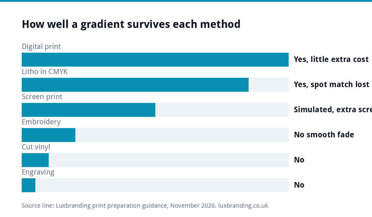
What gradients cost, print method by method
| Method | Can it show a gradient? | Effect on cost or result |
|---|---|---|
| Digital print (flyers, cards, roller banners) | Yes | Little or no extra cost; watch for banding and colour shift |
| Litho print in CMYK | Yes | Fine for long runs; spot colour matching is lost |
| Screen print (T-shirts, hoodies, bags) | Only by simulating it with halftone dots | Extra screens and setup per colour; soft fades can look grainy |
| Embroidery (polos, caps, jackets) | No smooth fade | Needs a flat version; complex blends raise digitising effort |
| Cut vinyl (vans, windows, signs) | No | Must switch to printed vinyl, or use a flat version |
| Engraving, embossing, rubber stamps | No | Only one colour or depth; the gradient disappears |
The pattern is clear. The more physical the process, the more a gradient costs you or the less of it survives.
Where the extra charges come from
Screen printing on workwear
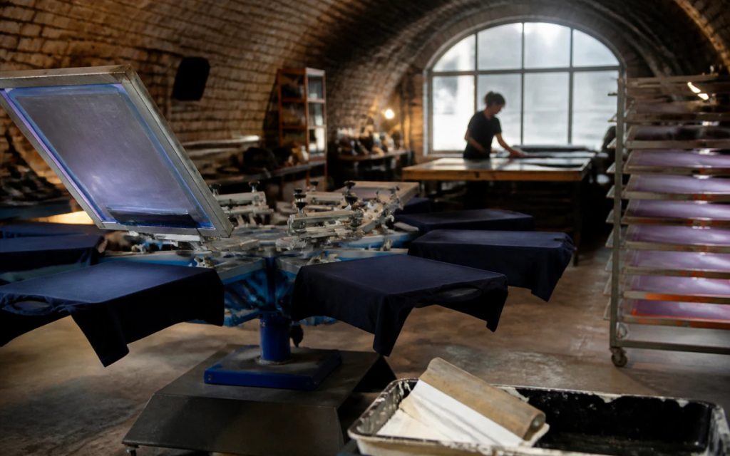
Screen printers make one screen for each ink colour and charge setup for each. A two-colour flat logo needs two screens. A gradient has to be faked with halftone dots in one or more inks, often with extra screens to get the blend right, and it is harder to keep consistent across a batch. Many printers will suggest digital transfers instead for gradient designs, which suit small runs but can feel and wear differently.
Embroidery
Embroidery is stitched in solid thread colours chosen from a maker’s range, such as those sold by Madeira. Thread cannot fade smoothly from one shade to another. A digitiser can suggest a blend with alternating stitches in two or three colours, but it takes more work and rarely looks like the screen version on a small chest logo. Our guide to logo files for embroidery and signs covers what embroiderers need.
Vans and signs
Traditional sign vinyl is cut from solid-colour sheets. A gradient means printing onto white vinyl instead, then laminating it, which changes the price and the look. Our guide to vehicle signage costs explains how those options are priced.
Spot colours
Many brands specify exact spot colours so they match on every job. Pantone’s Formula Guide describes its spot colours as backed by ink formulations for accurate reproduction from design through print. A gradient between two spot colours cannot be printed as a single mixed ink, so printers either convert it to CMYK, losing the exact match, or add extra plates.
Promotional items
Branded pens, mugs, lanyards, USB sticks and keyrings are usually pad printed or screen printed in one or two spot colours, on a tiny area. Suppliers often price these per colour, so a gradient either pushes the job into a more expensive full-colour process or gets flattened by the supplier’s own artworker, who may not choose the colours you would. Send a single-colour version and stay in control of how it looks.
Small sizes
Even where a process can reproduce a gradient, size matters. A fade that looks rich on a roller banner can turn into a muddy smudge on a 25mm chest logo, a favicon or the corner of an invoice. At small sizes, flat colour almost always reads better, which is another reason to have both versions ready before anyone asks.
Gradients on screen are fine
None of this means a gradient logo is a mistake. On a website, an app icon, social media and digital adverts, a gradient can look modern and polished at no extra cost. The problem only appears when the gradient version is the only version you have and every supplier has to work from it.
A worked example: one logo, five suppliers
A mobile phone repair business in Cardiff has a logo with a purple-to-blue gradient behind white lettering. In its first year it needs five things:
- Website and social media: the gradient looks great. No problem, no extra cost.
- Business cards and flyers: digital print handles it, though the purple prints a little duller than on screen.
- Staff T-shirts: the screen printer quotes extra screens and setup for the blend, and suggests a flat purple version instead.
- Embroidered polos: the embroiderer asks for a flat version, as the fade will not stitch at that size.
- Shop window vinyl: the sign maker asks whether to print the gradient on white vinyl or cut it in one solid colour.
Three of the five suppliers either charge more or ask for a different file. Creating one flat-colour version and one single-colour version up front would have answered all three questions before they were asked.
The fix: a logo family, not a new logo
You rarely need to drop the gradient. You need versions:
- Full gradient: for screens and full-colour digital print.
- Flat colour: the gradient replaced with one or two solid brand colours, for screen printing, embroidery and cut vinyl.
- Single colour: one colour only, for engraving, stamps, one-colour print and dark or busy backgrounds.
- Reversed: white out of a dark background, for vans and dark workwear.
Pick the flat colours carefully. Usually the darker end of the gradient carries the lettering better, while the lighter end works as an accent. Test both at small sizes before deciding.
Write the colour codes down for every version: the CMYK and spot references for print, the RGB and hex values for screens, and thread or vinyl references once a supplier has matched them. Keeping that list with your logo files means the next T-shirt or sign order starts from the same colours instead of a fresh guess.
Pricing the fix
| Your situation | What you need | Our price |
|---|---|---|
| You have a vector file of your gradient logo | Flat and single-colour versions added | Logo Edit, £50 |
| You only have a PNG or JPG | The logo redrawn as true vector first | Recreate & Vectorise, £79 for one layout, £39 per additional layout |
| The gradient is hiding a weak design | A new logo that works everywhere | Logo Design, £129 |
| A printer needs a specific job set up | Print-ready file with bleed and correct colour | Print-Ready Artwork, £49 |
If you only have a picture of your logo, our Recreate & Vectorise service rebuilds it first, and our Logo Edit then adds the flat and single-colour versions with colour codes for each.
Before your next print order
- Check which versions of your logo you actually have.
- Ask each supplier whether the gradient will cost extra or need a different file.
- Send flat-colour files to screen printers, embroiderers and vinyl cutters.
- Ask for a proof, and ideally a physical sample, before a large run.
If a printer has already sent your files back, our guide to printer-rejected artwork explains the common reasons, and the print-ready artwork guide covers the checks.
Designing it right from the start
If you are having a new logo designed and like gradients, say so in the brief, and ask to see the flat and single-colour versions at concept stage, not after you have approved the design. Our Logo Design is £129 with unlimited concepts, unlimited revisions within your brief and every file format. Every price is on our pricing page.
Get the UK Print-Ready Artwork Checklist (free)
A one-page checklist for any UK designer or printer covering CMYK, bleed, fonts and resolution. Saves you the pre-press fix-up fees.
No spam. UK GDPR compliant. We only use your email to send this resource, unless you tick the box to hear from us.
Frequently asked questions
Can you print a gradient logo? +
Yes, in full-colour digital and litho print, such as flyers, business cards and roller banners, with little or no extra cost. Screen printing has to fake the fade with halftone dots and extra screens, embroidery cannot stitch a smooth fade, and cut vinyl cannot show one at all. A flat version solves those.
Can a gradient logo be embroidered? +
Not as a smooth fade. Embroidery uses solid thread colours, so a digitiser can only suggest a blend with alternating stitches, which takes more work and rarely looks like the screen version on a small chest logo. Most embroiderers will ask for a flat-colour version of the logo instead.
Should I remove the gradient from my logo? +
Usually not. Keep the gradient for screens and full-colour print, and add flat-colour and single-colour versions for screen printing, embroidery, vinyl and engraving. Only consider a redesign if the logo relies on the gradient so heavily that it stops making sense in one or two solid colours.
How much does it cost to make a flat version of my logo? +
If you own a vector file, our Logo Edit is £50 and adds flat and single-colour versions with colour codes in every format. If you only have a PNG or JPG, the logo first needs redrawing as vector with Recreate & Vectorise, which is £79 for one layout and £39 per additional layout.
Why does my gradient print differently from the screen? +
Screens mix light, while print mixes ink, so bright purples, blues and greens often print duller in CMYK. Long, smooth fades can also show visible bands. Ask for a printed proof before a large run, and use spot or flat colours where the exact shade matters, such as on signage.