Quick answer
Neither length wins by itself. A page converts when it answers every question a buyer has before acting, then stops. A quick, low-risk job worth around £90 suits a short page with a price, proof and a button. A £12,000 extension needs a longer page covering costs, process, proof and doubts. Match length to the decision.
“Should my service page be long or short?” is one of the most common questions we hear when planning a website. The honest answer is that length is a result, not a target. This guide shows how to work out the right length for each page, how people actually read online, and how to build a long page that still gets people to the button.
Why “long or short” is the wrong question
Visitors do not object to long pages. They object to pages that waste their time. A three-line page that leaves someone unsure about price or trust loses the enquiry just as surely as a rambling page that hides the phone number under five paragraphs about your history.
The better question is: what does this visitor need to know before they feel safe to act? For a small, familiar purchase, that list is short. For an expensive or risky one, it is long, and a short page leaves the visitor to find the answers somewhere else, usually on a competitor’s site.
What decides the right length
Four things push a page longer or shorter:
- Price. The more something costs, the more reassurance people want.
- Risk. Work on someone’s home, health or business invites more questions than a one-off small job.
- Familiarity. People know what a boiler service is. They may not know what a heat pump survey involves.
- Urgency. Someone with a burst pipe wants a phone number, not a guide.
Page length by situation
| Situation | Example | Right length | Must include |
|---|---|---|---|
| Urgent, simple | Emergency locksmith, blocked drain | Short | Phone number at the top, area covered, response time, price guide |
| Small, familiar purchase | Boiler service, carpet clean | Short to medium | Price, what is included, reviews, booking button |
| Considered local service | Driveway, roof replacement | Medium to long | Price range, process, photos of real work, guarantees, FAQs |
| High-value project | Extension, kitchen fit, bespoke software | Long | Cost breakdown, timeline, case studies, who does the work, objections answered |
| Single offer from an ad | Free quote campaign, seasonal offer | Short, focused | One offer, one form, proof, no menu distractions |
A worked example: one roofer, two pages
Picture a roofing firm with two main services. Its emergency leak repair page is short: a click-to-call button, the towns covered, a typical response time, a guide price for a call-out and three recent reviews. Someone with water coming through the ceiling needs nothing else. Its full roof replacement page is long: a price range by house type, what happens on survey day, how long the job takes, scaffolding and waste removal, the guarantee, before-and-after photos and answers to the questions people ask on the phone. Both pages are the right length, because each one matches the decision its visitor is making.
A focused page for ads is usually a landing page: one offer, one action and nothing else competing for attention.
What Google says about word count
A lot of “long pages rank better” advice comes from people assuming Google rewards length. Google’s guidance on creating helpful content answers this directly: it asks whether you are writing to a particular word count because you have heard Google has a preferred one, and says it does not.
What Google does reward is a page that fully answers the search. For a considered service, that naturally takes more words, because there are more questions to answer. For an urgent one, padding the page with filler to hit a number makes it worse for the visitor and does nothing for rankings.
How people actually read a web page
Most people do not read web pages word by word. In a well-known study, Nielsen Norman Group found that 79% of test users always scanned any new page, and only 16% read word by word. Their write-up on how users read on the web also found that concise, scannable and objective text was markedly easier to use.
That changes how a long page should be built. People skim headings, bold phrases, tables and lists, and stop to read when something answers their question. A long page works when the skimmer can find their answer in seconds; it fails when it is a wall of paragraphs.
The top of the page still does the most work
People do scroll, but attention is not spread evenly. NN/g’s research on scrolling and attention found that the content at the top of the page, before any scrolling, still received most viewing time.
So whatever the length, the first screen has to carry the essentials: what you do, where, roughly what it costs and how to get in touch. A long page is the top of a short page with the answers to every follow-up question underneath it.
How to build a long page that still converts
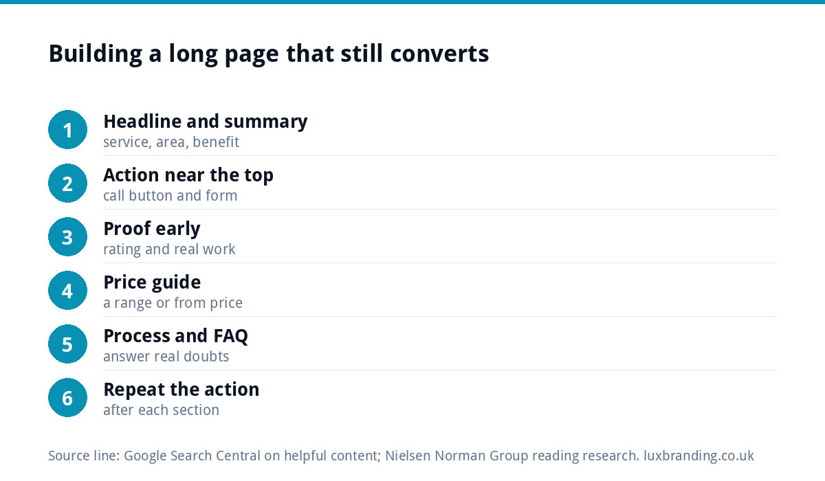
- Open with a clear headline and one-line summary of the service, area and main benefit.
- Put the main action near the top: a call button on mobile and a short quote form or link.
- Show proof early: your rating, photos of real work, accreditations.
- Answer cost next, even as a range or a “from” price. It is the question everyone has.
- Explain the process in numbered steps, so the visitor can picture working with you.
- Answer doubts in an FAQ built from questions customers really ask on the phone.
- Repeat the action after each major section, so nobody has to scroll back to the top.
Each section has to earn its place. If a paragraph does not answer a question or remove a doubt, cut it.
What each section of a long page is for
| Section | Question it answers | Cut it if |
|---|---|---|
| Headline and summary | Am I in the right place? | Never |
| Proof strip | Can I trust them? | Never; keep it short |
| Price guide | Can I afford it? | Never; give a range if prices vary |
| Process | What happens next? | The job is so simple there is no process |
| Case studies | Have they done this before? | You have no real examples yet |
| About the team | Who will turn up? | It is already covered on your about page |
| FAQ | What about my specific worry? | The questions are made up rather than real |
When a short page wins
Short pages win when the visitor already knows what they want and only needs to confirm you can do it. Emergency services, simple bookings and pages that sit behind a specific ad are the clearest examples. Here, every extra paragraph is a chance to get distracted.
Some businesses need nothing more than a single, well-built page. If you offer one or two services in one area, a one-page website at £299 can do the job, with a short, strong section for each service.
How to test what works for you
You do not have to guess. Look at what visitors do now and change one thing at a time.
- Watch where enquiries come from. If people call after reading the FAQ, the FAQ is earning its place.
- Check scroll depth in your analytics. If few people reach the price section, move it up.
- Listen to phone calls. Questions people ask repeatedly belong on the page.
- Test one change at a time for a few weeks, such as adding a price guide or moving the form higher.
Speed matters for any length. A long page with heavy images and slow scripts loses mobile visitors before they see a word. Our guide to website speed for small businesses covers the quick fixes, and our website launch checklist covers what to check before a new page goes live.
Mistakes that lose enquiries
- Padding a page to hit a word count.
- Hiding the price because “every job is different”, when a range would do.
- Putting the only contact button at the very bottom.
- Copying the same long text onto every service page, so none of them answers its own questions.
- Long paragraphs with no headings, lists or tables to skim.
Getting service pages written and built properly
Our Custom WordPress Website is £499 one-off for up to 8 pages, hand-coded with a mobile-first build, SEO foundation and contact forms connected to your inbox, plus a written CMS walkthrough so you can add to pages later. Want a rough budget first? Try our website cost calculator, or see every fixed price on our pricing page.
Get the UK Website Project Brief Template (free)
A two-page template for briefing any UK web designer: sitemap, integrations, audience and deliverables. Cuts revision rounds in half.
No spam. UK GDPR compliant. We only use your email to send this resource, unless you tick the box to hear from us.
Frequently asked questions
Do longer web pages convert better? +
Not by themselves. A page converts when it answers the questions a buyer has before acting. Expensive, risky or unfamiliar services need longer pages covering cost, process, proof and doubts. Urgent or simple jobs convert better on short pages with a phone number, price guide and button. Match the length to the decision rather than a target.
Does Google prefer long pages? +
No. Google's guidance on helpful content asks whether you are writing to a word count because you heard Google has a preferred one, and says it does not. Google rewards pages that fully answer the search. For considered services that often takes more words, but padding a page to reach a number does not help rankings.
How long should a service page be? +
Long enough to answer what customers ask before booking, and no longer. A simple, urgent service might need a short page with a phone number, area, response time and price guide. A high-value project page usually needs a cost breakdown, process steps, case studies and an FAQ built from real customer questions.
Where should the contact button go on a long page? +
Near the top, where most attention goes, and again after each major section so nobody has to scroll back up. On mobile, a call button in the first screen matters most. Research from Nielsen Norman Group found content above the fold still receives most viewing time, even though people do scroll.
Can you write and build service pages for my business? +
Yes. Our Custom WordPress Website is £499 one-off for up to 8 pages, hand-coded with a mobile-first build, SEO foundation and contact forms connected to your inbox. A focused Landing Page is £199 and a One-Page Website is £299. Every fixed price is listed on our pricing page.