Quick answer
Leave clear space around your logo equal to a part of the logo itself, so it scales with any size. A common rule is the height of one capital letter or of the icon, measured on all four sides. Nothing else, including text, photos and the edge of the page, goes inside it. Print usually gets more room than screens.
Clear space, also called the exclusion zone or safe area, is the empty margin that keeps a logo readable and stops it looking like an afterthought. Large organisations write exact rules for it; most small businesses never set one, which is why their logo ends up jammed against a phone number on the van or cropped on a social post. This guide explains how to set a rule that works, with real examples and the sizes that matter.
Why clear space matters
A logo needs breathing room for the same reason a sentence needs spaces between words. When other elements crowd it, the eye reads them as one lump, and the logo loses its shape. That matters most where people glance rather than read: a van passing at 30mph, a sign across a street, a tiny avatar in a feed.
The NHS puts it plainly in its logo guidelines: the logo should not be cluttered by other text or images appearing too close to it, and should not be positioned so close to the edge of materials that it looks like an afterthought. That is exactly the problem clear space solves.
How to measure clear space
The trick is to measure clear space with a part of the logo, not a fixed number of millimetres. Then the rule works at any size, from a business card to a shop fascia. Common units are:
- The height of a capital letter in the wordmark. Easy to see and measure.
- The height or width of the icon. Generous; suits bold marks.
- A detail of the logo, such as a dot or a stroke. Tighter; suits busy layouts.
- A fraction of the full logo height, such as half or the whole height.
Draw a box around the logo, add that unit on all four sides, and the result is the zone nothing else may enter. Your designer should mark it on a diagram in your brand guidelines so anyone producing artwork can follow it.
Real examples from UK brand guidelines
Public bodies publish their rules, which makes them a useful benchmark. Three take different approaches.
| Brand | Clear space rule | Minimum size guidance | Approach |
|---|---|---|---|
| NHS | Full logo height for print and signage; half the logo height for digital | 30px high on screen; favicons as small as 15px square | Generous, with a lighter rule for screens |
| GOV.UK | Defined by the size of the dot in the wordmark | Minimum widths set; small crown version below that, for example favicons | Tight, based on a logo detail |
| UK Space Agency | Height of the uppercase letters, on every side | 30mm wide in print; 70 pixels wide on screen | Middle ground, based on lettering |
The NHS rule is generous because its logo appears on everything from hospital signs to leaflets. The GOV.UK brand guidelines use the dot in the wordmark, a small unit that suits dense digital pages. The UK Space Agency guidelines use the height of the capital letters and add that whenever possible you should leave more space. All three stress that their figure is a minimum.
Choosing a rule for your own logo
For most small businesses, a simple rule beats a clever one, because the people applying it are printers, sign-makers and whoever is making this week’s social post.
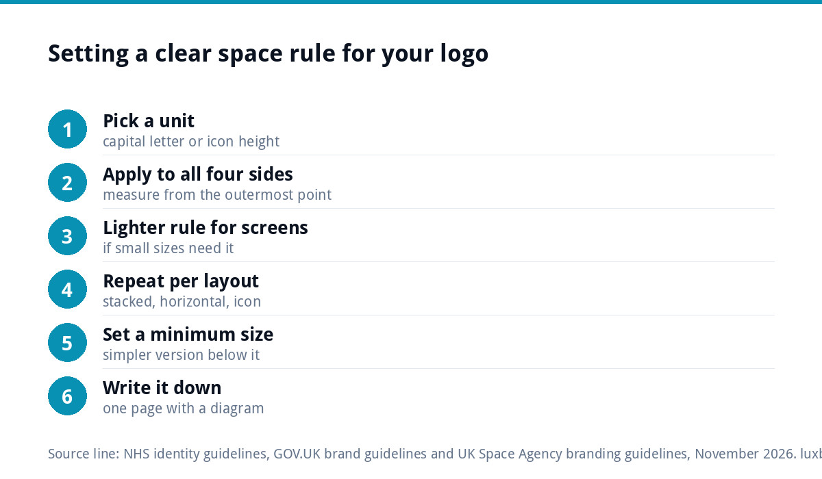
- Pick a unit that is easy to spot in your logo: usually a capital letter height or the icon height.
- Apply it on all four sides, not just left and right.
- Set a lighter rule for small digital uses if needed, as the NHS does with half the height for screens.
- Set it for each layout. Stacked, horizontal and icon-only versions may each need their own diagram.
- Write it down in a one-page guide with a picture, and send it with your logo files every time.
Clear space by application
| Where the logo appears | Common clash | Practical rule |
|---|---|---|
| Van or vehicle | Phone number and services crammed up against it | At least the full clear space; separate the contact panel |
| Shop sign or fascia | Logo stretched edge to edge of the board | Clear space from every edge of the sign, more if possible |
| Website header | Menu items sitting tight against the logo | Clear space on all sides, even at small heights |
| Social profile picture | Logo cropped by the circle | Use the icon and keep it well inside the circle |
| Workwear | Placket, seams or pockets cutting into it | Allow for the garment’s edges as well as the clear space |
| Business card and letterhead | Logo pushed into the corner to fit text | Move the text, not the logo |
| Co-branded material | Two logos almost touching | Each logo’s clear space respected, with a divider if needed |
Minimum size: the partner rule
Clear space goes hand in hand with a minimum size. Below a certain size, fine details close up and text becomes unreadable however much space surrounds it. The UK Space Agency sets 30mm wide in print and 70 pixels on screen; the NHS sets 30 pixels high for digital and allows favicons as small as 15 pixels square.
The common solution is a simpler version for small uses. GOV.UK switches to a small crown version below the main logo’s minimum, for things like favicons. For a small business, that usually means the icon on its own, or the initials, for app icons, social avatars and embroidery on a cap. If your logo has no version that works small, that is worth fixing; our guide to logos for embroidery and signage covers why detail disappears at small sizes.
Common clear space mistakes
- Adding a border or box around the logo to “protect” it. This changes how the logo looks; leave the space empty instead.
- Measuring from the wrong edge. Measure from the outermost point of the logo, including any tagline locked to it.
- Letting a background photo intrude. Clear space covers busy imagery as well as text. Put the logo on a calm area or a plain panel.
- Squashing the logo to fit. If the logo plus its clear space does not fit, use a smaller size or a different layout. Never stretch it.
- Forgetting the trim. On print, the edge of the page is where the paper is cut. Keep the clear space inside the safe area, not just inside the bleed.
Briefing a printer, sign-maker or web designer
Most clear space problems happen when someone else lays out your logo without knowing the rule. A short brief prevents it. When you send logo files for a job, include:
- The right layout for the space: horizontal for a fascia or website header, stacked for a square post, icon-only for an avatar.
- Vector files such as SVG, EPS or PDF for anything printed or cut, so the logo stays sharp at size. Our guide to logo file formats explains which to send where.
- The clear space diagram and minimum size, as a one-page PDF.
- Your colour codes for print and screen, so the logo is not matched by eye.
- A request for a proof before anything is printed, cut or fitted. Check the space around the logo on the proof, not just the spelling.
Proofs are where most problems can still be fixed for free. Once a van is lettered or a sign is fitted, moving a phone number away from the logo costs real money.
Write it into your brand guidelines
A clear space rule nobody can find is no rule at all. It belongs in a short brand guide alongside your colours, fonts and logo versions, so a sign-maker or printer can apply it without asking. If your branding is applied differently on every job, the guide is usually the missing piece; our article on inconsistent branding covers how to pull it back together, and brand guidelines costs explains what a guide includes.
Getting it set up
If you are having a logo designed, ask for clear space and minimum size to be specified. Our logo design is £129 one-off, with stacked, horizontal and icon-only layouts all included, in every file format. Our brand identity design is £299 and adds colours, typography, imagery and brand guidelines, which is where clear space rules are written down.
If you already have a logo that only fails because a layout is missing or the spacing inside it is awkward, a logo edit is £50 one-off and keeps the mark recognisable. See every option on our pricing page.
Get the UK Branding Budget Worksheet (free)
A printable worksheet: decide what your brand needs now and price it against fixed published prices and the IPO trademark fee.
No spam. UK GDPR compliant. We only use your email to send this resource, unless you tick the box to hear from us.
Frequently asked questions
How much space should I leave around my logo? +
Use a unit taken from the logo itself, so the rule scales with size. Common choices are the height of a capital letter or the height of the icon, applied on all four sides. Nothing else should enter that zone, including text, photos and the page edge. Treat it as a minimum and leave more where you can.
What is a logo exclusion zone? +
It is the same thing as clear space: an invisible margin around the logo that other elements must not enter. Brand guidelines show it as a box drawn around the logo with a measured gap on each side. It keeps the logo readable and stops it looking cramped or like an afterthought on printed and digital material.
Should clear space be different for print and screen? +
It can be. The NHS, for example, asks for clear space equal to the full logo height in print and signage, but accepts half the logo height for digital uses, where small sizes make the larger margin impractical. If you set two rules, write both down with a diagram so nobody has to guess.
What is the minimum size for a logo? +
It depends on the detail in your logo. Published examples include the UK Space Agency's 30mm wide in print and 70 pixels on screen, and the NHS's 30 pixels high for digital. Below the minimum, switch to a simpler version such as the icon on its own, as GOV.UK does with a small crown for favicons.
Can you add clear space rules to my existing logo? +
Yes. Clear space and minimum sizes are usually written into brand guidelines, part of our brand identity design at £299. If your logo needs a missing layout or a spacing fix inside the mark itself, a logo edit is £50 one-off and keeps it recognisable. New logo design is £129 with all layouts included.