Quick answer
Good logo feedback says what to keep, what to change and why, in terms of your customers rather than your taste. Look at the concepts at real sizes before replying, gather everyone’s comments into one message, choose one direction instead of mixing several, and describe problems rather than prescribing fixes. Then test the final version before approving it.
The brief gets the project started, but feedback decides how it ends. Vague comments such as “make it pop” send a designer guessing, and every guess costs a round. This guide covers how to look at concepts, how to word feedback so it gets used, how to test a logo before you comment, and when to stop revising and approve.
Before you reply: look at the concepts properly
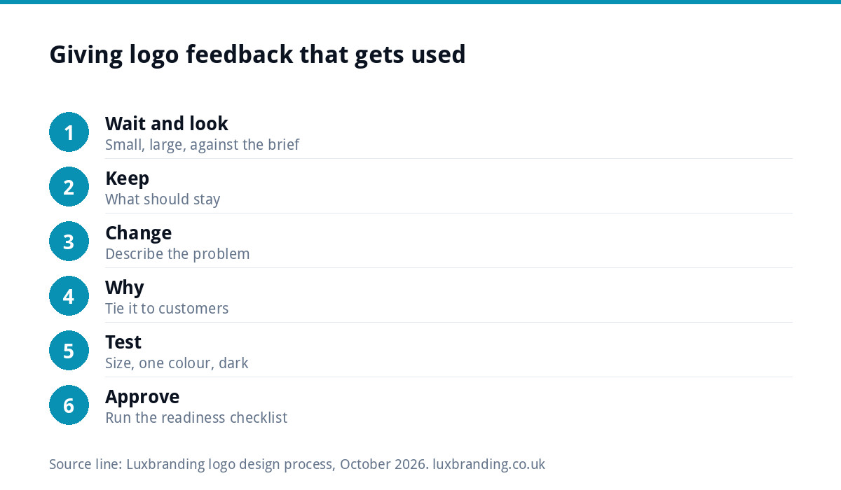
First impressions of a logo are unreliable. Most people react to colour and to whether it looks like something they have seen before, which says little about whether it will work for the business over the next ten years. Before writing anything:
- Wait a few hours, or overnight. Unfamiliar designs often grow on people; familiar ones can fade.
- Look at it small. Shrink it to the size of a social profile picture on your phone.
- Look at it large. Imagine it on the side of a van or above a shop.
- Re-read your brief. Judge the concept against what you asked for, not against a logo you saw last week.
If you did not write a brief, or it was thin, our guide to brand identity versus logo design helps you decide what the logo alone needs to do.
The feedback formula: keep, change, why
Structure every round of feedback in three parts:
- Keep. What is working and should stay, so it does not get lost in the next version.
- Change. What is not working, described as a problem.
- Why. The reason, ideally tied to your customers, where the logo will be used, or your brief.
For example: “Keep the shape of the icon and the dark green. The lettering feels too playful for commercial clients we quote to, and it is hard to read at profile-picture size. Could we see something sturdier?” That gives the designer a direction without dictating a font.
Turning vague feedback into useful feedback
| Vague comment | What it usually means | A more useful version |
|---|---|---|
| “Make it pop” | It feels flat or gets lost | “It disappears on our white van; can it stand out more from a distance?” |
| “I don’t like it” | Something specific jars | “The script lettering feels too casual for our customers.” |
| “Make it more modern” | It feels dated or fussy | “It reminds me of older firms in our area; we want to look newer than them.” |
| “Can you make it bigger?” | The name is hard to read | “The business name is hard to read at small sizes.” |
| “Try lots of colours” | The colour does not feel right | “Blue feels like every plumber locally; could we see a warmer option?” |
| “My partner hates it” | Someone else has a concern | Ask them why, then pass on the reason, not the verdict |
Describing the problem rather than the fix matters because the designer may know a better fix than the one you would suggest. “Make the text bigger” might unbalance the mark; “the name is hard to read small” lets them solve it properly, perhaps with a heavier weight instead.
First-round feedback: choose one direction
The first round usually shows several concepts. The most useful thing you can do is pick one direction to develop. It is tempting to ask for “the icon from concept two with the font from concept four and the colours from concept one”, but combined parts rarely fit together; each concept was designed as a whole.
If one concept is close, say so and explain what stops it being right. If none is close, say what each one gets wrong. That tells the designer far more than “none of these work”, and new concepts will be better aimed. With our Logo Design, concepts are unlimited, so it is fine to ask for a fresh set if none of the first round fits the brief.
Later rounds: be precise
Once a direction is chosen, feedback should get smaller and more exact. Point to specific parts: the gap between the icon and the name, the weight of the lettering, a particular colour. A screenshot with a few circles and numbered notes is often the clearest way to do this. Keep each round to one consolidated message rather than a trickle of emails, so nothing is missed or contradicted.
A later-round message might look like this:
- Keep: the icon, the green and the overall layout.
- Change 1: the gap between the icon and the name looks larger than the gap between the words; could they feel more even?
- Change 2: the lower line of text is hard to read at phone size; could it be heavier or larger?
- Question: would the icon work on its own for our Instagram profile, or does it need adjusting?
Four short points, each tied to a reason, are far easier to act on than a paragraph of general impressions. Number them so the designer can reply point by point.
Test the logo before you comment
A few quick tests turn opinions into evidence:
- Size test. View it at 2cm wide on paper and as a small circle on your phone. Can you still read the name or recognise the icon?
- One-colour test. Ask to see it in black only. A strong logo still works without colour, which matters for embroidery, stamps and invoices.
- Dark background test. Ask for a white version on your darkest brand colour. A free tool such as the WebAIM contrast checker shows whether the colours have enough contrast to read comfortably.
- Real-world test. Look at a mockup on a van, a shirt or a sign. Our guide to logos for embroidery and signage explains which details survive those processes.
Who to ask for opinions, and who not to
Asking everyone you know produces contradictory feedback that pulls the logo towards the safest, dullest version. Instead:
- ask two or three people who match your customers, not friends who want to be kind;
- ask them a specific question, such as “what kind of business does this look like?”, rather than “do you like it?”;
- collect their answers, then decide yourself and send one set of feedback.
If several people genuinely share decisions, such as business partners, agree among yourselves first. A designer receiving conflicting instructions from two directors will struggle to please either.
When to stop revising and approve
Endless small tweaks rarely improve a logo and can make it worse. Use this checklist to decide whether it is ready.
| Check | Ready when |
|---|---|
| Brief | It does what your brief asked |
| Small size | Name or icon is clear at profile-picture size |
| One colour | It still works in black only |
| Dark backgrounds | A white version reads clearly |
| Layouts | Horizontal, stacked and icon-only versions all work |
| Customers | Two or three customer-type people describe it the way you hoped |
| Remaining doubts | Only minor matters of taste, not function |
Before you approve: three final checks
- Check for similar marks. Search the UK trade mark register for similar names and logos in your type of business.
- Confirm ownership. Copyright exists automatically in UK law, as the government’s copyright overview explains, so make sure your agreement transfers it to you on payment. Our guide to logo copyright and trade marks covers the detail.
- Confirm the files. You should receive vector masters and PNGs in every layout and colour version. Our logo file formats guide lists what each one is for.
If you want changes after approval
It happens: a year later the font feels wrong, or you need a version that was never made. If you own the vector files, our Logo Edit at £50 handles changes to colour, font, spacing, proportions or layout, keeping the mark recognisable, with a 24 to 48 hour turnaround. If the concept itself needs replacing, that is a new logo.
How feedback works with us
Our Logo Design is £129, with unlimited concepts and unlimited revisions within your brief, every file format, stacked, horizontal and icon-only layouts, and a 3D mockup. Concepts arrive within 48 hours, and you give feedback by replying to the email, as many rounds as you need within the brief. All prices are on our pricing page.
Get the UK Branding Budget Worksheet (free)
A printable worksheet: decide what your brand needs now and price it against fixed published prices and the IPO trademark fee.
No spam. UK GDPR compliant. We only use your email to send this resource, unless you tick the box to hear from us.
Frequently asked questions
How do I give feedback on a logo design? +
Use three parts: what to keep, what to change and why. Describe problems in terms of your customers or where the logo will be used, not personal taste, and let the designer choose the fix. Look at the concepts at real sizes first and send everyone's comments in one consolidated message.
Should I combine elements from different logo concepts? +
Usually not. Each concept was designed as a whole, so the icon from one and the font from another rarely fit together. Pick the direction that is closest, explain what stops it being right, and let the designer develop it. If none is close, say what each one gets wrong.
How many rounds of logo revisions are normal? +
It depends on the designer's terms and how clear the feedback is. Precise, consolidated feedback often settles a logo in a few rounds, while vague or conflicting comments can drag on. With our Logo Design, revisions are unlimited within your brief, so you can keep refining until it works.
Who should I ask for opinions on my new logo? +
Two or three people who match your customers, asked a specific question such as what kind of business it looks like. Avoid polling everyone you know, which produces contradictory views that pull the design towards something bland. Collect answers, decide yourself and send one set of feedback.
What if I want changes after approving my logo? +
If you own the vector files, a Logo Edit from us is £50 and covers changes to colour, font, spacing, proportions or layout while keeping the mark recognisable, with a 24 to 48 hour turnaround. If the concept itself needs replacing, that is a new Logo Design at £129.