Quick answer
Luxury branding is the craft of making a business feel worth more than its competitors before anyone sees a price. It comes from restraint, not decoration: fewer colours, generous space, confident type, real photography, consistent details and service that matches the look. A small business can borrow most of it; the identity work starts at £299.
You do not need to sell watches or handbags to benefit from the premium playbook. A kitchen fitter, a florist or an accountant charging above the local average needs customers to feel the difference before they read the quote. This guide breaks down which signals create that feeling, which ones a small budget can afford, and what to skip.
What luxury branding actually means
In the strict sense, luxury brands sell scarcity, heritage and status: products people buy partly because few others can. Most small businesses are not in that market and should not pretend to be. What they can use is premium positioning: presenting the business so that a higher price feels justified rather than greedy.
The distinction matters because it changes the brief. A true luxury identity often hides the product and sells a world. A premium small-business identity does the opposite: it makes the quality of the work obvious, calm and easy to trust. Both share the same visual habits, which is why the techniques transfer.
A useful test is to ask what a customer would say about your business if they saw your van, your website and your quote side by side without a price on any of them. If the honest answer is “probably the cheap option”, the branding is working against you, however good the work is. Premium positioning is about closing that gap between the quality you deliver and the quality people assume.
The nine signals that make a brand feel premium
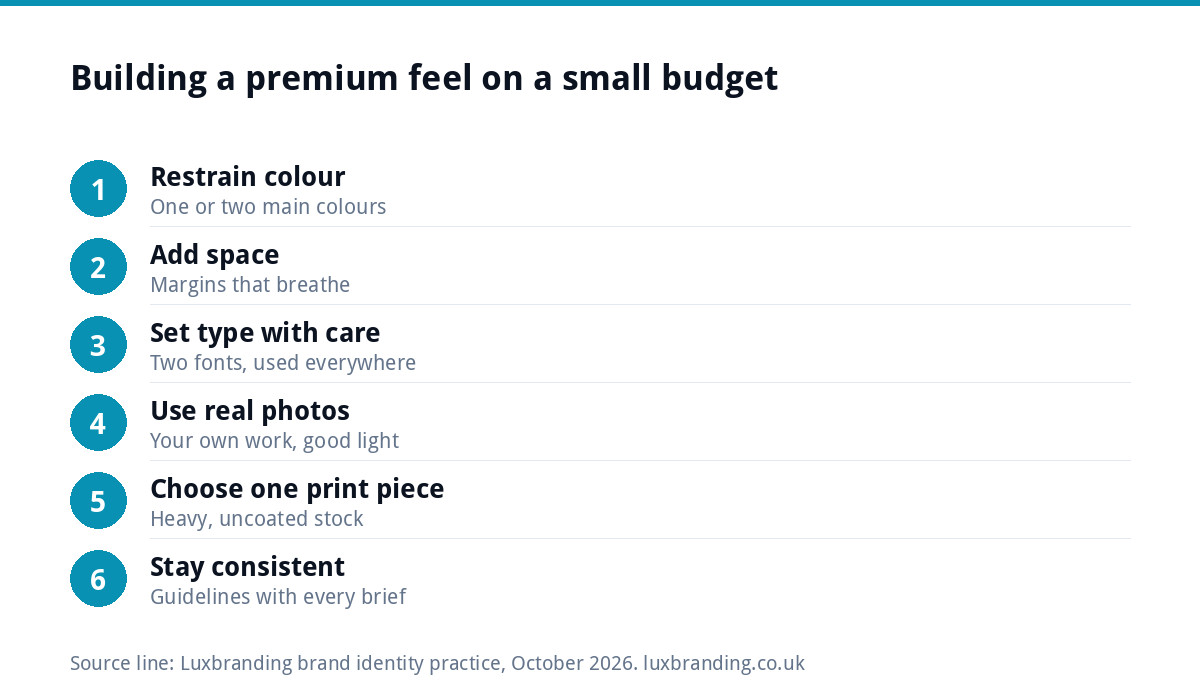
- Restraint in colour. One or two main colours, often deep or muted, used consistently. Many colours read as busy and cheap.
- Space. Generous margins on the website, the menu, the quote. Crowding signals that every inch had to earn its keep.
- Confident typography. A well-made serif or a refined sans, set with care: proper spacing, no stretched or squashed letters, no novelty fonts.
- A simple mark. Premium logos tend to be quiet: a wordmark or a monogram rather than an illustrated scene.
- Real photography. Your actual work, your premises, your materials, well lit. Generic stock images undo everything else.
- Tactile print. Heavier paper, uncoated or soft-touch finishes, perhaps one spot detail. Cheap gloss card works against the rest.
- Fewer words. Calm, specific copy with no exclamation marks and no “cheapest” or “unbeatable”.
- Consistency. The van, the invoice, the email signature and the website all match. Inconsistency is the fastest way to look small.
- Service that matches. Quick replies, clear quotes, tidy handovers. The brand promises a standard; the experience proves it.
Premium signals versus budget signals
Most businesses already send a mix of both. This table helps you spot the budget signals that are quietly undercutting your prices.
| Area | Reads as premium | Reads as budget |
|---|---|---|
| Colour | One or two deep or muted colours | Five bright colours and gradients |
| Logo | Simple wordmark or monogram | Clip-art icon with a swoosh |
| Type | Two well-chosen fonts, carefully spaced | Several fonts, stretched text, all capitals everywhere |
| Photography | Your own work, consistent light | Stock photos, phone snaps of mixed quality |
| Copy | Specific, calm, short | “Cheapest”, “unbeatable”, exclamation marks |
| Heavy uncoated stock, one finish | Thin glossy card | |
| Pricing | Clear, confident, presented once | Discounts and offers in every message |
Colour and type: where premium is won or lost
Colour and typography do more of the work than the logo itself. A deep green, navy, charcoal or warm neutral used with plenty of white or cream space feels considered. Bright primary colours can be premium too, but only with great discipline; most small businesses are better served by a muted palette with one accent.
For type, choose one family for headings and one for body text, and use them everywhere. Set headings with a little extra letter spacing rather than heavier weights. Body text should be easy to read, with enough line spacing that paragraphs breathe. If you are not sure whether your current fonts help or hinder, a brand identity project settles it once and writes it down so suppliers stop guessing.
Packaging, print and touch points
Premium is felt physically. For product businesses, packaging is often the first thing a customer touches, and it shapes how the product is judged. Our guides to packaging design for small brands and product label design cover how to get that right on a small run.
For service businesses, the touch points are smaller but just as telling: the business card, the quote document, a printed care guide left after a job, the sign outside the premises. If you have a shopfront, our guide to signage and shopfront design covers the decisions that make it read as established rather than temporary.
Honest claims: the premium trap to avoid
Premium brands sound confident, but confidence is not the same as unprovable claims. Words such as “the finest”, “the best in the UK” or “award-winning” are factual claims under advertising rules. The Advertising Standards Authority’s guidance on substantiation explains that marketers must hold evidence for objective claims before they make them. The government’s summary of marketing and advertising law sets out the wider rules.
The same applies to green credentials, which often travel with premium positioning. If you describe products as sustainable or eco-friendly, the Competition and Markets Authority’s Green Claims Code sets out how to make those claims accurately. Truly premium brands rarely need superlatives anyway; they let materials, photographs and specifics carry the weight.
Where to spend and what to skip on a small budget
You do not need a five-figure agency project to look premium. Spend where customers look most, and skip the extras that impress designers more than buyers.
| Spend on | Why | Skip or delay |
|---|---|---|
| A considered identity with guidelines | Sets colour, type and logo rules everyone follows | Custom-drawn typefaces |
| Your own photography | Shows the real quality of the work | Stock photo subscriptions |
| One excellent printed item | Customers hold it and remember it | Foiling and embossing on everything |
| A clean, fast website | It is where most prices get judged | Video backgrounds and animation for its own sake |
| Packaging, if you sell products | It is the product’s first impression | Bespoke box shapes on a first run |
For context on our prices: Brand Identity Design is £299 (logo, colours, typography, imagery and brand guidelines), Packaging Design is £99, and a Custom WordPress Website is £499. Everything is listed on our pricing page, and our guide to what branding costs in the UK puts those figures in the context of the wider market.
A worked example: a joinery firm moving upmarket
Consider a hypothetical joinery business that wants to move from general carpentry into bespoke kitchens, where jobs are larger and margins are better. Its current branding has a clip-art saw, three bright colours and a website full of stock kitchen photos.
A premium-leaning refresh might change five things: a simple wordmark in a refined serif; a palette of deep green and warm off-white; a photographer for a day on three finished kitchens; a quote template with generous margins and a short paragraph on materials; and a heavier, uncoated business card. None of those is extravagant. Together they tell a homeowner that the firm works at the level of the price it is asking.
What it should not do is claim to be “the region’s leading kitchen maker” without evidence, or show work it did not build. Premium positioning only lasts when the work underneath it is real.
Keeping it consistent once you have it
Most premium identities do not fail at launch; they erode. A staff member makes a flyer in a different font, a supplier prints the van in a slightly different green, a social post uses an old logo. After a year the brand looks ordinary again. The fix is a short set of guidelines and a habit of sending them with every brief. If your branding has already drifted, our guide to a brand that looks inconsistent everywhere covers how to pull it back together.
Where we fit
Our Brand Identity Design at £299 covers the logo, colour palette, typography, imagery direction and brand guidelines, which are the foundations of a premium look. If you only need the mark, Logo Design is £129 with every layout and file format included. You can order online, or email support@luxbranding.co.uk to talk through whether a full identity or a logo is the right starting point.
Get the UK Branding Budget Worksheet (free)
A printable worksheet: decide what your brand needs now and price it against fixed published prices and the IPO trademark fee.
No spam. UK GDPR compliant. We only use your email to send this resource, unless you tick the box to hear from us.
Frequently asked questions
What is luxury branding? +
Luxury branding presents a business so that it feels worth more than its competitors before a price is seen. True luxury brands sell scarcity and status. Most small businesses use premium positioning instead: restrained colour, generous space, careful typography, real photography and consistent details that make a higher price feel justified.
Can a small business have a premium brand? +
Yes. Most premium signals cost discipline rather than money: fewer colours, more space, two fonts used consistently, your own photography and calm, specific copy. Spend where customers look most, such as the identity, the website and one excellent printed item, and skip extras like foiling on everything.
What colours look premium for a brand? +
Deep or muted colours such as dark green, navy, charcoal and warm neutrals, used with plenty of white or cream space, tend to read as premium. Bright colours can work, but only with strict discipline. Using one or two main colours consistently matters more than the exact shade.
Can I describe my business as the best or the finest? +
Only if you can prove it. The Advertising Standards Authority treats objective claims such as best, finest or award-winning as needing evidence held before the claim is made. Premium brands rarely need superlatives; specific facts about materials, methods and results are more convincing and safer.
How much does a premium brand identity cost with Luxbranding? +
Our Brand Identity Design is £299 and covers the logo, colour palette, typography, imagery direction and brand guidelines. Logo Design on its own is £129 with every layout and file format. Prices are on our pricing page, and you can order online or email support@luxbranding.co.uk.