Quick answer
The best newsletter layout for most small businesses is a single column about 600 pixels wide: logo at the top, one main story with an image and a clear button, two or three shorter items below, then a footer with your details and an unsubscribe link. Single columns read well on phones, where many people open email.
A newsletter does not need to be clever to work. It needs to load properly, look like your business and make the next step obvious. This guide sets out five layouts that suit small businesses, the technical limits that decide what actually displays in an inbox, the legal footer every UK marketing email needs and the mistakes that send newsletters to spam.
The anatomy of a newsletter
Whatever layout you choose, almost every effective newsletter is built from the same blocks, stacked in the same order:
| Block | What goes in it | Why it matters |
|---|---|---|
| Preheader | A one-line summary shown next to the subject in the inbox | Second chance to earn the open |
| Header | Your logo, small, linked to your website | Instant recognition |
| Lead story | Headline, image, two or three sentences, one button | The main reason for sending |
| Secondary items | Two or three shorter pieces, each with a link | Something for readers the lead did not catch |
| Proof or personal note | A review, a recent job, a line from the owner | Trust and personality |
| Footer | Business name, address, contact, unsubscribe | Legal requirements and trust |
Five newsletter layouts that work
Pick the layout that matches what you have to say, not the one with the most boxes. Here is how the five compare:
| Layout | Best for | Main content | Effort each send |
|---|---|---|---|
| Single story | Service businesses with one message | One article or announcement | Low |
| Digest | Businesses with regular news or blog posts | Three to five short items | Medium |
| Product grid | Online shops and retailers | Two-by-two or stacked products | Medium |
| Letter style | Consultants, trades, owner-led firms | A short personal note, minimal images | Low |
| Seasonal offer | Time-limited promotions | One offer, one deadline, one button | Low |
1. The single-story layout
One headline, one image, a short paragraph and one button. It suits businesses that send monthly with one thing worth saying: a new service, a finished project, a seasonal reminder such as boiler servicing before winter. Because there is only one action, more readers take it.
2. The digest layout
A lead story followed by short items, each with a heading, one sentence and a “read more” link. It suits businesses that publish blog posts, run events or have regular news. Keep it to five items at most; beyond that, readers skim and click nothing.
3. The product grid
For shops, a hero product or collection at the top, then products in a simple grid. On phones, grids of two columns often collapse to one, so check each product still has its name, price and button together after stacking.
4. The letter-style layout
Almost plain text: a small logo, a greeting, a few short paragraphs from the owner and a signature. It feels personal, loads instantly and tends to avoid looking like a mass mailing. It works well for trades and professional services whose customers value the relationship.
5. The seasonal offer
One offer, one deadline, one button, with the offer stated in the headline rather than hidden in an image. Send it to people likely to care, and do not send one every week or readers learn to wait for the discount.
Width, images and the limits of email
Email is not a web page. Inboxes strip out or ignore a lot of what websites rely on, so layouts must be simple. Mailchimp’s guide to the limitations of HTML email makes several practical points:
- Viewing panes are narrow and may cut off emails wider than 600 to 800 pixels, so 600 pixels is the safe width.
- Background images do not render in every email client.
- Custom web fonts are replaced by a standard font when a client does not support them.
- Layouts should be static and table-based with simple inline styling.
- JavaScript, forms and embedded media are blocked by most inboxes.
- Campaigns should be previewed and tested before sending to everyone.
The practical rule: never put important words inside an image. If images do not load, your headline, offer and button text must still be readable as live text.
Designing for the phone first
Sketch your newsletter as a single narrow column, then check it on an actual phone before every send. A few habits make the biggest difference:
- Body text large enough to read without zooming
- Buttons wide enough to tap with a thumb, with space around them
- Short paragraphs of two or three sentences
- Images cropped so the subject is still clear at phone width
- Your phone number as a tappable link, not part of an image
Subject line and preheader: the layout before the layout
The inbox view is the first part of your layout anyone sees, and it decides whether the rest is ever opened. Treat the sender name, subject line and preheader as one unit:
- Sender name: your business name, or “Name at Business” for owner-led firms. Never a no-reply address.
- Subject line: say what is inside in plain words. “Your boiler service is due before the cold snap” beats “October news”.
- Preheader: add a detail the subject did not, such as a date, a price or a location.
Keep the subject short enough that the point survives being cut off on a phone, and make sure the email delivers what the subject promised.
The legal footer every UK newsletter needs
Marketing emails in the UK are covered by the Privacy and Electronic Communications Regulations. The ICO’s guidance on electronic mail marketing says you must not send marketing emails to individuals unless they have specifically consented, with a narrow exception (the soft opt-in) for existing customers who bought or negotiated to buy a similar product or service from you, where you offered an opt-out when you collected their details and in every message since. You must not disguise or conceal your identity, and people need a working way to unsubscribe.
Large senders face extra rules from inbox providers. Google’s sender guidelines say that senders of 5,000 or more messages a day to Gmail must set up SPF, DKIM and DMARC, support one-click unsubscribe for marketing messages with a clearly visible unsubscribe link in the body, and keep spam rates reported in Postmaster Tools below 0.30%, ideally below 0.10%. Most small businesses send far fewer, but following the same rules keeps you out of spam folders. Our guide to emails going to spam covers the setup.
Make it look like your business
A newsletter should be instantly recognisable as yours: the same logo, colours and tone as your website, van and social media. Inconsistent branding makes people hesitate before opening, and in an inbox full of scams, hesitation means deletion. Our guide to fixing a brand that looks inconsistent everywhere explains how to line everything up. If you do not yet have defined colours and fonts, our Brand Identity Design at £299 gives you the logo, colours, typography and guidelines a newsletter template needs, and our Social Media Design templates from £79 keep your social posts matching.
Planning what to send
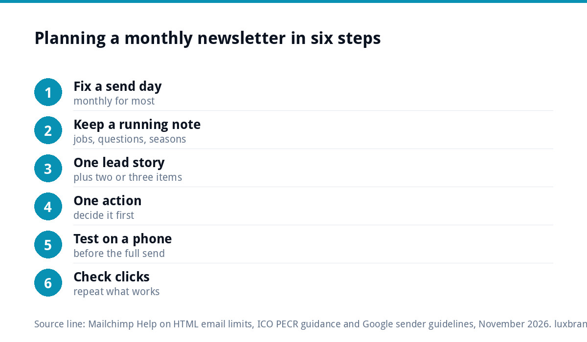
The hardest part of a newsletter is not the layout but having something to say every month. A simple planning habit:
- Pick a send day and stick to it, monthly for most small businesses.
- Keep a running note of finished jobs, questions customers ask and seasonal reminders.
- Choose one lead story per send, and two or three short items from the note.
- Decide the single action you want from the lead story before writing it.
- Send to a test inbox, check it on a phone, then send to the list.
- Look at clicks, not just opens, and repeat what got clicked.
Common newsletter layout mistakes
- One big image containing all the text, which shows as a blank box when images are off
- Too many buttons competing for attention, so readers click none
- Tiny text designed on a desktop screen
- No preheader, so the inbox shows “View this email in your browser” instead
- Linking to your homepage instead of the page the story is about
- A hidden or missing unsubscribe link, which pushes people to press “report spam” instead
Getting it set up properly
If you would rather have a branded template and the automations behind it built for you, our Email Marketing Automation setup starts from £149 and covers welcome sequences, abandoned cart flows, newsletters and segmentation, built on Mailchimp, Klaviyo or Brevo. If your newsletter promotes a specific offer, a dedicated landing page at £199 gives the button somewhere focused to go. All our prices are on the pricing page.
Get the UK SEO DIY Audit Checklist (free)
A 32-point checklist UK SMEs can run against their own website in an afternoon. Surfaces the quick wins before paying for a paid audit.
No spam. UK GDPR compliant. We only use your email to send this resource, unless you tick the box to hear from us.
Frequently asked questions
What is the best width for an email newsletter? +
Around 600 pixels. Mailchimp's guidance says viewing panes are narrow and may cut off emails wider than 600 to 800 pixels. A 600 pixel single column displays reliably in desktop inboxes and stacks neatly on phones. Wider multi-column layouts often break or force readers to scroll sideways, which most people will not do.
Should my newsletter be mostly images or text? +
Mostly live text with a few supporting images. Images do not always load, and Mailchimp notes that background images and web fonts do not display in every email client. If your headline, offer or button is part of an image, readers may see a blank box. Keep every important word as real text and use images to show, not tell.
What must a UK marketing email include? +
The ICO says you must not disguise or conceal your identity, and recipients need a working way to opt out in every message. You also need consent to email individuals, or the soft opt-in for existing customers who bought something similar. Include your business name, contact details and a clear unsubscribe link in the footer.
How often should a small business send a newsletter? +
Monthly suits most small businesses. It is frequent enough to stay remembered and rare enough that you always have something worth saying. Pick a send day and stick to it. Shops with frequent new stock may send more often, but sending weekly with nothing new trains readers to ignore you.
Can Luxbranding design and set up our newsletter? +
Yes. Our Email Marketing Automation setup starts from £149 and covers welcome sequences, abandoned cart flows, newsletters and segmentation, built on Mailchimp, Klaviyo or Brevo. If you need the logo, colours and fonts the template is based on, our Brand Identity Design is £299. All prices are on our pricing page.