Quick answer
For most new and small businesses, a wordmark-led logo with an optional simple icon is the right call: the priority at your stage is getting the name remembered, and an icon only earns its place once it has somewhere to work (app tiles, favicons, van roofs, social avatars). Icon-only identities (the Apples and Nikes) are earned through years of repetition and media spend; starting there means paying big-brand costs without big-brand recognition. This guide is the decision logic; if you want the taxonomy of all seven formats first, that’s covered in the types of logos explained.
The question that decides it: what does your logo need to do?
| Your situation | Format that fits | Why |
|---|---|---|
| New business, name unknown | Wordmark (± small icon) | Every impression must teach the name |
| Long or multi-word name | Combination mark or monogram | The icon/initials carry small spaces the name can’t fit |
| App, SaaS or web tool | Combination mark, icon-capable | App tiles and favicons are non-negotiable squares |
| Trade with van + directories | Bold wordmark + square-cropping device | Vans reward names; avatars reward squares |
| Ambitions of icon-only use | Combination mark designed to separate | Let recognition accumulate before dropping the name |
The case for wordmark-first
Customers recommend you by name, search you by name, and read your name on quotes and invoices. A distinctive wordmark, with the right typeface, weight and spacing and often one customised letterform, makes every one of those moments do brand work. It’s also the most practical format: it scales cleanly, embroiders well, and never raises the “what is that symbol?” question. The classic failure mode it avoids: a beautiful abstract icon paired with the name in an afterthought font, where the part customers actually need (the name) got none of the design attention. What separates a strong wordmark from typed text is craft: the principles in what makes a good logo apply letter by letter.
When you genuinely need the icon
- Square spaces are part of your life: favicons, app icons, social avatars. A wordmark crushed into a 48px square is unreadable. This is the single most common reason to add a mark, and why your logo at tiny sizes deserves its own thought.
- The name is long. “Hartley & Whitfield Building Contractors” needs an H&W device for everywhere the full name won’t go.
- You’ll brand objects, not just documents: product goods, workwear chest positions, van roofs visible from buildings: small strong symbols travel where words can’t.
Combination marks: the practical default, with one rule
Most professional identities land here: name plus mark, designed to work together and apart. The rule that separates good ones: every element must survive alone. Test the icon at 16px without the name; test the wordmark on a van without the icon; test the lockup in one colour. If any piece fails its solo test, you have a decorative arrangement, not a system. This is also why proper deliverables include separate files for each element and layout (stacked, horizontal, icon-only) in every format. The full list is in logo file formats explained.
Mistakes that cost money later
- Buying icon-only because it looks premium. You inherit the recognition problem without the media budget. Keep the name in play until the market proves it knows you.
- An icon that duplicates the name. A bakery called “The Rolling Pin” with a rolling-pin icon says the same thing twice and wastes the slot: the icon is a chance to add meaning (warmth, craft, locality), not repeat it.
- No square-crop plan. Discovered the day someone sets up your Google Business Profile or app listing, and retrofitting one costs more than designing it in.
- Trend-chasing the format. Minimal icon-only identities are fashionable; fashion cycles. Your format should follow your use cases, which don’t.
A professional process resolves all of this in the first conversation: where your logo needs to live determines what gets designed. That’s how we scope every project in our logo design service, and if you’re weighing up who should design it, how to choose a logo designer covers the supplier side.
The trademark angle nobody factors in
Format choice quietly changes what you can protect and what it costs. At the UK IPO, a word mark (your name as text, no styling) and a figurative mark (the logo as an image, or the name in its specific typography) are separate applications, each priced per class of goods and services, currently in the region of £205 online for the first class with a modest fee for each additional class, so protecting both routes across two classes lands somewhere near £500 to £600 in official fees alone, before any attorney involvement.
The practical guidance that follows:
- The word mark is usually the one worth having. It protects the name in any typeface, which is broader than protecting one arrangement of pixels. If budget allows only one application, this is normally it.
- A figurative-only registration is narrow. Register only the styled lockup and a competitor can use a confusingly similar name in a different font and you have a weaker argument than you assumed.
- Icon-only identities need the icon registered separately if the symbol is doing the recognition work, which is another hidden cost of starting where the big brands finished.
- Redesigns can invalidate the picture, not the name. Rebrand the styling and a figurative registration increasingly protects something you no longer use; a word mark survives every visual refresh you will ever do.
None of this is a reason to delay a logo, but it is a reason to make sure your designer hands over a clean name-only wordmark file as a standalone asset, not just the lockup.
Reproduction reality: what each format costs to apply
Formats are not equally cheap to put on things, and the gap compounds over a decade of ordering.
| Application | Wordmark | Icon | Full combination lockup |
|---|---|---|---|
| Embroidered polo / jacket chest | Fine if short; long names get illegible under ~7cm | Cheapest and cleanest: few stitches, holds shape | Often needs a redraw; more stitches, higher unit price |
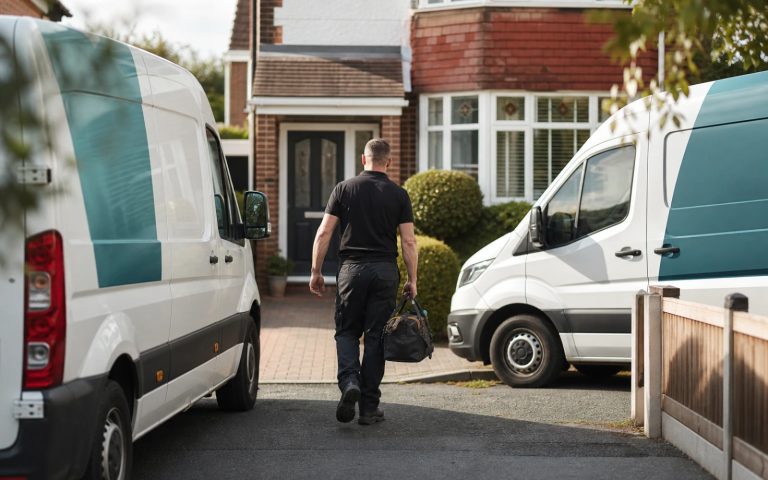
| Van door vinyl | Ideal: this is the name’s home ground | Weak alone; nobody phones a symbol | Standard and correct |
| Social avatar / favicon (square) | Fails below roughly 64px | Its entire reason to exist | Fails: the crop destroys it |
| Etched glass, single-colour stamp, foil block | Good if the letterforms are solid | Good if there are no hairlines | Risky: fine detail closes up |
| Screen-printed workwear | Good | Good | Costs rise per additional colour |
Embroidery is the usual reality check: digitising a design for stitch typically costs £15 to £45 once, and a fussy lockup can add pennies per garment forever afterwards, which matters when you are kitting out a team: the trade-offs are set out in more detail in branded workwear and merchandise for UK businesses. Vans are the mirror image: a symbol alone earns nothing, because the whole job of livery is to make a name and number readable from a following car, which is why vehicle wrap and signage pricing is quoted around legible text areas rather than clever marks.
A worked decision: two businesses, same budget
Two businesses commission identity work in the same month with £600 to spend across design and first applications.
Business A is a two-van electrical contractor. Its logo lives on van doors, polo shirts, quote PDFs and a Checkatrade profile. Square usage: one avatar. The correct spend is almost entirely on a bold, distinctive wordmark that survives at 40cm on a door and 6cm on a chest, plus a simple square-croppable device (often just a monogram in a container) for the one avatar. Money spent on an elaborate illustrated mark here buys nothing that generates a phone call.
Business B is a booking app. Its logo lives in an app tile, a favicon, a push notification, an App Store listing and a splash screen: five square, small, name-hostile contexts before any marketing exists. Here the icon is not a nice-to-have; it is the primary asset, and the wordmark is the secondary one. Spending on the wordmark first would leave the product’s most-seen surface undesigned.
Same money, opposite allocation, decided entirely by where the thing gets seen. This is why “which format is better?” has no general answer and a very quick specific one.
Questions to put to a designer before they start
- “Will I get the wordmark, the icon and the lockups as separate files?” If the answer is one file, the format decision was never made, it was assumed.
- “Show me the icon at 16 pixels and the wordmark on a dark background.” Ask during the concept stage, not at handover, when changes are expensive.
- “What happens if my name gets longer?” Adding “& Sons” or “Group” later breaks tightly-drawn lockups; a system anticipates it.
- “Is the typeface licensed for my uses?” Desktop, web and app embedding are separate licence grants for many commercial fonts, and this is a genuine cost that surfaces months later, one more reason the choice deserves the attention given in how typeface choice shapes what customers believe.
- “What is the one-colour version?” Every business eventually needs it for stamps, invoices, faxed forms, embroidery and etching.
Edge cases the standard advice gets wrong
Three situations invert the usual wordmark-first guidance. If you are trading under a name that is common in your sector (three “Premier Plumbing”s in the same county), the distinctive element has to be visual, because the name cannot carry the differentiation on its own. If you sell physical product where the branding appears on curved, small or textured surfaces, the icon does the recognition work and the name plays support. And if you expect to be acquired or franchised, an identity built as a genuine system rather than a single drawing is worth the extra scoping, because every new outlet, sub-brand and application draws on it; that system layer is what separates a logo purchase from a full brand identity, and it is the difference between owning a picture and owning a set of rules.
Get the UK Branding Budget Worksheet (free)
A printable worksheet: decide what your brand needs now and price it against fixed published prices and the IPO trademark fee.
No spam. UK GDPR compliant. We only use your email to send this resource, unless you tick the box to hear from us.
Sources & Further Reading
- The Design Economy 2026, Design Council
- Typography Fundamentals, Google Fonts Knowledge
- Trade Mark Registration, GOV.UK / IPO
Frequently asked questions
Should my logo be a wordmark or an icon? +
For most new and small businesses: wordmark-led, because every impression needs to teach your name. Add an icon when square spaces (favicons, avatars, app tiles) are part of your life, when the name is long, or when you brand objects. Icon-only identities are earned through years of recognition, not chosen at the start.
What is the difference between a wordmark and a combination mark? +
A wordmark is the business name as the designed logo itself. A combination mark pairs a name with a symbol, built to work together and separately. Combination marks are the practical default for professional identities because they cover both wide spaces (the name) and square spaces (the icon).
Can I add an icon to my wordmark logo later? +
Yes, and it is a normal evolution, provided the wordmark was designed with consistent weights and geometry an icon can harmonise with. A designer will typically derive the mark from an existing letterform or motif so the addition feels inevitable rather than bolted on.
Why do big brands drop the name from their logos? +
Because decades of repetition made the symbol alone sufficient, and dropping the name is itself a statement of that status. The strategy only works after recognition exists. A new business using an icon-only logo takes on a recognition cost with no budget behind it.
What logo files do I need for each format? +
Every element and layout separately: full lockup (stacked and horizontal), wordmark alone, icon alone, each as vector masters (SVG/EPS/PDF), one-colour and reversed versions, plus PNG exports and a square crop for avatars and favicons. Missing solo files is the commonest deliverables gap.