Most people think a logo is just “the picture for your business”, but designers actually split logos into a handful of distinct types, and the one you choose shapes how memorable, flexible and professional your brand looks for years. Pick the wrong type and you end up with a mark that’s illegible on a phone screen, impossible to embroider, or so generic it disappears. We’ve designed identities across dozens of UK sectors since 2019, and the conversation almost always starts here: which kind of logo is actually right for me? This guide walks through the seven main types, with real examples and who each one suits.
Quick answer
There are seven main types of logo: the wordmark, the lettermark, the pictorial (brand) mark, the abstract mark, the mascot, the combination mark and the emblem. Most small businesses are best served by a wordmark or a combination mark, because they’re legible, flexible and read as professional at any size. Lettermarks suit long names, pictorial and abstract marks suit ambitious brands building recognition, and emblems suit heritage or institutional feel. A professional, fully-owned mark in your chosen type starts from £129.
The 7 types of logos explained
Every logo you’ve ever seen falls into one of these seven categories, or blends two of them. Here’s what each type is, a well-known example, and the businesses it suits best.
1. Wordmark (logotype)
What it is: the business name set in a distinctive, custom-styled typeface, with no separate symbol. The type is the logo. Examples: Google, Coca-Cola, FedEx. Pros: instantly tells people your name, scales beautifully, and works hard on a website header. Cons: relies on a short, memorable name and clear typography; long names get cramped. Best for: businesses with a concise, distinctive name that want their name to do the brand-building: agencies, consultancies and most new ventures.
2. Lettermark (monogram)
What it is: the initials of a longer name, treated as a tidy graphic. Examples: IBM, HBO, NASA. Pros: turns an unwieldy name into something compact and ownable; brilliant as a favicon or social avatar. Cons: initials alone don’t tell a newcomer what you do, so you build recognition slowly. Best for: organisations with long or multi-word names, professional firms and brands confident enough to lead with initials.
3. Pictorial mark (brand mark)
What it is: a recognisable image or icon that stands for the brand: a literal object, simplified. Examples: the Apple apple, the Twitter/X bird, the Shell shell. Pros: a strong picture is memorable and travels across languages. Cons: a symbol on its own carries no recognition until you’ve earned it, so it’s a long game for a new business. Best for: brands with a clear visual metaphor and the patience (or marketing budget) to build association over time.
4. Abstract mark
What it is: a bespoke geometric or abstract symbol that isn’t a literal object. Examples: the Nike swoosh, the Adidas stripes, the Pepsi globe. Pros: uniquely yours, conveys a feeling rather than a single thing, and avoids the clichés of literal icons. Cons: it means nothing until you give it meaning; again, that takes exposure. Best for: ambitious brands that want a distinctive, ownable symbol and aren’t tied to depicting one specific product.
5. Mascot
What it is: an illustrated character that represents the brand and gives it a friendly face. Examples: KFC’s Colonel, the Michelin Man, Duracell’s bunny. Pros: approachable, fun, and great for marketing to families or younger audiences. Cons: hard to scale down, can date quickly, and risks looking informal for premium or professional services. Best for: family-friendly businesses, food brands, sports clubs and anyone whose personality is the selling point.
6. Combination mark
What it is: a symbol and the business name locked together, usable as a pair or split apart. Examples: Burger King, Lacoste, Doritos. Pros: the most flexible type: the name builds recognition while the symbol becomes a standalone mark over time. Cons: more elements to keep balanced, and you need a clean version of each. Best for: the majority of small and growing businesses. It covers every use case from signage to a tiny app icon.
7. Emblem
What it is: the name sits inside a symbol: a badge, crest or seal where text and shape are one unit. Examples: Starbucks, Harley-Davidson, BMW. Pros: looks established, traditional and authoritative. Cons: the detail can break up at small sizes and is harder to embroider or print in one colour. Best for: brands wanting a heritage or institutional feel, such as schools, breweries, cafés, clubs and trades that trade on tradition.
Which type of logo is right for you?
The right type depends on your name, your sector and how much recognition you can realistically build. The table below summarises the practical trade-offs so you can shortlist quickly.
| Logo type | Best for | Watch-out |
|---|---|---|
| Wordmark | Short, distinctive names; new ventures | Needs a memorable name and strong typography |
| Lettermark | Long or multi-word names | Initials don’t explain what you do |
| Pictorial mark | Brands with a clear visual metaphor | Slow to build meaning from scratch |
| Abstract mark | Ambitious brands wanting an ownable symbol | Means nothing until you give it exposure |
| Mascot | Family, food, sports, fun brands | Can date; awkward at small sizes |
| Combination mark | Most small & growing businesses | More elements to keep balanced |
| Emblem | Heritage, institutional, trades | Detail breaks up when shrunk |
A few quick rules of thumb make the choice easier:
- Short name? A wordmark lets the name do the work. Long name? A lettermark keeps it tidy.
- New and unknown? Lead with text (a wordmark or combination mark) so people learn your name. Pure symbols and abstracts pay off later, not on day one.
- Need it everywhere? A combination mark is the safest all-rounder: it splits into a wordmark for headers and a symbol for favicons and app icons.
- Want a traditional, trusted feel? An emblem signals heritage; just keep a simplified version for small uses.
For most owners we work with, the honest answer is a clean wordmark or a combination mark. They’re legible, flexible and read as professional, which matters far more than chasing a clever symbol nobody recognises yet. If you’re weighing this up for a smaller venture, our small-business logo guide goes deeper on the practical side.
Before choosing, one useful piece of context: the type you pick doesn’t really move the price. A wordmark, an emblem or anything in between sits in the same UK market band for a professionally designed mark, so the decision below is about fit, not budget.
Which type fits your business? Sector shortcuts
- Trades and home services: combination mark or wordmark. Your logo lives on vans, embroidered polos and 48px directory avatars, so a symbol earns its place only if it survives one-colour stitching at 50mm. We’ve written the worked version of this decision for one trade in logo design for landscapers, and the full rollout logic in branding for trades businesses.
- Food, hospitality and venues: emblem or mascot territory. Signage, packaging and merchandise reward a badge with character. Commission a simplified version at the same time for small uses.
- Professional services (accountants, consultants, legal): wordmark or lettermark. Restraint reads as credibility, and long firm names monogram neatly.
- Retail and e-commerce: combination mark. You need a standalone symbol for the favicon, app icon and social tiles, and the name everywhere else; one type covers both.
- Personal brands and freelancers: a name-led wordmark, sometimes with a monogram as the secondary mark. You are the brand; the type should say your name clearly.
Then run three filters over the shortlist: the surface test (list every place the logo will actually appear, smallest first), the name test (short names free you; long names push towards lettermarks), and the recognition test (symbols without names need marketing budget to teach, do you have it?).
The combination mark, up close
There’s a reason the combination mark keeps winning our recommendation for small businesses: it’s really four logos in one. A proper delivery includes the full horizontal lockup for website headers and van sides, a stacked version for square spaces, the wordmark alone for narrow print, and the symbol alone for favicons and avatars, each with fixed spacing, so nobody rebuilds it by eye in Word. Two combination marks from our own portfolio show the range:
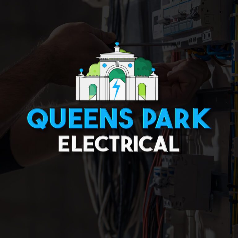

The discipline that makes a combination mark work: the symbol must mean something with the name before it can mean anything without it, and the name must survive alone when the symbol is cropped away. If either half can’t stand its shift, you’ve got a decorated wordmark, not a combination mark.
One style that cuts across these types is the hidden symbol; see our guide to negative space logos.
Type-choice mistakes that cost real money
- Choosing the sector cliché pictorial. The plumber’s droplet, the electrician’s bolt, the spark-and-spanner. Instantly readable and instantly forgettable, because four competitors on the same results page chose it too.
- An emblem where embroidery lives. Badges and crests look superb on a shopfront and turn to mud stitched at 50mm on a polo. If workwear is a daily surface, test the type there first.
- A mascot in front of premium pricing. Cartoon characters are warmth machines, brilliant for family services, quietly fatal under a £12,000 quote.
- An abstract mark with no media budget. The swoosh works because decades of spend taught it. An unknown abstract on a startup tells customers precisely nothing, at the moment they most need telling.
- Letting a DIY generator decide. Generators default to generic icon-plus-name lockups with no one-colour version, no spacing rules and no standalone symbol: a combination mark in appearance, none of the engineering.
What to do next
Start by deciding which two or three types fit your name and sector using the table above, then make sure whatever you commission comes with the files you’ll actually need: full vector versions, a simplified secondary mark for small uses, and clean monochrome and reversed variants. A good logo design service delivers all of that and transfers full ownership, so the mark is yours outright. Professional logos in any of these seven types start from £129, with concepts typically back within 48 hours. If you want to understand pricing across the different types and complexity levels first, our UK logo cost guide breaks it down in full.
Logo design, any type
A professional logo in the right type from £129
Wordmark, combination mark, emblem or symbol. We’ll recommend the type that fits your name and sector. Full vector files, monochrome versions, complete ownership and 48-hour first concepts.
Get the UK Branding Budget Worksheet (free)
A printable worksheet: decide what your brand needs now and price it against fixed published prices and the IPO trademark fee.
No spam. UK GDPR compliant. We only use your email to send this resource, unless you tick the box to hear from us.
Sources & Further Reading
- Intellectual Property Office, GOV.UK
- Design Council, Design Council
Frequently asked questions
What are the 7 types of logos? +
The seven main types are the wordmark (logotype), the lettermark (monogram), the pictorial or brand mark, the abstract mark, the mascot, the combination mark and the emblem. Most logos are one of these or a blend of two.
Which type of logo is best for a small business? +
For most small businesses a wordmark or a combination mark works best. Both are legible, flexible and read as professional at any size, and a combination mark splits neatly into a name for headers and a symbol for app icons.
What is the difference between a lettermark and a wordmark? +
A wordmark sets your full business name in a distinctive typeface, like Coca-Cola. A lettermark uses only your initials, like IBM or HBO, which keeps a long or multi-word name compact and tidy.
Why is a pure symbol logo risky for a new brand? +
A pictorial or abstract symbol carries no meaning until people learn to associate it with you, which takes exposure and time. New brands usually build recognition faster by leading with their name in a wordmark or combination mark.
Can a logo combine more than one type? +
Yes, and most do. A combination mark pairs a symbol with the name, and many businesses also keep the symbol or the wordmark on its own for small spaces such as social profiles and favicons.