Quick answer
A WooCommerce product page converts better when a shopper can answer four questions without scrolling: what is it, what does it cost including delivery, is it in stock, and can I trust this shop? Start with sharp photos, a clear price and button, delivery and returns beside the button, and a fast mobile load.
This guide is for small UK shops on WooCommerce whose visitors look but do not buy. It works through the product page from top to bottom, with a checklist you can run against your own pages this afternoon and the order to fix things in if time is short.
The anatomy of a product page that sells
Most product pages carry the same parts. What separates a page that sells from one that does not is how well each part answers the shopper’s next question.
| Element | What good looks like | Common fault |
|---|---|---|
| Photos | 4 to 8 sharp images: product on white, in use, close-up, scale | One supplier photo, no sense of size |
| Title | Plain name plus the key detail (size, material, colour) | Supplier code or keyword stuffing |
| Price | Large, near the title, VAT position clear | Price hidden below options |
| Short description | Three or four lines on who it is for and why | Blank, or a copy of the long description |
| Options | Clear choices, price updates as you pick | Dropdowns that reset or hide stock |
| Add to basket | High contrast, visible on a phone without scrolling | Pushed below the fold by banners |
| Delivery and returns | Cost, timing and returns window beside the button | Only explained at checkout |
| Trust | Reviews, secure payment note, contact route | None of these visible on the page |
Photos: the first thing shoppers judge
Online, the photo is the product. Shoppers cannot pick it up, so the images have to do the work a shop counter would.
- Lead image: the product on a clean background, filling most of the frame. This is the image that appears on category pages and in Google Shopping.
- In-use image: the product on a shelf, in a hand or on a person, so size is obvious.
- Detail images: stitching, texture, the label, the plug, whatever a careful buyer would check in person.
- Consistent sizes: set one aspect ratio, usually square, so the gallery does not jump about as people swipe.
A phone and daylight from a window can produce perfectly good product photos. What lets shops down is not the camera but inconsistency: different backgrounds, different crops and different lighting across the range.
Title, price and button above the fold
On a phone, the first screen usually holds the lead image, the title and not much else. Check your own product pages on a phone and ask whether the price and the button are visible without scrolling. If a promotional banner, a breadcrumb trail and a large header push them down, trim those first.
Make the price unmissable and say whether it includes VAT if you sell to trade buyers. If delivery is free above a threshold, say so next to the price, not only in the footer.
Keep the button label plain. “Add to basket” is what UK shoppers expect, and it should stay visible as people scroll, either as a sticky bar on mobile or repeated after the description. Related products belong below the description, not between the photos and the button, where they compete with the sale the shopper was about to make.
Descriptions that answer questions
WooCommerce gives you two description fields, and they do different jobs.
- Short description: sits beside the photos. Three or four lines: what it is, who it suits and the one reason to choose it. No supplier waffle.
- Long description: sits further down. This is where dimensions, materials, care instructions, compatibility and what is in the box belong. Use short paragraphs and a bullet list of specifications.
The quickest way to improve descriptions is to read your customer emails. Every question someone asked before buying is a sentence missing from the page. If three people asked whether the candle tin has a lid, the answer belongs in the short description.
Write your own words for every product. Copying the manufacturer’s description means your page says exactly what every other stockist says, which gives a shopper no reason to buy from you.
Variations without confusion
Sizes and colours are where many WooCommerce pages lose people. WooCommerce’s guide to managing products notes that each variation can have its own price, SKU and stock level, which is useful but needs presenting clearly.
- Show colour choices as swatches rather than a dropdown of names where you can.
- Make the photo change when a colour is picked.
- Grey out or label sold-out options instead of letting someone pick one and fail at the button.
- If prices differ between sizes, show the price range before a choice is made.
- Link a simple size guide right beside the size options, not at the foot of the page.
Delivery, returns and the information the law requires
Unexpected delivery costs are one of the most familiar reasons for an abandoned basket. Put delivery cost and timing beside the button: “UK delivery £3.95, free over £40, dispatched within 2 working days” answers the question before it is asked.
There is also a legal side. GOV.UK’s guidance on online and distance selling lists information you must give customers before they order, including the full price with taxes, delivery costs and arrangements, and their cancellation rights. Customers can generally cancel within 14 days of delivery without giving a reason. A short returns line on the product page, linking to the full policy, covers the shopper’s worry and your obligation at the same time.
Trust signals near the button
A first-time visitor to a small shop is asking whether it is real. Help them decide close to where they decide to buy.
- Product reviews: even a few genuine reviews help. Ask recent buyers by email a week after delivery.
- Payment logos: recognised card and wallet options reassure people the checkout is secure.
- A human route: a phone number, email or live chat link shows someone is there.
- Business details: a real address in the footer and a proper About page.
Speed on a phone
Product pages are heavy: big images, galleries, review widgets and tracking scripts. A slow page loses mobile shoppers before they see the price. Compress images, limit the gallery to the images that earn their place, and remove plugins you no longer use. Our guide to website speed for small businesses covers the fixes that matter, and our speed optimisation service is £99 if you want it done for you.
Help Google show your products properly
Google can show price, availability and review details in search results when the page carries product structured data. Google’s introduction to product structured data explains the two types: product snippets and merchant listings for pages where people can buy. Many WooCommerce setups output some of this automatically, but it is worth testing a product page with Google’s Rich Results Test to see what is actually there.
The product page checklist
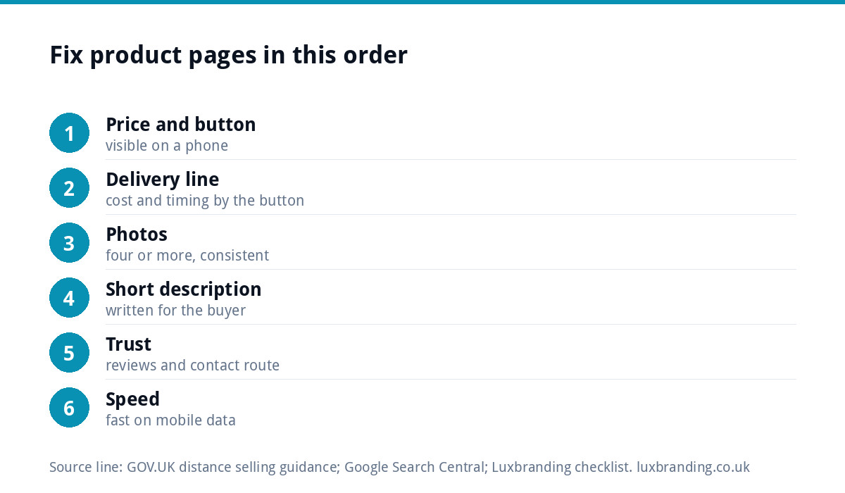
Run each product page against this list. Fix the first items first: they affect every visitor.
| # | Check | Pass? |
|---|---|---|
| 1 | Price and Add to basket visible on a phone without scrolling | Yes / No |
| 2 | Delivery cost and timing stated beside the button | Yes / No |
| 3 | At least four consistent, sharp photos including one showing scale | Yes / No |
| 4 | Short description written for the buyer, not copied from the supplier | Yes / No |
| 5 | Sold-out variations labelled, photo changes with colour | Yes / No |
| 6 | Returns line on the page, linking to the full policy | Yes / No |
| 7 | Reviews or another trust signal near the button | Yes / No |
| 8 | Specifications and dimensions in the long description | Yes / No |
| 9 | Page loads quickly on mobile data | Yes / No |
| 10 | Product structured data passes Google’s test | Yes / No |
If the product pages are fine and sales still do not come
Sometimes the product page is not the problem. If visitor numbers are tiny, or people add to basket and then leave at checkout, the cause sits elsewhere: traffic, pricing, checkout friction or trust in the shop as a whole. Our guide to an online store with no sales works through those causes in order. If the platform itself is the question, our Shopify vs WooCommerce comparison sets out the trade-offs.
If the honest answer is that the shop needs rebuilding, our e-commerce website build is £499 for up to 20 products on WooCommerce or Shopify, with Stripe and PayPal, a mobile-first build and an SEO foundation. Every price is on our pricing page.
Get the UK Website Project Brief Template (free)
A two-page template for briefing any UK web designer: sitemap, integrations, audience and deliverables. Cuts revision rounds in half.
No spam. UK GDPR compliant. We only use your email to send this resource, unless you tick the box to hear from us.
Frequently asked questions
What makes a product page convert? +
A shopper should be able to see what the product is, the full price including delivery, whether it is in stock and whether the shop can be trusted, ideally without scrolling on a phone. Sharp consistent photos, a clear button, delivery and returns beside it and fast loading do most of the work.
How many product photos should a WooCommerce page have? +
Four to eight is a sensible range for most products: a clean lead image, an in-use shot that shows scale, and close-ups of the details a careful buyer would check in person. Keep one aspect ratio, usually square, so the gallery looks tidy and the category pages line up.
Should I use the manufacturer's product description? +
It is better to write your own. A copied description makes your page identical to every other stockist and gives shoppers no reason to choose you. Use the questions customers email you before buying as a guide to what each description should answer, and keep specifications in a bullet list.
Where should delivery information go on a product page? +
Beside the price or the Add to basket button, in one short line covering cost, any free delivery threshold and dispatch time. Delivery costs that only appear at checkout are a familiar cause of abandoned baskets. Link the line to your full delivery and returns policy for anyone who wants detail.
How much does Luxbranding charge to build a WooCommerce shop? +
Our e-commerce website build is £499 for up to 20 products, on WooCommerce or Shopify, with Stripe and PayPal payments, custom design, a mobile-first build and an SEO foundation. If your existing shop just loads slowly, website speed optimisation is £99. All our prices are on the pricing page.