
Quick answer
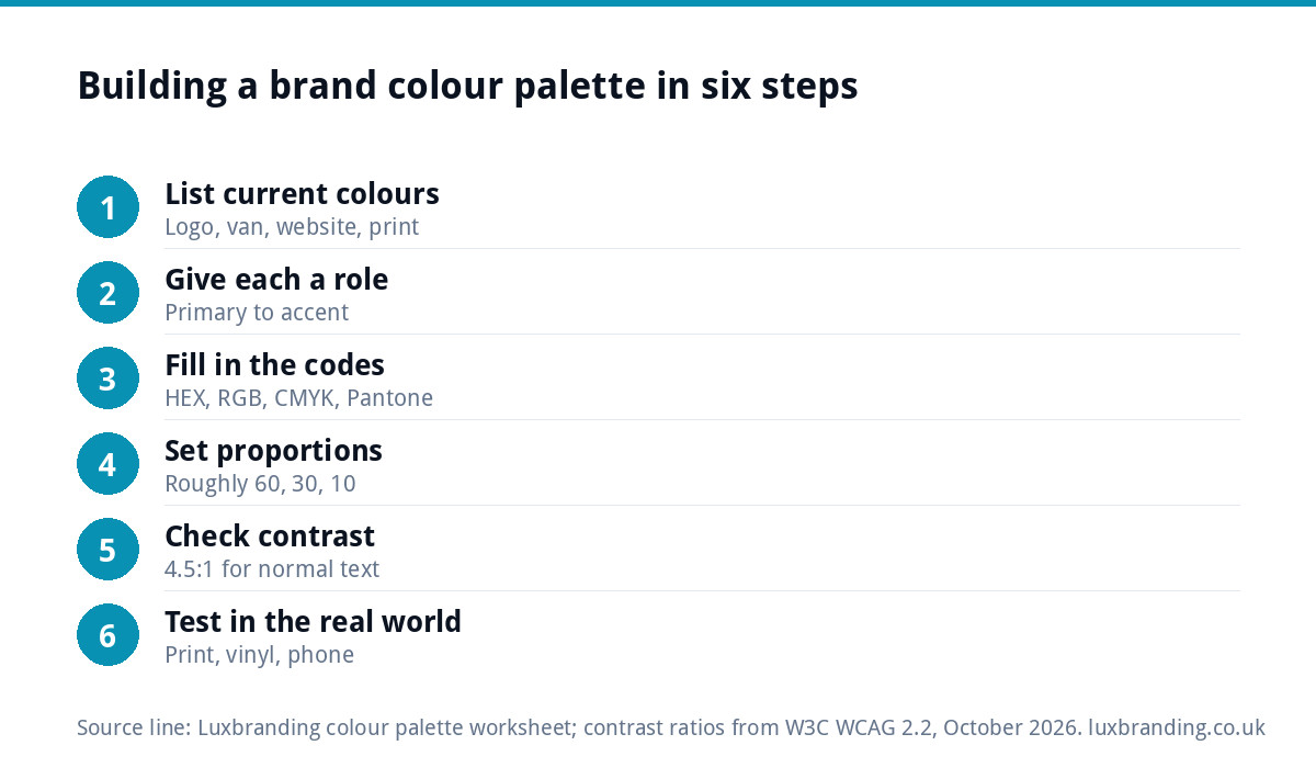
A working brand colour palette has about five colours, each with a job: one primary, one or two secondary colours, two neutrals for text and backgrounds, and one accent for buttons. Record every colour as HEX, RGB and CMYK, check text pairings reach a 4.5:1 contrast ratio, and test each one on paper.
The worksheet below takes you through it in six steps. Copy the tables into a document, fill them in, and you will finish with a palette your printer, web designer and sign-maker can all use without guessing.
Step 1: list the colours you already use
Before choosing anything new, write down every colour your business uses today. Most small businesses find they have drifted: the van is one blue, the website another, the business cards a third. Look at your logo, website, social media graphics, vehicle, uniforms, signage and printed stationery, and note each colour you see.
If the list is long, that drift is the problem the palette solves. Our guide to a brand that looks inconsistent everywhere covers how it happens and why it costs trust.
Then decide which colours stay. Usually that means keeping the colour in your logo, because customers already know it, and fixing everything around it. If the logo itself is the colour you want to change, a logo edit (£50) can change its colours while keeping the mark recognisable.
Step 2: give each colour a role
A palette is not a list of colours you like. It is a set of colours with jobs. Use these five roles:
- Primary: the colour people associate with you. Usually from the logo.
- Secondary (one or two): supports the primary on backgrounds, panels and illustrations.
- Dark neutral: body text. Often a near-black or deep grey rather than pure black.
- Light neutral: backgrounds. White, off-white or a very pale tint.
- Accent: buttons, links and calls to action only. It should stand out from everything else.
The GOV.UK Design System is a good public example of this thinking: its colour guidance defines functional colours and tells teams to use each one only in the context it was designed for, such as a single colour reserved for showing which element has focus.
Step 3: the palette worksheet
Fill in one row per colour. Leave the Pantone column blank if you never print spot colours; your printer can advise if you start.
| Role | Name | HEX | RGB | CMYK | Pantone | Used for |
|---|---|---|---|---|---|---|
| Primary | e.g. Harbour Blue | #______ | ___ ___ ___ | __ __ __ __ | ______ | Logo, headers, van |
| Secondary | #______ | ___ ___ ___ | __ __ __ __ | ______ | Panels, social graphics | |
| Dark neutral | #______ | ___ ___ ___ | __ __ __ __ | n/a | Body text | |
| Light neutral | #______ | ___ ___ ___ | __ __ __ __ | n/a | Backgrounds | |
| Accent | #______ | ___ ___ ___ | __ __ __ __ | ______ | Buttons, links, offers |
Give each colour a name. “Harbour Blue” is easier to say to a sign-maker on the phone than a six-character code, and it makes the palette feel like part of the brand.
Step 4: set the proportions
A common rule of thumb in design is roughly 60, 30 and 10: about 60% of a page or vehicle in a neutral or the primary, 30% in a secondary colour, and 10% in the accent. It is a starting point, not a law, but it stops the most frequent mistake, which is using the accent everywhere until nothing stands out.
Write your proportions next to the worksheet. For example: “Website: white background, dark grey text, Harbour Blue headers, orange buttons only.” That one sentence will save a lot of back-and-forth with whoever builds your next page. Write a similar line for the van, the uniform and printed stationery, because each has a different background to work against.
Step 5: check the contrast
Colours that look fine on your monitor can be hard to read for many visitors, on cheap phones in sunlight, or for anyone with a visual impairment. The web accessibility standard, WCAG, sets the bar. The W3C’s guidance on contrast (minimum) asks for a ratio of at least 4.5:1 for normal text and 3:1 for large text, which it defines as at least 18 point, or 14 point bold.
You do not need to calculate this. Paste your HEX codes into the free WebAIM contrast checker and it reports pass or fail. Test these pairings:
- Dark neutral text on light neutral background.
- White text on your primary colour.
- White text on your accent (your buttons).
- Primary colour text on the light background.
If a pairing fails, darken or lighten the colour slightly rather than replacing it. A small shift is often enough to pass while keeping the same character.
Step 6: test it in the real world
Screens and print show colour differently. Screens mix light (RGB); printers mix ink (CMYK), and some bright screen colours, especially vivid blues, greens and oranges, cannot be printed exactly. Before you sign off the palette:
- Print a test sheet on the paper you actually use and compare it with the screen.
- Check the primary colour in black and white: your logo and key graphics should still work in one colour.
- Ask your sign-maker or embroiderer how close they can match each colour on vinyl or thread.
- Look at your social graphics on a phone in daylight, not just on your desktop at night.
If a printer has already sent artwork back because of colour problems, our guide to printer-rejected artwork explains the fixes, and our guide to a logo for embroidery and signage covers the physical side.
A worked example: a two-van plumbing firm
This illustrative example shows how the worksheet plays out for a typical small plumbing and heating business whose materials had drifted over a few years of different printers and a self-built website.
- What they found in step 1: three different blues across the logo, the vans and the website, a red used for both emergency call-outs and general headings, and grey text that was hard to read on a phone.
- Primary: the deep blue from the logo, kept because customers recognise it on the vans.
- Secondary: a pale blue tint of the primary for panels and social graphics, so the website feels related to the vans without repeating the same strong colour everywhere.
- Neutrals: a near-black for text, replacing the light grey that failed the contrast check, and an off-white background.
- Accent: a warm orange used only for “Book a visit” buttons and the emergency number, so it always means “act now”.
The red was dropped entirely. Nothing about the business changed except that every supplier now received the same five codes, and the next van, the next leaflet and the next website update all matched without anyone having to remember which blue was the right one.
Which colour code goes where
| Code | Used for | Who will ask for it |
|---|---|---|
| HEX (e.g. #1B4F72) | Websites, email templates, social graphics | Web designers, social media tools |
| RGB | Screens, presentations, video | Designers, video editors |
| CMYK | Printed leaflets, cards, brochures | Printers |
| Pantone | Spot-colour print, merchandise, exact matches | Printers, merchandise suppliers |
| RAL | Paint, powder coating, some signage | Sign-makers, fabricators |
The codes should all describe the same colour as closely as each medium allows. If you only have a HEX code, ask a designer to set the matching CMYK and Pantone values rather than letting each supplier pick their own. Our guide to logo file formats covers which file types carry which colour mode.
Put the palette where people will use it
A palette that lives in your head does not stop the drift. Put the finished worksheet on one page with your logo, your fonts and a few examples of the colours in use, and send it to anyone who makes anything for you. That page is the start of a set of brand guidelines; our guide to brand guidelines costs explains what a fuller version includes.
When to hand it to a designer
The worksheet works well if your logo colours are settled and you need a system around them. It is harder if you are starting from scratch, rebranding, or your existing colours fail contrast and print tests. Our brand identity design is £299 and covers the logo, colours, typography, imagery and brand guidelines together, so the palette is designed alongside everything it has to work with. If you are not sure whether you need a logo or a full identity, our guide to brand identity vs logo design sets out the difference. All our fixed prices are on our pricing page.
Get the UK Branding Budget Worksheet (free)
A printable worksheet: decide what your brand needs now and price it against fixed published prices and the IPO trademark fee.
No spam. UK GDPR compliant. We only use your email to send this resource, unless you tick the box to hear from us.
Frequently asked questions
How many colours should a brand palette have? +
Around five works for most small businesses: one primary colour, one or two secondary colours, a dark neutral for text, a light neutral for backgrounds and one accent for buttons and offers. Fewer than that can feel flat across a website and print; many more makes it hard for anyone to apply the brand consistently.
What colour codes do I need for my brand colours? +
At least HEX for websites and social graphics, RGB for screens and video, and CMYK for print. Add Pantone if you print spot colours or order merchandise, and RAL if your sign-maker or fabricator asks for it. All the codes should describe the same colour as closely as each medium allows.
Why do my brand colours look different in print? +
Screens mix light in RGB, while printers mix ink in CMYK, and some bright screen colours cannot be printed exactly. Paper type also changes how colour looks. Set proper CMYK values for each colour rather than letting the printer convert them, and print a test sheet before ordering in volume.
How do I check my brand colours are readable? +
Use a contrast checker such as WebAIM's free tool. The W3C's accessibility guidance asks for a contrast ratio of at least 4.5:1 for normal text and 3:1 for large text. Test text on backgrounds, white on your primary colour and white on your button colour, and adjust shades slightly if a pairing fails.
Can Luxbranding design my brand colour palette? +
Yes. Our brand identity design is £299 and covers the logo, colours, typography, imagery and brand guidelines together. If you only need the colours of an existing logo changed, our logo edit is £50 and keeps the mark recognisable while updating colour, font, spacing or layout.


