
Quick answer
Brand guidelines, including those in a £299 brand identity, should share one core (logo, colours, fonts, voice) and then split into a digital section and a print section, because screens and ink behave differently. Digital needs HEX and RGB colours, web fonts, contrast rules and image sizes. Print needs CMYK and Pantone values, sizes in millimetres, bleed and paper notes.
Most small-business guidelines are written once, as a single PDF, and then quietly ignored when a printer asks for a CMYK value or a web developer needs a font file. The fix is not a longer document. It is a clear structure: a shared core everyone reads, then two practical sections written for the people who actually produce things on screen and on paper. This guide sets out what belongs in each section, with a side-by-side table you can use as a checklist.
Why one set of rules is not enough
Your brand looks the same everywhere only if the instructions respect how each medium works:
- Colour is built differently. Screens mix red, green and blue light; printers lay down cyan, magenta, yellow and black ink, or a premixed spot colour. A bright screen colour may have no exact ink equivalent.
- Size is measured differently. Web layouts work in pixels and change with the screen; print works in millimetres and is fixed.
- Fonts are licensed differently. A font installed on your computer for documents may not be licensed for use on a website, and the reverse.
- Different people use them. A web developer, a social media freelancer, a sign maker and a printer each need different information, fast.
The shared core
Everything in this part applies wherever the brand appears, and it should be short enough to read in five minutes:
- Logo versions: primary, stacked, horizontal and icon-only, with when to use each.
- Clear space: the margin around the logo nothing else may enter.
- Misuse examples: stretched, recoloured, outlined, placed on busy photos.
- Colour palette with names, roles (primary, accent, background) and proportions.
- Typography: heading and body fonts, weights and the order of importance.
- Imagery style: the kind of photos and illustrations that fit.
- Tone of voice: a few lines on how the brand sounds, with examples.
Digital and print, side by side
| Topic | Digital section | Print section |
|---|---|---|
| Colour values | HEX and RGB | CMYK and, where used, Pantone spot references |
| Logo files | SVG and transparent PNG | Vector PDF, EPS or AI |
| Minimum logo size | In pixels, for headers and avatars | In millimetres, for cards and small print |
| Fonts | Web font files and fallbacks | Desktop fonts for documents and artwork |
| Accessibility | Approved text and background pairs with contrast ratios | Minimum text sizes and readable pairings |
| Image specs | Sizes for social posts, link previews and the website | 300dpi at final size, CMYK conversion |
| Templates | Social posts, email header, email signature | Letterhead, business card, flyer, signage |
| Production notes | Favicon, app icon, dark mode version | Bleed, safe area, paper and finish choices |
What the digital section should say
Colour for screens. Give each colour as HEX (for example #1B2A49) and RGB. Then go one step further and list which combinations are approved for text. The W3C’s guidance on minimum contrast sets a ratio of at least 4.5:1 for normal text and 3:1 for large text. A brand guide that says “white text on our orange is fine for buttons, never for paragraphs” saves endless guesswork.
Logos for screens. SVG for the website, so the logo stays sharp at any size; PNG with a transparent background for tools that do not accept SVG; a square icon version for social avatars and the browser favicon. State a minimum width in pixels below which the icon replaces the full logo.
Fonts for the web. Name the web font, where it is loaded from, and the fallback system font if it fails. Check the licence covers web use.
Image sizes. List the sizes your team uses most. For link previews, Meta’s guidance on images for shared links recommends at least 1200 x 630 pixels at about a 1.91:1 ratio. Platforms change their specs, so date this page and review it.
Digital templates. Social post layouts, story frames, an email header and a standard email signature, all built from the core rules.
What the print section should say
Colour for ink. Give CMYK values for every colour, and a Pantone reference for any colour that must match exactly, such as on signage, vehicles or packaging. Pantone describes its Formula Guide, in its coated and uncoated edition, as showing how colours appear on both kinds of paper stock. That matters: the same reference can look noticeably different on a silk business card and an uncoated letterhead, so note which one you approved.
Logos for print. Vector files only (PDF, EPS or AI), with one-colour, black and white-out versions for embroidery, vinyl and single-colour print. Give a minimum size in millimetres; below it, use the icon or simplified mark.
Print production basics. Bleed (commonly 3mm), a safe area inside the trim, 300dpi images at final size, fonts embedded or outlined. A short paragraph here prevents most printer rejections. Our guide to print-ready artwork explains each requirement.
Paper and finish. Note the stocks you have approved, such as uncoated for letterheads and silk for flyers, so reprints match.
Print templates. Letterhead, business card, compliments slip, flyer layout and a van or sign layout, each with dimensions.
One colour, four sets of values
A well-specified brand colour carries a value for each use. A navy brand colour might be recorded like this, with the values checked against real proofs rather than taken from an automatic conversion:
| Format | Used for | Who asks for it |
|---|---|---|
| HEX | Websites, email templates, online design tools | Web developers, social media freelancers |
| RGB | Screen graphics, presentations, video | Presentation and video makers |
| CMYK | Everyday full-colour print | Printers of cards, flyers and brochures |
| Pantone coated | Exact matches on glossy and silk stocks | Packaging and premium print suppliers |
| Pantone uncoated | Exact matches on uncoated paper | Letterhead and stationery printers |
Signage and vehicle suppliers often work from Pantone references or vinyl manufacturers’ colour ranges, so ask them which they need and record their closest match in the print section once you have approved a sample.
If your guidelines only list a HEX code, a printer will convert it automatically and you may not like the result. Our guide to logo file formats covers which files go with which values.
Common gaps in small-business guidelines
- Only one colour format, usually HEX, with nothing for print.
- No minimum logo size, so the logo appears unreadable on pens and favicons.
- No guidance on placing the logo over photos.
- Fonts named but not supplied, or supplied without checking licences.
- No approved text and background pairs, so brand colours are used for unreadable text.
- Nothing for embroidery, vinyl or single-colour use, which trades need constantly.
Inconsistency usually starts in these gaps. If your materials already look different everywhere, see why your brand looks inconsistent and how to fix it.
How long should it be?
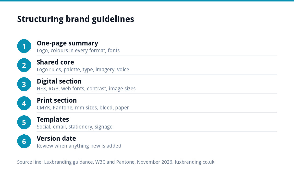
For most small businesses, ten to twenty pages is plenty: a few pages of shared core, a few for digital, a few for print, and template pages. Add a one-page summary at the front with the logo, colours in all formats and fonts, because that is the page people will actually send to suppliers. Our guide to brand guidelines costs sets out what different levels of depth typically include.
Keeping it usable
Guidelines only work if people can find them and follow them. Keep the latest version in one shared place, put a version date on the cover, and send suppliers the relevant section rather than the whole document. When you add something new, such as a vehicle livery or a new social format, add its rules to the right section the same week.
Test the document the way suppliers will use it. Hand the digital section to whoever updates your website and ask them to build a social post from it without asking you anything; hand the print section to your printer and ask whether anything is missing. Every question they raise is a gap to fill.
Getting guidelines that cover both
Our Brand Identity Design is £299 and includes the logo, colours, typography, imagery and brand guidelines. If you only need the logo for now, Logo Design is £129 with every file format and stacked, horizontal and icon-only layouts included. Every fixed price is on our pricing page.
Get the UK Branding Budget Worksheet (free)
A printable worksheet: decide what your brand needs now and price it against fixed published prices and the IPO trademark fee.
No spam. UK GDPR compliant. We only use your email to send this resource, unless you tick the box to hear from us.
Frequently asked questions
Why do brand guidelines need separate digital and print sections? +
Because screens and ink work differently. Screens mix light, so they use HEX and RGB colours and sizes in pixels; printers use CMYK or Pantone inks and sizes in millimetres. Fonts are licensed differently for web and desktop too. Separate sections give each supplier exactly the information they need.
What colour codes should brand guidelines include? +
Ideally four sets for each colour: HEX for websites and digital tools, RGB for screen graphics, CMYK for everyday print, and a Pantone reference for colours that must match exactly on signage, vehicles or packaging. Record which values you approved against a real printed proof rather than relying on automatic conversions.
Should brand guidelines include accessibility rules? +
Yes, in the digital section at least. List which text and background pairs from your palette are approved, with their contrast ratios. W3C guidance sets at least 4.5:1 for normal text and 3:1 for large text. It stops brand colours being used for text people struggle to read.
How long should small business brand guidelines be? +
Ten to twenty pages is usually enough: a short shared core, a few pages each for digital and print, and template pages. Put a one-page summary at the front with logo versions, colours in every format and fonts, because that is the page most suppliers actually use.
Does Luxbranding's Brand Identity Design include guidelines? +
Yes. Our Brand Identity Design is £299 and includes the logo, colours, typography, imagery and brand guidelines. If you only need a logo for now, our Logo Design is £129 with every file format and stacked, horizontal and icon-only layouts included, and you can add the wider identity later.