Quick answer
A brand pattern is a repeating graphic built from your logo shapes, simple geometry or colours. You need one if your brand covers large surfaces such as vans, packaging, shopfronts, workwear or social backgrounds. If it mostly appears as a logo on invoices and a website header, skip it for now: a strong logo and palette matter more.
Patterns are one of those brand elements that look wonderful on a presentation board and then never get used. Done well, though, a pattern is the hardest-working asset a small brand can own: it fills the back of a business card, wraps a van, lines a box and makes a social post recognisable before anyone reads it. This guide explains what counts as a brand pattern, where it earns its keep, when to skip it, and how to specify one so it actually gets used.
What counts as a brand pattern
A brand pattern is any repeatable graphic that belongs to your identity rather than to one piece of artwork. The common types are:
- Icon repeats. Your logo symbol, or part of it, tiled at a small size. Simple and instantly linked to the brand.
- Geometric patterns. Stripes, chevrons, grids or dots in brand colours, often echoing shapes in the logo.
- Line and texture patterns. Fine linework, contours or a subtle grain that adds depth without shouting.
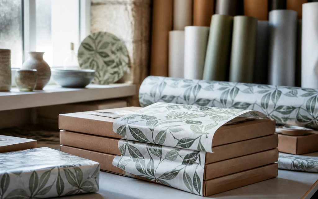
- Illustrative patterns. Small drawings of tools, ingredients or products, common in food, retail and hospitality.
- Supergraphics. One oversized, cropped shape from the logo used across a large surface, such as a van side.
A texture is related but different: it adds a surface feel, such as paper grain, concrete or timber, rather than a repeat. Textures suit premium and craft brands; patterns suit almost anyone with large surfaces to fill.
Where a pattern earns its keep
| Surface | How a pattern helps | Watch out for |
|---|---|---|
| Vans and vehicles | Makes a fleet recognisable from a distance and from behind | Competing with the phone number and name |
| Packaging and labels | Builds shelf recognition across a product range | Leaving room for required product information |
| Shopfronts and interiors | Window film, feature walls and counters in a consistent style | Overwhelming small spaces |
| Business cards and stationery | Fills the reverse of a card or a folder | Fine detail that prints poorly when small |
| Social media | Backgrounds and frames that make posts recognisable in a feed | Text placed over busy areas |
| Website | Section backgrounds, dividers and footers | Distracting from content and slowing the page |
| Workwear and merchandise | Linings, sleeves, tote bags and mugs | Cost of many colours in screen print and embroidery |
Vehicles and packaging are where patterns pay back most clearly. A van with a confident, ownable pattern is recognisable in a car park before anyone reads it, which is the whole point of livery.
When to skip it
A pattern is not essential, and adding one too early can dilute a young brand. Skip it, or leave it for later, if:
- Your brand mainly appears as a logo on documents, a website header and a few social posts.
- Your logo itself is not yet settled or used consistently.
- You have no large surfaces planned: no vans, no packaging, no premises.
- Your budget is better spent on photography of your work, which persuades more than decoration.
The test is simple: list the places a pattern would appear in the next twelve months. If you cannot name three, it can wait.
How a good pattern is built
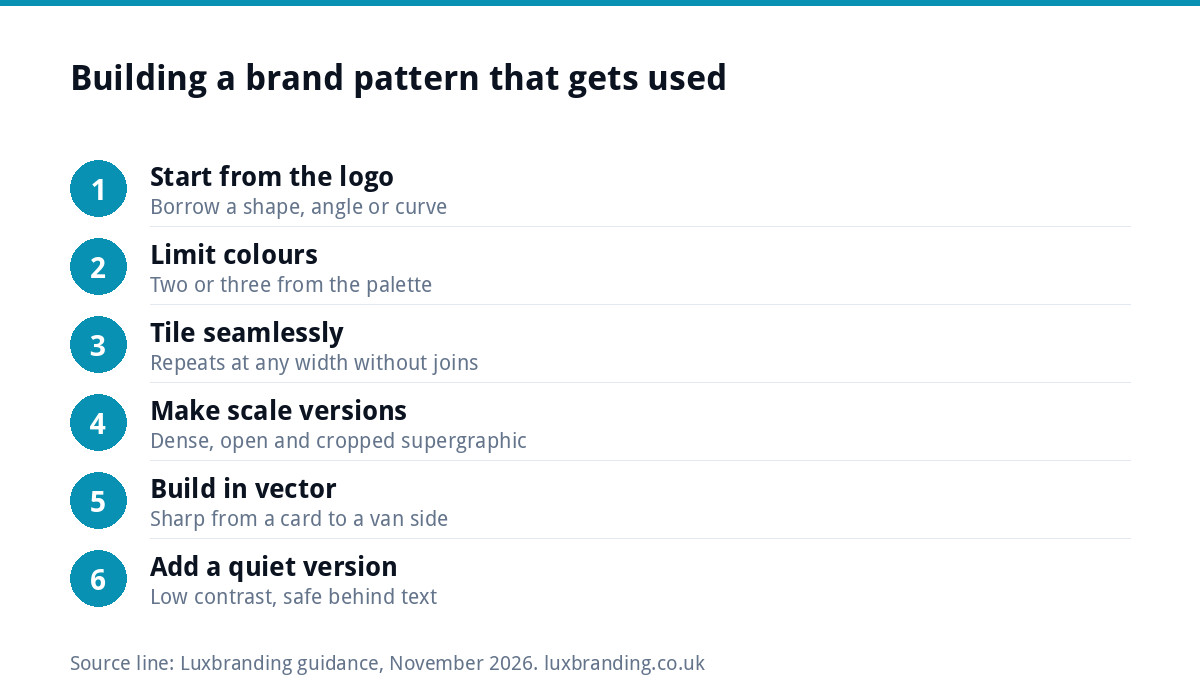
- Start from the logo. Borrow a shape, an angle or a curve from your mark, so the pattern feels related rather than added on.
- Limit the colours. Two or three from your palette, usually with one dominant. Fewer colours also keep print and embroidery costs down.
- Design it to tile seamlessly, so it can repeat across any width without visible joins.
- Make scale versions. A dense version for small items, an open version for large surfaces, and a cropped supergraphic for vehicles.
- Build it as vector, so it stays sharp from a business card to a van side.
- Create a quiet version: a low-contrast tint of the pattern that can sit behind text.
Patterns and text
The most common mistake is putting text over a busy pattern. Readability depends on contrast, and a pattern makes the background uneven. The W3C’s guidance on minimum contrast sets at least 4.5:1 between normal text and its background on websites. Over a pattern, that has to hold for the lightest and darkest parts the text crosses, which is hard to guarantee.
The fix is to plan calm zones. Use the pattern at the edges, in panels or behind images, and keep text on a solid colour block or on the quiet, low-contrast version. On a van, the pattern frames the name and number rather than running under them.
Print and production realities
Patterns behave differently on each surface. In full-colour digital print they are straightforward. In screen printing, each colour usually needs its own screen and setup, so a three-colour pattern costs more than a one-colour one. In embroidery, fine repeats are slow and expensive to stitch, so a simplified version is often needed. Cut vinyl suits bold, simple shapes better than intricate repeats; printed vinyl handles detail but costs more.
Build those limits in from the start by approving a one-colour version of the pattern alongside the full one. Our guide to branded workwear and merchandise explains how print methods affect cost.
Patterns on screen
On a website and social media, a pattern works best as seasoning rather than the main dish. A thin band of pattern at the top of the footer, a panel behind a testimonial, or a frame around a product photo is enough to make the page feel like yours. Full-screen patterned backgrounds behind body text tire the eye and fight the content.
For social posts, build two or three templates that use the pattern in the same position each time, such as a corner block or a border, and keep the middle for the photo or message. Over a few weeks, that consistency is what makes your posts recognisable in a fast-scrolling feed.
Keep web files light. A simple geometric pattern can be supplied as a small SVG that repeats in the browser, which loads far faster than a large photographic background. Ask your web designer to use the vector version rather than a flattened image, and check the page on a phone before it goes live.
Owning your pattern
A pattern your designer creates for you is an original artistic work. In the UK, as GOV.UK’s copyright guidance explains, copyright protection is automatic, with no register and no fee. As with your logo, make sure your agreement transfers the copyright to you.
If the pattern will appear on products you sell, such as fabric, homeware or packaging, a registered design is worth considering too. GOV.UK’s guide to registering a design says registration can protect the appearance of a product, including its pattern, that it starts at £60 for one design, and that it must be renewed every five years, up to a maximum of 25 years. The design must be new.
What to put in your brand guidelines
| Specify | Why |
|---|---|
| The pattern files: full, one-colour and quiet versions | Suppliers use the right version for each method |
| Approved colour combinations | Stops off-brand recolouring |
| Minimum and maximum scale | Keeps the repeat recognisable |
| Where it may and may not go | Protects text and the logo |
| Clear space around the logo when used together | The logo stays the hero |
| Examples on real items | Shows the intent faster than rules |
If you are still deciding what your guidelines need overall, our guide to brand guidelines costs sets out what different levels typically include.
A worked example: a landscaping firm
Picture a landscaping business with two vans, a team in branded polos and a growing Instagram account. Its logo includes a simple leaf shape. A pattern built from that leaf, tilted and repeated in two greens, gives it a van livery that reads from across a road, a sleeve detail for the polos in a single colour, and a background for social posts in the quiet version. The logo, name and phone number stay on solid panels. Three surfaces, one asset, and every one of them now looks like the same company.
Getting a pattern designed
Brand Identity Design is £299 and covers the logo, colours, typography, imagery and brand guidelines. If you would like a pattern as well, email us at support@luxbranding.co.uk before ordering, saying where it will be used, so the scope is clear from the start. For vans and signs, vehicle wrap and signage design starts from £99, and packaging design is £99. Every fixed price is on our pricing page.
Get the UK Branding Budget Worksheet (free)
A printable worksheet: decide what your brand needs now and price it against fixed published prices and the IPO trademark fee.
No spam. UK GDPR compliant. We only use your email to send this resource, unless you tick the box to hear from us.
Frequently asked questions
What is a brand pattern? +
A brand pattern is a repeating graphic that belongs to your identity, usually built from a shape in your logo, simple geometry or your brand colours. It is used to fill large surfaces such as vans, packaging, shopfronts, social backgrounds and the reverse of business cards, so your brand is recognisable before anyone reads it.
Does a small business need a brand pattern? +
Only if it has large surfaces to fill. Businesses with vans, packaging, premises or a busy social feed get real value from one. If your brand mainly appears as a logo on documents and a website header, a strong logo, colour palette and good photography will do more for you, and a pattern can come later.
Can I put text over my brand pattern? +
It is best avoided. A pattern makes the background uneven, so text may meet contrast guidance in one place and fail in another. Keep text on solid colour panels, or use a quiet, low-contrast version of the pattern behind it, and use the full pattern at the edges or around images.
Can I protect my brand pattern? +
Copyright protects original artwork automatically in the UK, so make sure your design agreement transfers it to you. If the pattern will appear on products you sell, GOV.UK says a registered design can protect a product's appearance, including pattern, from £60 for one design, renewed every five years up to 25 years.
Does a brand pattern cost more to print? +
It can. Full-colour digital print handles patterns easily, but screen printing usually needs a screen per colour, embroidery struggles with fine repeats, and cut vinyl suits bold, simple shapes. Approving a one-colour version alongside the full pattern keeps workwear, merchandise and signage costs under control.