Quick answer
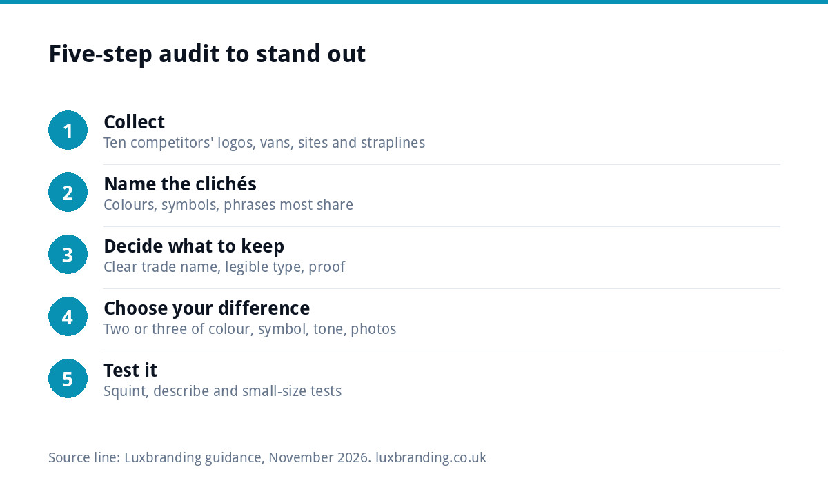
Screenshot ten competitors’ logos, vans and websites, list the colours, symbols and phrases they share, then deliberately avoid at least two of them. Keep the cues customers rely on, such as a clear trade name, and change the rest: colour, symbol, tone and photography. A distinctive brand is also easier to register as a trade mark.
Search for plumbers in any UK town and you will see the same blue, the same water drop and the same “no job too small”. Electricians get a yellow lightning bolt; builders get a roof outline; cleaners get sparkles. Each of those choices made sense once. Repeated across a whole sector, they make every business look interchangeable, so customers fall back on price. This guide gives you a five-step method to see your sector’s clichés and step out of them, without becoming so different that customers cannot tell what you do.
Why every business in a sector looks the same
Sameness is rarely laziness. It comes from sensible-sounding decisions made in isolation: copying what the market leader does, choosing the “obvious” colour for the trade, picking an icon from a template site, or asking a designer to make something “like” a competitor you admire. Each business ends up a little closer to the average.
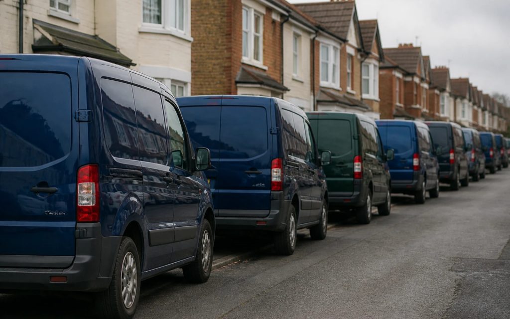
The cost is quiet but real. When a customer sees three vans or three search results that look alike, they cannot remember which one they liked, and they cannot tell who is the specialist and who is the generalist. Being recognisable is a large part of what branding is for.
Step 1: collect what customers actually see
Spend an hour gathering evidence, not opinions. Search the way your customers do, for your service plus your town, and capture:
- The logos and profile pictures of the top ten businesses that come up.
- Their vans, signs or shopfronts, from Google Street View or your own photos.
- The first screen of each website on a phone.
- Their straplines and the first sentence of their homepage.
- The kind of photos they use: stock images, real jobs, team shots.
Put everything on one page or one wall, side by side. Patterns jump out when you see them together that you would never notice one site at a time. Our guide to branding for trades businesses covers the full set of places your brand appears.
Step 2: name the clichés
Now list what most of them share. In many UK trade sectors, the same cues come up again and again:
| Sector | Common colours | Common symbols | Common phrases |
|---|---|---|---|
| Plumbing and heating | Blue, sometimes with red | Water drop, flame, pipe or tap | “No job too small” |
| Electrical | Yellow and black, or blue | Lightning bolt, plug | “Fully qualified” |
| Building and roofing | Navy, grey, orange | Roof outline, house shape | “Quality workmanship” |
| Cleaning | Light blue, green | Sparkles, bubbles, spray bottle | “We leave it spotless” |
| Landscaping | Greens | Leaf, tree, grass blades | “Transforming outdoor spaces” |
| Accountancy | Navy, teal | Graph line, tick, pound sign | “Your trusted advisors” |
Your own list will be specific to your area and niche. Mark each cue as used by most, some or few competitors.
Step 3: decide what to keep
Not every shared cue is a cliché to avoid. Some are category signals that help customers understand what you do at a glance, and throwing them all away can confuse people. Keep the ones that do a job:
- A clear name or descriptor that says what you do, such as “Roofing” or “Electrical”.
- Legible, confident type, because readability on a moving van beats novelty.
- Proof cues such as accreditations and real photos, which customers look for.
Then pick at least two of the most common cues to deliberately avoid. If every competitor is blue with a water drop, a plumber in deep green with a distinctive monogram is instantly different and still obviously a trade business.
Step 4: choose where to be different
You do not need to be different everywhere. Being clearly different in two or three of these is enough:
- Colour. The fastest route to recognition. A colour nobody else in your area uses becomes yours on vans and signs.
- Symbol. Replace the generic icon with a monogram, a shape drawn from your name or story, or no icon at all with a strong wordmark.
- Tone of voice. If everyone says “quality workmanship”, say something specific and true instead: response times, what you do on the first visit, how you leave the site.
- Photography. Real photos of your team and your work, consistently styled, beat the stock images most competitors use.
- Layout of vans and signs. A bold, simple livery stands out against vehicles covered in bullet points.
Here is how that plays out for a roofing firm in a town where every competitor uses navy, grey and a house outline. It keeps “Roofing” clearly in the name and a confident, readable typeface. It changes the colour to a warm terracotta that echoes clay tiles, replaces the house icon with a bold monogram of its initial, and swaps “quality workmanship” for a specific promise about written quotes within a set time that it can actually keep. Its vans now carry just the name, one line and the phone number on that terracotta. In a car park full of navy vans, it is the one people notice and remember.
Step 5: test it in the real world
Before you commit, put your new direction back on the wall with the competitors. Then run three quick checks:
- The squint test. Squint at the wall. Can you still pick yours out by colour and shape alone?
- The describe test. Ask someone to describe your logo from memory after a quick look. “The green one with the big H” is a pass; “a blue one with a drop, I think” is not.
- The small test. Shrink it to a social media avatar beside competitors’ avatars.
If it passes all three, check it does not stray so far that customers no longer recognise your trade. Show it to two or three existing customers and ask what kind of business they think it belongs to. If they get it right, you have found the balance between different and clear.
Distinctive is also easier to protect
There is a legal upside to standing out. GOV.UK’s page on what you can register as a trade mark says a trade mark cannot describe the goods or services it relates to, cannot be too common and non-distinctive, and cannot be the same as or similar to another business’s mark for the same goods or services. A generic water drop with “Plumbing Services” is hard to protect; a distinctive name and mark is much easier. Our guide to logo copyright and trade marks explains the basics.
Do not copy the leader
When a competitor is clearly winning, it is tempting to look like them. Resist it. Customers who know them will see a copy, and close imitation can create legal risk as well. Copyright protects original artwork automatically, as GOV.UK’s copyright guidance explains, with no need to register. Learn from what the leader does well, such as clear vans or fast-loading websites, and express it in your own way.
Owning a colour
If colour is your main point of difference, specify it precisely so it stays the same on every van, sign and shirt. Record a Pantone reference alongside the CMYK, RGB and HEX values; Pantone’s Formula Guide is the standard reference printers and sign makers use for spot colours, in coated and uncoated versions. A colour that drifts between suppliers loses the recognition you paid for.
Safe but forgettable vs different and clear
| Choice | Safe but forgettable | Different and clear |
|---|---|---|
| Colour | The sector’s usual blue | A colour no local competitor uses, applied consistently |
| Symbol | A stock icon of the trade | A monogram or shape drawn from your name |
| Strapline | “No job too small” | A specific promise you can keep |
| Photos | Stock images of smiling models | Your own team and finished jobs |
| Van | Every service listed in bullet points | Name, one line, phone number, bold colour |
If your current logo is part of the problem, our checklist of signs your logo needs a redesign helps you decide between a refresh and a fresh start.
Getting a brand that stands apart
Our Logo Design is £129 with unlimited concepts, so you can see several directions that step away from your sector’s clichés before choosing one. Brand Identity Design is £299 for the logo, colours, typography, imagery and brand guidelines. For an established business changing its whole look, our Rebrand Package is £1,999. Every fixed price is on our pricing page.
Get the UK Branding Budget Worksheet (free)
A printable worksheet: decide what your brand needs now and price it against fixed published prices and the IPO trademark fee.
No spam. UK GDPR compliant. We only use your email to send this resource, unless you tick the box to hear from us.
Frequently asked questions
How do I make my brand look different from competitors? +
Collect the logos, vans, websites and straplines of your ten nearest competitors, list what they share, then deliberately avoid at least two of the most common cues, such as the usual colour or symbol. Keep the cues that help customers understand what you do, and test the new direction side by side with competitors.
Should my logo use the usual symbol for my trade? +
Not necessarily. Symbols such as a water drop for plumbers or a lightning bolt for electricians are so common that they make businesses look interchangeable. A monogram, a shape drawn from your name, or a strong wordmark with a clear trade descriptor usually makes you more memorable while still saying what you do.
Is it risky to look very different from other businesses in my sector? +
It can be if you drop the signals customers rely on, such as a clear description of your trade and readable type. The safe approach is to keep those category cues and be clearly different in two or three areas, such as colour, symbol, tone of voice or photography, rather than everywhere.
Does a distinctive logo help with trade marks? +
Yes. GOV.UK says a trade mark cannot describe the goods or services it relates to, cannot be too common and non-distinctive, and cannot be the same as or similar to another business's mark for the same goods or services. A distinctive name and mark is far easier to protect than a generic one.
How much does a distinctive logo cost with Luxbranding? +
Our Logo Design is £129 one-off with unlimited concepts, so you can compare several directions that step away from your sector's clichés. It includes stacked, horizontal and icon-only layouts and every file format. Brand Identity Design is £299 and adds colours, typography, imagery and brand guidelines.