Quick answer
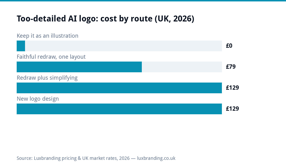
If a sign maker, printer or embroiderer has told you your AI-made logo “can’t be recreated” or has “too much detail,” they are almost certainly right, and the fix is usually straightforward. A faithful redraw as a true vector costs £79 for one layout, plus £39 for each additional layout, and takes 2 to 3 working days. If the design also needs simplifying to work as a logo at all, add a Logo Edit at £50 on top. If what you actually have is an illustration rather than a mark, the honest route is a fresh logo built from a brief: Logo Design is £129 for one layout, and each additional layout is £39. We cover all three routes below, or you can start by sending us the file through Fix My AI Logo.
Is it a logo or an illustration?
Most AI image generators were trained on photographs and painted artwork, not on brand marks, so when you ask for “a logo” you often get an illustration wearing a logo’s clothing. The result can look striking on a screen and still be unusable the moment it needs to be reproduced by hand or by machine. Shading, gradients, drop shadows, photographic lighting and dozens of near-identical colours are the giveaways. A working logo is built from a small number of flat, closed shapes. It has to survive being shrunk to a few pixels, printed in one colour, and reproduced by hand or by machine, none of which an illustration was ever designed to do. For background on the difference between a raster illustration and a true vector mark, MDN’s guide to SVG and Wikipedia’s entry on vector graphics are useful primers.
Four five-minute tests you can run today
Before you brief anyone or pay for a redraw, you can find out how much trouble you’re in yourself, in about five minutes. None of these need design software, just the image file you already have.
- Shrink it to 16 pixels. Resize the image to the size of a browser tab icon. If it turns to mush, there’s too much fine detail for a small mark. Our guide to turning a logo into a favicon and app icon covers what actually survives that shrink.
- Print it in one colour. Convert it to black and white in any image viewer. If the shapes disappear into a grey smudge, the design is relying on colour and shading to do the work an outline should be doing. Our piece on designing logos that work in black and white explains why this test matters.
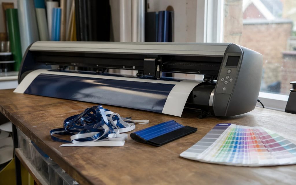
- Imagine it cut from vinyl. A vinyl cutter follows a single continuous outline per colour. Trace the silhouette in your head. If you can’t say where one shape stops and the next starts, a cutter can’t either.
- Imagine it stitched at chest size. An embroidery machine lays thread in blocks, not pixels, and each colour change is a separate stop. Fine gradients and thin overlapping lines aren’t a stitch a machine can make that small.
If your logo fails two or more of these, you’re looking at an illustration rather than a working mark, and it’s worth reading on before you ask anyone to “just vectorise it.”
What each printing and stitching method can actually reproduce
| Medium | What it reproduces well | Where fine detail breaks down |
|---|---|---|
| Cut vinyl (signs, vans, windows) | Solid flat shapes, clean outlines, 1 to 3 colours | Gradients, thin hairlines, shapes that touch or overlap |
| Screen print (workwear, merchandise) | Flat spot colours, typically up to 4 to 6 separate screens | Photographic shading, soft colour blends, very small text |
| Large format print (banners, boards) | Full colour detail viewed at a distance | Fine detail intended to be read up close, blown up to large scale |
| Favicon or app icon | One bold shape from 16 to 512 pixels | Any detail smaller than the icon’s own outline |
| Embroidery (chest size and above) | Bold shapes, a limited colour count, clear outlines. See our full guide to logos for embroidery and signage | Gradients, thin lines, more than around 6 to 8 thread colours |
What simplifying a logo keeps, and what it loses
A good simplification keeps the silhouette, the core palette, the key shape that makes the mark recognisable, and the name if it’s a wordmark. It should still look like the same brand from ten paces. What it loses, deliberately, is shading, texture, background elements and any detail that only reads at large size. If your current design mixes a picture element with lettering, it’s also worth deciding whether you actually need both together on every application. Our guide to wordmark versus icon logos covers when a name-only mark works harder than a combination mark, and when an icon earns its place.
Your three routes, and what they cost
Once you know whether the problem is the file format, the level of detail, or the design itself, the right route is usually obvious. Here is the same decision as a quick reference, with the routes explained in full further down the page.
| Situation | What happens | Price |
|---|---|---|
| Good logo, just needs converting to a proper vector file | Recreate & Vectorise: a faithful redraw as true vector artwork | £79 for one layout, £39 per additional layout |
| Right idea, but too busy or detailed to use as a logo | Recreate & Vectorise plus a Logo Edit to simplify it | £79 plus £50 |
| It is genuinely an illustration, not a mark | A new logo built from a short brief | Logo Design (£129), plus £39 per additional layout |
Route one: a faithful redraw as true vector
If the overall design is right and it just needs to exist as proper artwork, this is Recreate & Vectorise: £79 for one layout, £39 for each additional layout, delivered in 2 to 3 working days. A layout means one arrangement, stacked, horizontal, or icon only, and colour versions of that layout are included in the price. If the AI generator invented lettering that isn’t a real typeface, we respell it in the closest real, licensed font as part of the job, at no extra cost. For a walkthrough of what the process actually involves, see our guide to how to vectorise a logo in the UK. Most jobs in this category are straightforward: the shapes are already sound, so the work is redrawing them cleanly rather than redesigning anything.
Route two: simplifying a logo that’s too detailed
If the idea is right but the execution is too busy, shading, gradients, too many near-identical colours, the fix is a Logo Edit at £50, done alongside the Recreate & Vectorise redraw. We strip it back to flat shapes and a workable palette while keeping the silhouette and the idea intact, so the version a sign maker or embroiderer receives is one they can actually cut or stitch. This is the most common combination we see from AI-generated logos, since the two problems, wrong file format and too much detail, tend to arrive together.
Route three: when it isn’t a logo at all
Sometimes the honest answer is that the image is a nice illustration but was never going to work as a mark, no matter how much it’s simplified: too many separate elements, no clear focal shape, or built around a scene rather than a symbol. In that case, forcing a redraw wastes money. The better route is a new logo built from a short brief. Logo Design is £129 for one layout, and each additional layout is £39. You can see this alongside our other prices on the pricing page. It costs a little more upfront than a redraw, but it avoids paying twice: once to simplify an image that was never structured like a logo, and again later when it still doesn’t hold up on a sign or a shirt.
What we check before any work starts
We review every image you send before we start and tell you which of the three routes applies, and what it will cost, before any work begins. If we take on a job and find we can’t actually deliver it, we issue a full refund rather than bill for an attempt. There’s no guessing which service to order first, and you’re never charged for the wrong one because we route the job before it starts.
When to keep the detailed version, just not as your logo
None of this means the detailed AI image has to be thrown away. It can still earn its place as a menu cover illustration, a website banner, a social media graphic or packaging artwork, anywhere it’s viewed as a picture rather than asked to behave like a mark. What it shouldn’t do is sit on your van, your workwear or your favicon trying to be a logo when a simpler, purpose-built mark would do that job properly. Keep the illustration for the places illustrations belong, and use a true vector logo everywhere your business needs to be instantly recognised at any size, from a favicon in a browser tab to lettering on the side of a van.
Get the UK Branding Budget Worksheet (free)
A printable worksheet: decide what your brand needs now and price it against fixed published prices and the IPO trademark fee.
No spam. UK GDPR compliant. We only use your email to send this resource, unless you tick the box to hear from us.
Sources & Further Reading
- SVG: Scalable Vector Graphics, MDN Web Docs
- Vector graphics, Wikipedia
- Machine embroidery, Wikipedia
Frequently asked questions
Can every logo be vectorised? +
Technically almost any image can be traced into vector paths, but that isn't the same as producing a usable logo. If the original is an illustration with heavy shading or dozens of colours, a literal trace just turns those problems into curves instead of pixels. What actually helps is a faithful redraw that keeps the design's intent while rebuilding it as flat, closed shapes a printer or cutter can use.
Why does my AI-generated logo look fine on screen but fail at a sign maker or embroiderer? +
Screens show millions of colours and infinite detail at any zoom level. Vinyl cutters, screen printers and embroidery machines work with a limited number of solid colours and physical outlines, so gradients, soft shading and micro-detail that look fine on a monitor simply have no equivalent in cut vinyl, ink or thread.
What's the difference between a Logo Edit and Recreate & Vectorise? +
Recreate & Vectorise (£79) rebuilds your existing design as true vector artwork, keeping it faithful to the original. A Logo Edit (£50) is for when the design also needs simplifying, removing shading or busy detail, so it works as a logo rather than an illustration. The two are usually ordered together when a design is both unvectorised and too detailed.
Is my AI logo an illustration or a real logo? +
Run the four tests: shrink it to 16 pixels, print it in one colour, imagine it cut from vinyl, and imagine it stitched at chest size. If it fails two or more, treat it as an illustration rather than a working mark, and consider a new logo from a brief rather than trying to force the existing image into every use case.
Can you keep AI-generated lettering in my logo? +
AI tools rarely generate real, licensed typefaces, so the lettering they produce usually can't be reproduced as-is. As part of a Recreate & Vectorise redraw, we respell any AI-generated text in the closest real, licensed font at no extra cost, so the finished logo is legally usable and consistent across every application.
What happens if you can't fix my logo? +
We review every image before starting and tell you which route applies and what it will cost first. If we take on the job and genuinely can't deliver a usable result, we issue a full refund rather than bill for an attempt.