Quick answer
A website wireframe is a simple black-and-white plan of a page that shows where each element goes: headings, text, images, buttons and forms, with no colours or final styling. You sketch one for each key page before design starts, so the structure is agreed while changes still cost minutes rather than days of rebuilding.
Wireframes sound like a designer’s tool, but they are just as useful for a business owner briefing a web designer. A rough sketch of what you want on your homepage says more than a page of written notes. This guide explains what a wireframe is, how it differs from a mockup and a prototype, what a small business page should include and how to draw one in six steps.
What a wireframe is, and what it is not
The Nielsen Norman Group, a long-standing usability research firm, describes wireframes in its article on wireflows as a common deliverable to show page-level layout ideas. That is the whole point: layout, not looks. A wireframe answers questions like “what does a visitor see first?”, “where is the phone number?” and “how far down is the contact form?”
It deliberately leaves out colours, fonts, photos and polished wording. Boxes with a cross through them stand in for images, and grey lines or short placeholder headings stand in for text. Keeping it plain stops everyone arguing about shades of blue before the structure is right.
Wireframe, mockup or prototype?
These three words get used interchangeably, but they are different stages of the same process:
| Stage | What it shows | Looks like | Used to decide |
|---|---|---|---|
| Wireframe | Structure and content order | Grey boxes and labels | What goes on each page and where |
| Mockup | The visual design | A static picture of the finished page | Colours, fonts, imagery, spacing |
| Prototype | How it behaves | Clickable pages or working code | Whether people can complete tasks |
| Live site | The real thing | Built, hosted, indexed | Whether it brings enquiries |
The UK Government’s service manual on making prototypes describes the same range, from a quick pen and paper sketch to fully interactive code, and notes that sketches are useful for exploring and discussing basic ideas with colleagues. Most small business websites only need the first two stages before the build.
Why wireframes save time and money
Moving a box on a sketch takes seconds. Moving a section on a finished, coded page means redesigning it, rebuilding it, checking it on mobile and testing it again. Most of the expensive back-and-forth on website projects comes from structural changes made late: “can we put the reviews higher?”, “we forgot the gallery page”, “the form needs more fields”.
A wireframe forces those decisions early, when they are cheap. It also helps you compare quotes fairly. When two web designers price “a five-page website”, a wireframe for each page tells both of them exactly what you mean, so the quotes describe the same job.
Low fidelity or high fidelity?
Wireframes and prototypes come in different levels of detail, which designers call fidelity. The Nielsen Norman Group’s guide to prototype fidelity describes it as how closely a design matches the look and feel of the final system, and makes two useful points. Low-fidelity designs suit early stages, when you want to try more options quickly, and they put less pressure on the people reviewing them. High-fidelity versions suit later testing of visual details and real workflows.
For a small business site, that means: start rough. A pencil sketch or a few grey boxes is enough to agree the structure. Save the detailed version for the designer’s mockup.
What to include on a small business homepage
Every business is different, but most service-business homepages need the same building blocks. Use this as a checklist when you sketch:
| Block | Purpose | Position |
|---|---|---|
| Header with logo, menu and phone | Identity and a quick route to call | Top of every page |
| Headline and one-line summary | What you do and where | First screen |
| Main call to action | Call, quote form or booking | First screen, repeated lower down |
| Services overview | Route visitors to the right page | Just below the first screen |
| Proof | Reviews, accreditations, photos of real work | Middle of the page |
| Areas covered | Confirms you serve the visitor’s town | Middle or lower |
| About in brief | The people behind the business | Lower |
| Contact block and footer | Every way to reach you | Bottom of every page |
How to wireframe your website in six steps
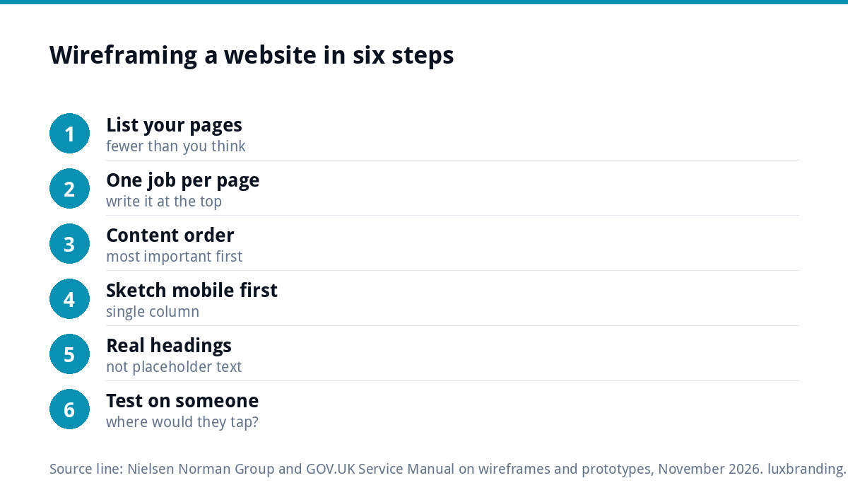
- List your pages. Homepage, one page per main service, about, reviews or gallery, contact. Most small business sites need fewer pages than people expect.
- Decide the one job of each page. A service page exists to get a quote request for that service; write that at the top of the sketch.
- Write the content order before drawing. List the blocks from top to bottom in order of importance to a visitor, not to you.
- Sketch the mobile version first. Most visitors to a trades or local business site arrive on a phone, and a single column forces you to prioritise.
- Add real headings, not placeholder text. “Emergency boiler repair in Derby” tells a designer far more than lorem ipsum.
- Show it to someone outside the business. Ask them to point at where they would tap to get a quote. If they hesitate, move it.
Worked example: a plumber’s homepage, top to bottom
Here is how the six steps play out for a one-van plumbing and heating business covering a single city. Written as a wireframe, from the top of a phone screen down:
- Header: logo on the left, a tap-to-call phone button on the right, menu icon.
- Headline: “Plumbing and boiler repairs across Nottingham”, with one line underneath on response times and the areas covered.
- Two buttons: “Call now” and “Get a quote”.
- Three service boxes: boiler repair, bathroom installs, general plumbing, each linking to its own page.
- Proof strip: Gas Safe registration and a handful of short reviews.
- Photo grid of real jobs with one-line captions.
- Areas covered, as a short list of districts.
- A short “about us” with a photo of the owner on site.
- Quote form with four fields: name, phone, postcode, job description.
- Footer with phone, email, opening hours and accreditation details.
Nothing on that list mentions colour or fonts, yet a designer could price and build from it with almost no guesswork.
Annotating your wireframe for the designer
A sketch shows where things go; notes explain why. Add short annotations beside each block: “this must be visible without scrolling on a phone”, “use photos from the Clifton job”, “form sends to the office email”, “reviews pulled from Google”. Mark anything you are unsure about with a question rather than leaving it out. Designers would much rather answer a question at the wireframe stage than discover a missing requirement after the build.
Tools for wireframing
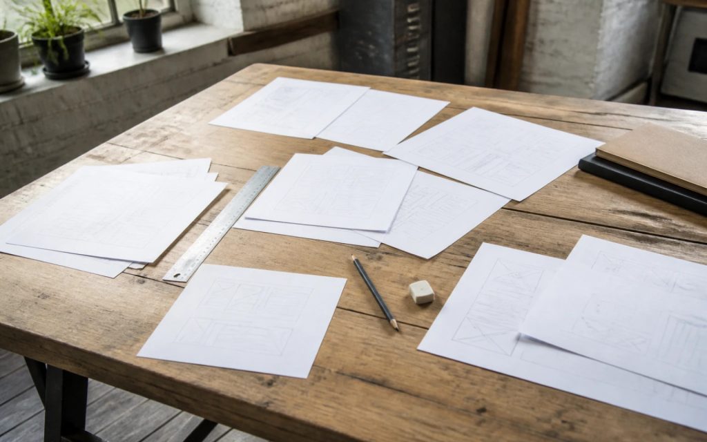
You do not need software. A pencil, plain paper and a ruler produce perfectly good wireframes, and a photo of the sketch is easy to send to a designer. If you prefer to work on screen, simple options include:
- Slides or a drawing app you already have, using rectangles and text boxes
- Dedicated wireframing tools such as Balsamiq or Whimsical, built for quick grey-box layouts
- Design tools such as Figma, which designers use for both wireframes and full mockups
Whatever you use, keep it grey. The moment colour arrives, the conversation shifts from structure to taste.
Common wireframing mistakes
- Designing desktop only, then discovering the layout collapses into a long, confusing scroll on a phone.
- Burying the call to action under paragraphs of history about the business.
- Too many menu items. Five or six top-level links is usually plenty.
- No proof near the top. Reviews and photos of real work belong high up, not on a separate page nobody opens.
- Copying a competitor’s layout without asking whether it actually works for them.
- Skipping the service pages and only sketching the homepage, when service pages are often where enquiries come from.
From wireframe to finished website
Once the wireframes are agreed, the designer turns them into a visual design, then builds and tests the real site. Sending a designer your sketches, even rough ones, shortens every stage after that. Before launch, run through our website launch checklist so nothing is missed.
If you are planning a new site, here is how our builds compare:
- Landing Page Design, £199: one page with one job, ideal for ad campaigns
- One-Page Website, £299: everything on a single scrolling page, ideal for new trades
- Custom WordPress Website, £499: up to 8 pages, hand-coded, mobile-first, with an SEO foundation and contact forms connected to your inbox
To estimate a bigger project, try our free website cost calculator or read our guide to how much a website costs in the UK. Every price is on our pricing page.
Get the UK Website Project Brief Template (free)
A two-page template for briefing any UK web designer: sitemap, integrations, audience and deliverables. Cuts revision rounds in half.
No spam. UK GDPR compliant. We only use your email to send this resource, unless you tick the box to hear from us.
Frequently asked questions
What is a wireframe in web design? +
A wireframe is a simple layout plan of a web page that shows where headings, text, images, buttons and forms go, without colours, fonts or final images. It is used to agree the structure and content order of each page before visual design starts, when changes are quick and cheap to make.
What is the difference between a wireframe and a mockup? +
A wireframe shows structure: what goes where, in plain grey boxes. A mockup shows the visual design: colours, fonts, imagery and spacing as the finished page will look. A prototype then shows behaviour, with clickable pages or working code. Most small business websites need a wireframe and a mockup before the build.
Do I need special software to make a wireframe? +
No. A pencil, plain paper and a ruler produce perfectly good wireframes, and a photo of your sketch is easy to send to a designer. Slides or a drawing app work too. Dedicated tools such as Balsamiq, Whimsical and Figma are useful if you wireframe often, but they are not necessary.
Should I wireframe the mobile or desktop version first? +
Start with mobile for most small business sites. A single narrow column forces you to decide what matters most, and many visitors to trades and local business sites arrive on a phone. Once the mobile order works, widening it for desktop is straightforward. The reverse often produces a long, confusing scroll.
Will a wireframe make my website cheaper? +
It usually makes it cheaper to get right. Structural changes made after a page is designed and built mean redesign, rebuild and retesting. Agreeing the layout first avoids most of that. It also helps you compare quotes, because every designer prices the same pages. Our Custom WordPress Website is £499 for up to 8 pages.