Quick answer
Review a website draft in one sitting per round: check it on your phone first, then the wording, then forms and links, then the look. Put every comment in one numbered list with the page, what is wrong and what you want instead, plus a screenshot. One consolidated list per round gets actioned far faster than scattered emails.
The design is nearly there, a link arrives, and suddenly you are the bottleneck. Most website projects that drag on do not stall in the build; they stall in feedback, with comments arriving in five emails, two text messages and a phone call, some contradicting each other. This guide gives you a review order that catches the important problems first, a format for comments that designers can act on without guessing, and the checks most owners forget until a customer finds them.
Why feedback is where websites slow down
Every round of feedback has a cost in time on both sides. Your designer has to read the comments, work out what each means, ask about the unclear ones, make the changes and send it back. Vague or piecemeal feedback multiplies that work. “Can the homepage pop more?” might take three emails to decode, while “make the headline larger and move the phone number into the top bar” can be done in minutes.
Feedback also drifts. Without a structure, owners tend to start with colours and fonts, because they are easiest to see, and only notice a wrong phone number or a missing service the day before launch.
Know what stage you are reviewing
Before you start, check what you have been sent and what kind of comments are useful at this point:
| Stage | What you see | Useful feedback | Leave for later |
|---|---|---|---|
| Design mock-up | Images of key pages | Layout, look, what is missing from the page | Typos in placeholder text |
| Staging site | A working private copy | Wording, links, forms, phone view, photos | Changing the overall style |
| Pre-launch check | The near-final site | Errors, contact details, legal pages | New features or sections |
Big changes are cheap at the mock-up stage and expensive on a nearly finished site. If you want to change direction, say so as early as possible.
The order to review in
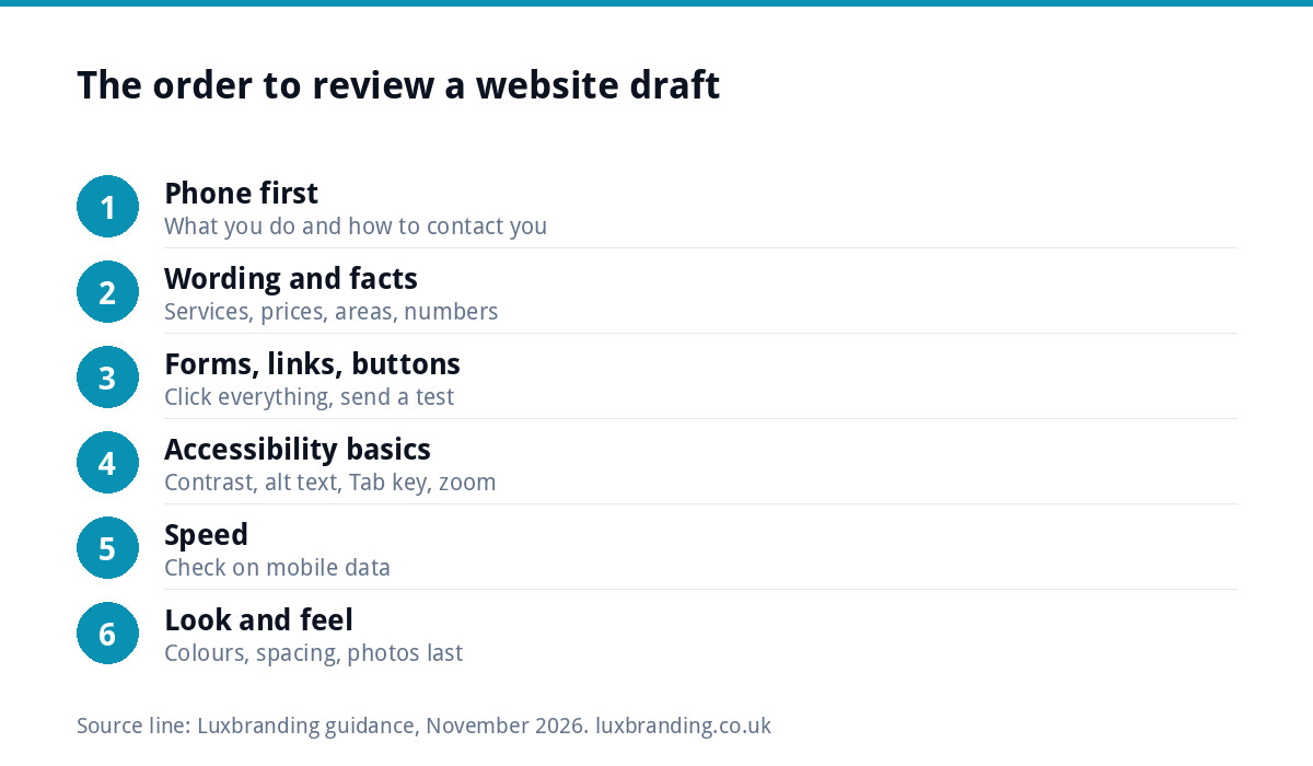
Work through the draft in this order, and do each step for every page before moving to the next:
- Phone first. Open the link on your own mobile. Can you see what you do and how to contact you without scrolling far?
- Wording and facts. Read every page for accuracy: services, prices, areas, phone numbers, opening hours.
- Forms, links and buttons. Click everything. Send a test enquiry.
- Accessibility basics. Text size, contrast, image descriptions, keyboard use.
- Speed. Does it load quickly on mobile data, not just office wifi?
- Look and feel. Only now: colours, spacing, photos, overall impression.
This order puts the things customers and search engines notice ahead of the things you notice, which is the right way round.
Checking on your phone first
Google says it uses the mobile version of a site’s content for indexing and ranking, known as mobile-first indexing, and many of your visitors will also be on a phone. Review the draft on your mobile as a customer would:
- Does the first screen say what you do and where?
- Can you tap the phone number to call?
- Is any text too small to read without zooming?
- Do menus open and close properly?
- Do photos load, crop sensibly and show the right thing?
If you can, ask someone with a different phone to look too. Older and smaller phones show problems newer ones hide.
Checking content, forms and links
This is the part only you can do, because you know your business. Use this checklist on every page:
| Check | What to look for |
|---|---|
| Contact details | Phone, email and address correct everywhere, including header and footer |
| Services | Every service listed, none you have stopped offering |
| Prices and areas | Current figures and the towns you actually cover |
| Names and accreditations | Spelt correctly, current and ones you are entitled to show |
| Forms | A test enquiry arrives in the right inbox, with a thank-you message on screen |
| Links and buttons | Each goes where its label says |
| Social links | Point to your accounts, not a template’s |
| Legal pages | Privacy policy and cookie notice present and accurate |
If test enquiries do not arrive, raise it immediately; our guide to contact forms that stop working explains the usual causes.
Accessibility and speed: two quick checks anyone can do
You do not need to be an expert to spot common problems. The W3C’s easy checks suggest looking at whether each page has a sensible title, whether images have text alternatives, whether headings are marked up as headings, whether text contrast meets a ratio of at least 4.5:1 for normal-size text, whether you can reach every link and form field with the Tab key, and whether text stays readable when you zoom in. Try the Tab key test yourself: it takes two minutes and reveals a lot.
For speed, run your main pages through Google’s PageSpeed Insights, which describes its purpose as making web pages fast on all devices. Do not chase a perfect score on a staging site, which may not have its final caching set up yet, but do ask about anything flagged in red. Our guide to website speed for small businesses explains what the main measures mean.
How to write feedback that gets actioned
Put every comment in one document or one email, numbered, with this structure: page, what is wrong, what you want instead, and a screenshot if it helps. Compare:
| Vague | Actionable |
|---|---|
| “The homepage feels a bit flat.” | “Homepage, top section: use the photo of the finished kitchen instead of the van, and make the headline larger.” |
| “Can we change the services bit?” | “Services page: remove ‘Loft conversions’, add ‘Garage conversions’ with the text attached.” |
| “The form doesn’t work?” | “Contact page: sent a test at 10.15 on Tuesday, nothing arrived at office@ or in junk.” |
| “Not keen on the colours.” | “The orange buttons clash with our van livery; please try our navy from the brand guidelines.” |
Explain why where it helps. “Customers always ask about parking, so add it to the contact page” lets the designer suggest the best way to do it, rather than just doing what you literally said.
Who should give feedback
Show the draft to the people who matter, but send one set of feedback. If a business partner, a manager and a relative all email their own comments, the designer receives contradictions and has to choose. Collect everyone’s views, settle the disagreements yourselves, and have one person send the agreed list.
Be careful with opinions from people outside your customer base. Your nephew may prefer a dark, moody design; your customers may want to see your phone number and your work.
Fixes versus changes of direction
There is a difference between correcting something and changing what was agreed. “This price is wrong” is a fix. “Actually, we want a shop as well” is a new piece of work. Most quotes cover revisions within the agreed brief; a change of direction or a new feature usually needs a fresh quote. Raising big changes early, and separately from the fixes list, keeps the project on schedule and avoids surprise invoices.
Keep a second list, titled “after launch”, for good ideas that are not essential now. It stops the launch slipping and gives you a ready-made plan for the next update.
A simple feedback routine for every round
- Block out one uninterrupted hour, ideally within two working days of receiving the draft.
- Follow the review order: phone, wording, function, accessibility, speed, look.
- Write one numbered list, with screenshots.
- Agree it with anyone else involved before sending.
- When the next version arrives, check your numbered items first, then do a fresh pass with new eyes.
- Keep every round’s list in one folder, so nothing agreed earlier quietly reverts.
Working with us
Our custom WordPress website is £499 one-off for up to 8 pages, typically delivered in 2 to 4 weeks. It is hand-coded and mobile-first, with an SEO foundation, contact forms connected to your inbox, Google Analytics, a written CMS walkthrough and 30 days of support. For a single campaign, a landing page is £199. Before go-live, our website launch checklist covers the final checks, and if you struggle to make your own edits afterwards, see what to do when you cannot update your website. Every fixed price is on our pricing page.
Get the UK Website Project Brief Template (free)
A two-page template for briefing any UK web designer: sitemap, integrations, audience and deliverables. Cuts revision rounds in half.
No spam. UK GDPR compliant. We only use your email to send this resource, unless you tick the box to hear from us.
Frequently asked questions
How long should I take to review a website draft? +
Aim to send feedback within two working days, in one uninterrupted hour per round for a small site. Quick, complete feedback keeps the project moving; a review spread across a fortnight of scattered emails can add weeks to the launch date and makes it easy for comments to be missed or misread.
Should I review the website on my phone or computer? +
Start on your phone. Google indexes the mobile version of sites, and many visitors will arrive on a phone, so problems there matter most. Check text size, the tappable phone number, menus and photos. Then review on a computer, and ask someone with a different phone to look as well.
What is the best format for website feedback? +
One numbered list per round, sent by one person, with each item stating the page, what is wrong and what you want instead, plus a screenshot where it helps. Add a short reason when it is useful. This avoids contradictions, lost comments and back-and-forth emails trying to decode vague requests.
What if I want to change the design after seeing the build? +
Say so as early as possible, and separately from your list of fixes. Corrections within the agreed brief are normally part of the job, but a change of direction or a new feature usually needs a fresh quote. Big changes are cheapest at the mock-up stage and most expensive just before launch.
How do I test whether my new website's contact form works? +
Send a real test enquiry from the form, using a different email address from your own business account if you can. Check it arrives in the right inbox and not in junk, that a thank-you message appears on screen, and that any automatic reply reaches the sender with the correct wording.