Quick answer
As general guidance, keep printed lines at 0.25pt or heavier (about 0.09mm), and use 0.5pt or more on uncoated paper, on textured stock or when reversed out of a colour. Keep reading text at 8pt or above and legal small print no smaller than about 6pt. Your printer’s own artwork spec always takes priority.
Fine lines and tiny text are where good-looking artwork turns into a disappointing print run. A hairline border that looked crisp on screen vanishes, a thin serif fills in, and the small print on a voucher becomes a grey smudge. This guide explains why it happens, gives safe starting points by job, and shows how to test before you pay for a full run. The figures below are widely used rules of thumb rather than a standard, so always check them against the spec of the printer you are using.
Why fine detail disappears in print
Your screen shows artwork as light, sharp and perfectly aligned. A press puts ink on paper, and three things work against fine detail:
- Ink spread. Ink soaks into paper and spreads slightly. Printers call the effect on tints dot gain, and as the Wikipedia entry on dot gain notes, uncoated papers absorb more ink than coated ones and so show more of it. Thin white gaps fill in; thin dark lines thicken unevenly.
- Registration. Full-colour print lays down cyan, magenta, yellow and black separately. If they land a fraction apart, a thin line built from all four colours goes fuzzy or picks up a coloured edge.
- Resolution of the process. Digital presses, screen printing, embroidery and vinyl cutting each have a smallest detail they can hold, and it is much coarser for thread and vinyl than for ink on paper.
Points and millimetres
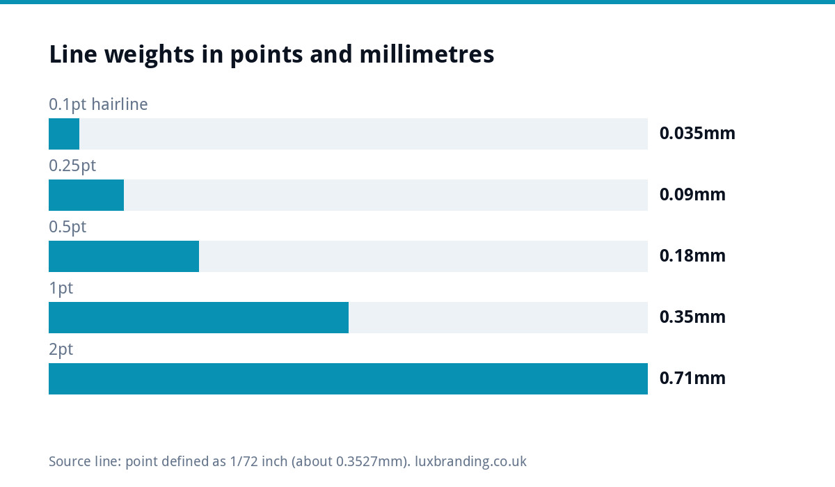
Design software measures line weight in points. The desktop publishing point is 1/72 of an inch, which the Wikipedia article on the typographic point puts at about 0.3527mm. That makes the numbers easier to picture:
| Line weight | Approximate width | What it is in practice |
|---|---|---|
| 0.1pt | 0.035mm | A “hairline”: too thin for most print |
| 0.25pt | 0.09mm | A common minimum for dark lines on coated paper |
| 0.5pt | 0.18mm | Safer for uncoated stock and reversed lines |
| 1pt | 0.35mm | A clearly visible rule or border |
| 2pt | 0.71mm | A bold rule; reads from across a room |
One trap: some software has a “hairline” setting that prints as the thinnest line the output device can make. On a high-resolution press that can be almost invisible. Set an actual weight instead.
Safe starting points by job
These are cautious starting points that work with most UK printers. Treat them as a floor, not a target.
| Job | Thinnest line | Smallest text | Watch out for |
|---|---|---|---|
| Business cards, coated | 0.25pt | 6pt for small print, 7 to 8pt for details | Thin fonts in light grey |
| Flyers and leaflets, silk or gloss | 0.25pt | 8pt for body copy | Terms and conditions set too small |
| Letterheads and uncoated stock | 0.5pt | 8 to 9pt | Ink spread filling in counters |
| White text reversed out of colour | 0.5pt or more | 8pt, medium weight or bolder | Thin serifs breaking up |
| Embroidery, vinyl, screen print | Far heavier: ask the supplier | Often no small text at all | Detail that cannot be stitched or cut |
For thread and vinyl the limits are set by the needle and the cutting blade, not by ink, so they are a different conversation. Our guide to logo files for embroidery and signage covers those processes.
Reversed-out text needs extra weight
White text on a dark or coloured background is the most common casualty. The “white” is unprinted paper, and the ink around it spreads inward, so thin strokes get narrower, not wider. Choose a medium or bold weight for reversed text, avoid delicate serif typefaces at small sizes, and give reversed lines at least 0.5pt.
If the background is built from several inks, for example a rich brand colour, registration makes it worse: a slight shift leaves a coloured fringe inside every letter. Larger, heavier type hides this; tiny type exposes it.
Keep small text and thin lines in one ink
For black text and fine black rules, set them in 100% black only, not a four-colour “rich black”. A single ink cannot mis-register against itself, so small type stays crisp. Rich black is useful for large solid areas, but on small detail it creates the fuzzy edges you are trying to avoid. The same principle applies to brand colours: if a thin element must be coloured, a spot colour or a single process ink holds detail better than a mix of four.
Logos with fine detail
Logos cause more fine-line problems than any other element, because they are designed large and then shrunk onto a business card, a pen or a social avatar. Two issues come up repeatedly:
- Strokes that do not scale. If a logo is built with outlined strokes and someone resizes it with stroke scaling switched off, the lines stay the same weight while everything else shrinks, or they get thinner than intended. Expanding strokes into solid shapes before supply avoids this.
- Detail that was never meant to be small. Fine inner lines, thin outlines and tiny taglines disappear below a certain size. A good logo has a simplified version for small use.
If your logo has a hairline that keeps vanishing, the fix is usually an edit rather than a new design: thickening lines, removing a tagline or creating a small-use version. Our Logo Edit is £50 for changes to a logo you already own, returned as an edited vector in every format. If you only have a JPG or PNG, it needs rebuilding as vector first through Recreate and Vectorise, £79 for one layout. Our guide to logo file formats explains why vector matters.
Small text and readability
Being printable is not the same as being readable. A 6pt line may reproduce perfectly and still be hard to read for many customers, especially older ones. The UK government’s guidance on publishing accessible documents recommends a sans serif font at a minimum of 12 points for accessible documents. You do not need that on every business card, but anything a customer must act on, such as a phone number, a booking instruction or a price, deserves generous sizing.
How to test before the full run
- Print at 100% scale on an office printer. If a line or word is marginal there, it will be marginal on press.
- Check it at arm’s length and up close, in daylight, ideally with someone who has not seen the design before.
- Zoom in on the PDF and look for strokes still set as hairlines or anything under your minimum.
- Ask for a printed proof on the real paper when colour or fine detail matters. Uncoated and textured stocks behave differently from silk.
- Read the printer’s artwork guide. Many publish minimum line weights and text sizes; follow theirs over any general rule.
A worked example: a heating engineer’s voucher card
Picture a DL voucher for a boiler service offer. The designer has used the firm’s navy as a full background, with white text throughout, a thin 0.2pt white border inset from the trim, a light serif font for the terms at 5pt, and the logo shrunk into a corner with its strapline still attached.
On a test print, four things fail. The border is patchy and drifts towards the trim. The terms are unreadable because the serifs have filled in. The strapline under the logo has turned into a grey line. And the phone number, set in a light weight to look elegant, is harder to read than it should be.
The fixes take minutes: drop the border or make it a 1pt rule well inside the safe area, set the terms in a medium sans serif at 6.5pt, use the small version of the logo without the strapline, and set the phone number in a bold weight at 12pt or more. Nothing about the design’s character changes, but the card now does its job.
Common fine-detail mistakes
- Thin decorative borders close to the trim, which also wander if the trim shifts.
- Light grey small print on white, which fades to almost nothing.
- Thin script fonts for contact details.
- Small type over a busy photo.
- Logos supplied as low-resolution images, where thin lines turn into jagged steps.
If a printer has already flagged your file, our guide on printer-rejected artwork walks through the usual fixes.
Getting artwork that prints cleanly
If you have a design that needs preparing for press, our Print-Ready Artwork service is £49, and we design print without printing it, so you can use any printer you like. When the problem is the source artwork itself, the logo services above fix it at the root. Our guide to print-ready artwork sets out the full checklist, and every fixed price is listed on our pricing page.
Get the UK Print-Ready Artwork Checklist (free)
A one-page checklist for any UK designer or printer covering CMYK, bleed, fonts and resolution. Saves you the pre-press fix-up fees.
No spam. UK GDPR compliant. We only use your email to send this resource, unless you tick the box to hear from us.
Frequently asked questions
What is the minimum line thickness for printing? +
As a general rule of thumb, keep dark lines on coated paper at 0.25pt or heavier, which is about 0.09mm, and use 0.5pt or more on uncoated stock or for white lines reversed out of a colour. Printers publish their own minimums, and their spec always takes priority over a general rule.
What is the smallest font size I can print? +
Many printers will reproduce text around 6pt, which is usually the floor for legal small print. For anything people need to read, such as body copy, prices or contact details, 8pt or larger is a safer choice, with heavier weights when text is reversed out of a dark background.
Why did the thin lines in my logo disappear when printed? +
Lines set as hairlines or very light strokes can be thinner than the press can hold, and ink spread on absorbent paper can fill fine gaps. Strokes that did not scale when the logo was resized are another common cause. Thickening the lines or creating a simplified small-use version usually fixes it.
Should small black text be rich black or 100% black? +
Use 100% black only for small text and fine lines. A rich black is built from all four process inks, and if the plates land slightly out of register, small type picks up fuzzy or coloured edges. Rich black is better kept for large solid areas where a deeper black helps.
Can Luxbranding fix a logo with lines that are too thin? +
Yes. Our Logo Edit is £50 for changes to a logo you already own, such as thickening lines or removing a small tagline, returned as an edited vector in every format. If you only have a JPG or PNG, it first needs rebuilding as vector through Recreate and Vectorise, £79 for one layout.