Quick answer
Use a stacked layout that splits the name into a bold main word and a smaller descriptor, then add a short version, such as initials or an icon, for tight spaces like social avatars and embroidery. Keep the full legal name on paperwork; the logo can lead with the part of the name customers actually say.
“Northfield Property Maintenance and Building Services Ltd” is a perfectly good company name. Squeezed into one line on a van, a polo shirt or a Facebook profile picture, it is a problem: the letters get tiny, nothing stands out, and nobody remembers it. Long names are common in trades and professional services, because they describe what the business does. This guide shows the layouts that handle them well, how to decide which part of the name leads, and what the rules say about legal names, trading names and Google.
Why long names cause problems
A logo has to work at very different sizes, from the side of a van to a 40-pixel circle on Instagram. A long name fights that in three ways:
- Size. The more letters on one line, the smaller each one becomes in a given space. On a business card or a favicon, small letters become unreadable.
- Hierarchy. When every word is the same size, the eye has nothing to grab. The memorable part of the name gets lost among the descriptive words.
- Shape. Very wide logos waste space in square and round formats, such as social avatars, app icons, embroidery on a chest and stickers.
The answer is rarely to cram harder or choose a narrower font. It is to design a family of layouts, each suited to a different space.
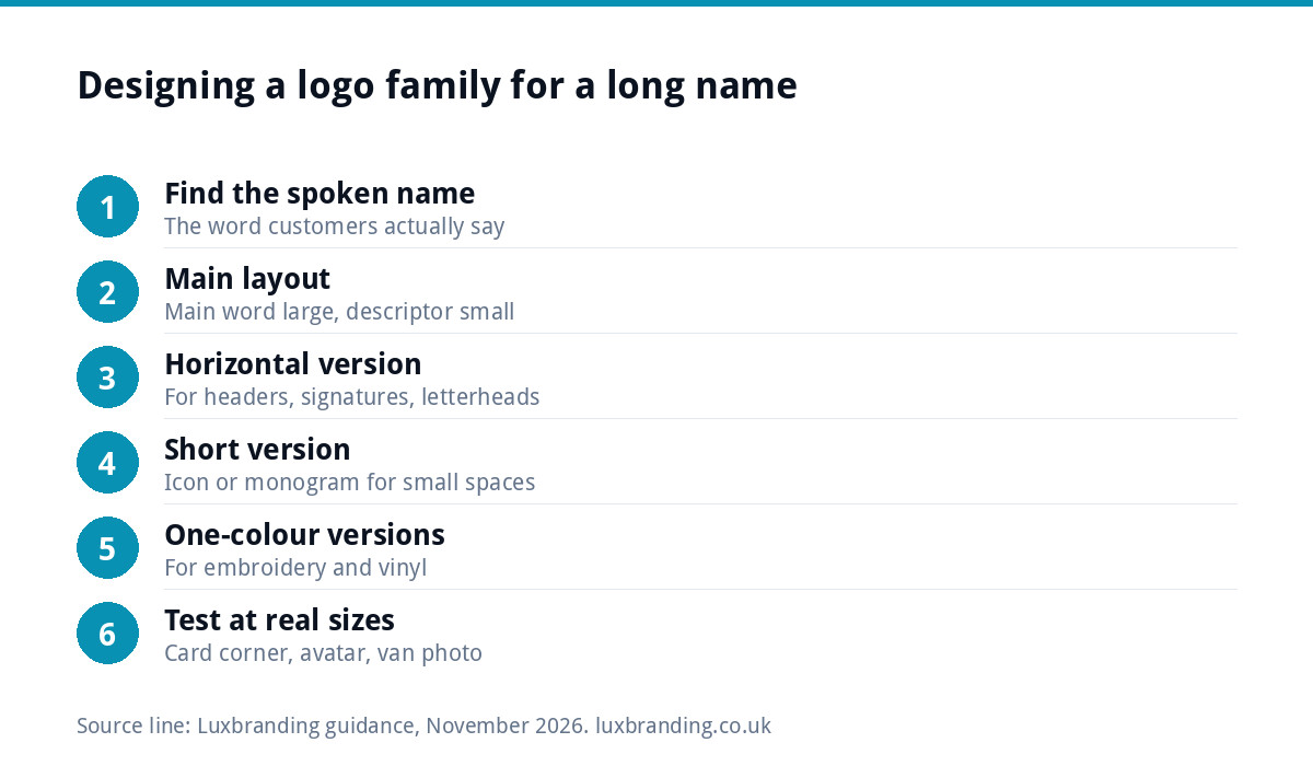
Six layouts that work
| Layout | How it works | Best for | Watch out for |
|---|---|---|---|
| Main word plus descriptor | “NORTHFIELD” large, “Property Maintenance” small beneath | Most trades; vans, websites, signs | Descriptor too small to read on vans |
| Stacked two or three lines | The name broken over lines at natural pauses | Square spaces, shirts, site boards | Awkward line breaks that change the meaning |
| Horizontal single line | The full name or main words on one line | Website headers, email signatures, letterheads | Too wide for anything square |
| Icon plus short name | A symbol beside the main word only | Social media, vehicles, uniforms | The icon must be simple and distinctive |
| Monogram or initials | “NPM” or “N” in a distinctive form | Avatars, favicons, embroidery, stamps | Initials alone mean nothing until people know you |
| Badge or emblem | The name set inside a shape | Heritage, hospitality, workwear patches | Small text inside the badge disappears |
Most businesses with long names end up using three of these: a main layout (usually main word plus descriptor), a horizontal version for wide spaces, and an icon or monogram for small ones.
Which part of the name should lead?
Listen to how customers refer to you. They rarely say “Northfield Property Maintenance and Building Services”; they say “Northfield” or “the Northfield lads”. That spoken name is the hero of the logo. The descriptive part, what you do, becomes a smaller supporting line or moves out of the logo entirely and into a strapline.
A quick test helps. Write the name out and circle the one or two words that are unique to you. Words such as “services”, “solutions”, “and sons”, “UK” and “Ltd” are almost never the ones to emphasise. Words that describe your trade, such as “roofing” or “electrical”, are useful but secondary. The distinctive word, often a place, a surname or an invented word, leads.
Legal name, trading name and the logo
Your logo does not have to show your full legal name. For a limited company, GOV.UK’s guidance on signs, stationery and promotional material says business letters, order forms and websites must show the registered number, the registered office address, where the company is registered and its limited status, usually by giving the full name with “Limited” or “Ltd”. That information belongs in the footer of your letterhead and website, not in the logo itself.
If you trade under a shorter name than your registered one, that is a trading name. GOV.UK’s guidance on choosing a company name notes that trading names must not include “Limited” or “Ltd” and must not use sensitive words without permission. It is sensible to check the short name is not already in use by a similar business before you print anything.
Keep the logo, signage and Google consistent
Whichever version of the name you lead with, use it consistently. Google’s Business Profile guidelines say your profile name should reflect your real-world business name as used consistently on your storefront, website and stationery, and that adding unnecessary information, such as service descriptions or location details, is not permitted. So if your vans and website say “Northfield Property Maintenance”, that is the name for your profile, not a keyword-stuffed version.
Consistency also helps people remember you. If the van says “Northfield”, the website says “NPM Services” and the invoices say “Northfield Property Maintenance and Building Services Ltd”, customers may not realise they are the same firm.
Where each version goes
| Place | Recommended version | Why |
|---|---|---|
| Van sides | Main word plus descriptor, large | Read from a distance and while moving |
| Van rear and bonnet | Stacked or icon plus short name | Narrow, square-ish spaces |
| Website header | Horizontal | Wide, short space at the top of the page |
| Social media profile picture | Icon or monogram | Shown as a small circle |
| Polo shirt chest | Stacked or icon plus short name | Small, square area; embroidery limits detail |
| Letterhead and invoices | Horizontal, with full legal details in the footer | Space for the full name where it is needed |
| Browser tab favicon | Monogram or icon | Tiny; letters beyond one or two are unreadable |
For embroidery and vinyl, there are extra limits on detail and colour; our guide to logo files for embroidery and signage explains them, and logo file formats explained covers which file goes where.
Line breaks that read well
When stacking, break the name where you would naturally pause when saying it, and keep words that belong together on the same line. “Northfield / Property Maintenance” works; “Northfield Property / Maintenance” splits the descriptor awkwardly. Watch for breaks that create a different meaning or an unfortunate word on its own line. Align the lines to one edge or centre them consistently, and let the main word be clearly larger, often two or three times the height of the descriptor.
A worked example
Take “Ashworth Heating, Plumbing and Renewable Energy Solutions Ltd”, a family firm known locally as “Ashworth’s”. A sensible logo family looks like this:
- Primary: “ASHWORTH” in a strong, wide typeface, with “Heating and Plumbing” in a smaller line beneath. “Renewable Energy Solutions” moves to a strapline on the website and van, where it can be read in full.
- Horizontal: a simple flame-and-droplet icon to the left of “ASHWORTH Heating and Plumbing” on one line, for the website header and email signature.
- Small: the icon alone, or a bold “A” built from the same shapes, for social media, the favicon and the chest of a polo shirt.
The full legal name, with “Ltd”, appears in the footer of the letterhead, the invoice and the website, alongside the company number and registered office. Every customer-facing version leads with the word people already use.
Should you shorten the name itself?
Sometimes the best fix is not in the logo. If customers already call you something shorter, adopting it as your trading name can simplify everything: vans, domain, social handles and signage. Check it is available first with our business name checker, which looks at domains and the register. A shorter name also makes a better web address and is easier to say on the phone.
If the long name carries real value, such as a family name with decades of reputation, keep it and let the layouts do the work.
Testing before you commit
- Print each version at the smallest size you will use it, such as a business card corner, and check it reads.
- Look at the van layout from across the road on a phone photo.
- Put the monogram in a 40-pixel circle and ask someone unfamiliar what they see.
- Check each version in one colour, for embroidery and single-colour print.
Getting a logo built for a long name
Long names are exactly why our Logo Design includes stacked, horizontal and icon-only layouts as standard: £129 one-off, with unlimited concepts, unlimited revisions within your brief, every file format and concepts in 48 hours. If you already have a logo that only works on one line, our Logo Edit is £50 for layout, spacing and proportion changes to a logo you already own. Every fixed price is on our pricing page.
Get the UK Branding Budget Worksheet (free)
A printable worksheet: decide what your brand needs now and price it against fixed published prices and the IPO trademark fee.
No spam. UK GDPR compliant. We only use your email to send this resource, unless you tick the box to hear from us.
Frequently asked questions
How do you design a logo for a long business name? +
Lead with the distinctive word customers actually say, set large, and put the descriptive part in a smaller line beneath. Then create a horizontal version for wide spaces and a short version, such as an icon or initials, for small square spaces like social avatars, favicons and embroidered shirts.
Does my logo need to include Ltd? +
No. GOV.UK says business letters, order forms and websites must show the company's registered number, registered office, place of registration and limited status, usually by giving the full name with Limited or Ltd. That belongs in the footer of your stationery and website, not in the logo itself.
Can I use initials as my logo? +
Initials or a monogram work well as a secondary version for avatars, favicons and embroidery, but on their own they mean little until people know you. Most small businesses should pair initials with the main name in their primary logo, and use the monogram only where space is tight.
Should my Google Business Profile use the full name in my logo? +
Use the name you consistently trade under. Google says the profile name should reflect your real-world business name as used on your storefront, website and stationery, without extra information such as service descriptions or locations. Keep your logo, vans, website and profile using the same version of the name.
What does a logo for a long name cost with Luxbranding? +
Our Logo Design is £129 one-off and includes stacked, horizontal and icon-only layouts as standard, with unlimited concepts, unlimited revisions within your brief and every file format. If you already own a logo that only works on one line, our Logo Edit is £50 for layout, spacing and proportion changes.