Quick answer
A logo becomes unreadable at small sizes because of fine detail: thin lines, small text, taglines, gradients and tight spacing that blur together on a business card, pen or profile picture. The fix is a simplified small-size version: drop the tagline, thicken strokes, open up spacing or use the icon alone. Our Logo Edit is £50.
It is a common moment of disappointment: the logo looked great on screen, then the first box of business cards arrives and the name is a smudge. Or the Google profile picture shows a grey blob where your mark should be. This guide explains why it happens, where it shows up, the six usual culprits, and how to fix it with an edit rather than starting again.
Why logos fall apart at small sizes
When you design or approve a logo, you usually see it large on a screen. At that size every fine line and small word is crisp. Shrink it to the corner of a business card, embroider it on a polo shirt or print it on a pen, and three things happen at once: thin lines get thinner than ink or thread can hold, small gaps close up, and small text drops below the size people can read.
Screens add their own problem. Small images are made of very few pixels, so curves and thin strokes get rounded off. Google’s guidance on favicons in search results requires a square image of at least 8 by 8 pixels and recommends going larger than 48 by 48 pixels so it looks good on different surfaces. At those sizes, there is simply no room for a strapline.
Where your logo appears small
| Place | Typical size | What usually goes wrong |
|---|---|---|
| Business card | A few centimetres wide on a standard UK card | Tagline and fine lines unreadable |
| Browser tab icon (favicon) | A few dozen pixels square | Wide logo squashed; text illegible |
| Social and Google profile pictures | Cropped into a small square or circle | Edges cut off; detail lost |
| Embroidered polo or cap | A small chest or front panel | Thin strokes and small letters cannot be stitched |
| Pens, keyrings, lanyards | Often under a couple of centimetres tall | Everything except a bold shape disappears |
| Email signature | Shown small, often scaled by the email app | Blurry or pixelated if supplied too small |
Google’s Business Profile photo guidelines recommend images of 720 by 720 pixels, with a minimum of 250 by 250, as JPG or PNG. Your profile logo is shown far smaller than that in search results and on Maps, so the design itself has to survive the shrink, not just the file.
The six usual culprits
- A tagline or strapline set in small type underneath the name.
- Thin strokes or outlines, especially hairline borders and line-art icons.
- Too much detail in the icon, such as a full house with windows, tiles and a chimney.
- Tight letter spacing, so letters merge when ink spreads or pixels blur.
- Gradients and shadows, which turn muddy when small or printed cheaply.
- A very wide layout, so the whole thing has to shrink to fit a small square.
Most logos with a small-size problem have two or three of these at once. The good news is that each one can be dealt with in a small-size version without changing what people recognise.
Six fixes, from simplest to biggest
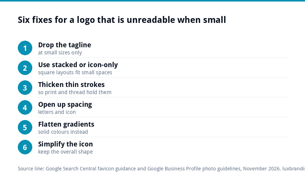
- Drop the tagline at small sizes. Keep it for signs and the website header, remove it everywhere small.
- Use the stacked or icon-only layout. A square version fits profile pictures, favicons and pens far better than a long horizontal one.
- Thicken thin strokes in the small version so they hold up in print and stitching.
- Open up the spacing between letters and around the icon.
- Flatten gradients and shadows into solid colours.
- Simplify the icon, removing details that disappear anyway, while keeping its overall shape.
Fixes one and two often need no design work at all if your logo already came with several layouts. Fixes three to six are design edits made to the vector file.
Make a small-size version, not a new logo
Big brands do not use one identical logo everywhere. They keep a full version for large uses and a simplified version for small ones, and nobody notices because the simplified version keeps the same shape, colours and lettering style. That is exactly the approach for a small business.
Think of it as a family: the full logo for your van and shop sign, the horizontal version for the website header, a stacked version for social posts and an icon-only mark for favicons, profile pictures and embroidery. If your current logo came as one single file, our Logo Design at £129 includes stacked, horizontal and icon-only layouts as standard, but if you are happy with the logo itself, an edit is all you need.
A typical example: an electrician’s logo with a lightning-bolt icon, the business name in a condensed font and “Domestic, Commercial, Industrial” underneath. On the van it reads perfectly. On a card the strapline is a grey line and the condensed letters run together. The small version keeps the bolt and the name, drops the strapline, widens the letter spacing slightly and thickens the bolt’s outline. Customers see the same logo; it just reads at a glance.
Contrast still matters
Colour can make a small logo unreadable too. Pale grey on white or dark blue on black might be fine large, but it vanishes small. The Web Content Accessibility Guidelines set a contrast ratio of at least 4.5:1 for normal text. Their contrast guidance exempts text that is part of a logo or brand name, but that exemption only means you are not required to fix it, not that people can read it.
For small uses, a solid one-colour version, in black, white or your strongest brand colour, is usually the most legible. It also tends to be cheaper to print and easier to embroider.
Test it before you print
- Print the logo on ordinary paper at the exact size it will appear on the card or item.
- Hold it at arm’s length and ask someone who does not know the business to read it.
- Look at it as a 32-pixel image on your phone and in a small circle.
- Check the one-colour version on a dark background as well as a light one.
- Ask your printer or embroiderer for a proof before the full run.
Five minutes of testing costs nothing. A box of cards with an unreadable logo costs a reprint. Our guide to logo files for embroidery and signage covers the file side of those jobs.
Edit or redesign?
| Problem | Usually an edit | Usually a redesign |
|---|---|---|
| Tagline too small | Yes: make a version without it | |
| Thin strokes, tight spacing | Yes: thicken and open up | |
| Gradients turning muddy | Yes: flat colour version | |
| Wide logo, no square version | Often: rearrange into a stacked layout | If nothing in it works as an icon |
| Icon is a detailed illustration | Sometimes: simplify | If simplifying loses what makes it recognisable |
| Logo looks dated or does not fit the business | Yes |
If several problems point to a redesign, our guide to the signs your logo needs a redesign will help you decide.
What a Logo Edit includes
Our Logo Edit is £50 one-off for changes to a logo you already own: colour, font, spacing, proportions or layout, keeping the mark recognisable. It is turned around in 24 to 48 hours from receiving the logo file and your list of changes, and you get the edited vector back in every format (SVG, AI, EPS, PDF, PNG, JPG) with colour codes and full ownership of the amended artwork. Revisions are unlimited within the changes you asked for.
Original files help but are not essential. If you only have a JPG or PNG, the logo has to be rebuilt as vector first through our Recreate & Vectorise service, £79 for one layout and £39 per additional layout. If the edit turns out to be bigger than an edit, we say so before any work starts.
Where we fit
Order the Logo Edit online, then reply to the order confirmation email with your logo file and a short list of changes, such as “a version without the tagline, thicker lines, and an icon-only square”. If you also need new cards, our business card design lays the small version out properly for print. Every price is on our pricing page, or email us at support@luxbranding.co.uk if you are not sure which you need.
Get the UK Branding Budget Worksheet (free)
A printable worksheet: decide what your brand needs now and price it against fixed published prices and the IPO trademark fee.
No spam. UK GDPR compliant. We only use your email to send this resource, unless you tick the box to hear from us.
Frequently asked questions
Why does my logo look blurry or unreadable on business cards? +
Usually because the design has detail that cannot survive the shrink: a small tagline, thin lines, tight letter spacing or gradients. Ink spreads slightly in print, so fine gaps close and small text blurs. A low-resolution file makes it worse. The fix is a simplified small-size version supplied as vector artwork.
Should I remove the tagline from my logo? +
Not from the logo as a whole, but from the small versions. Keep the tagline for large uses such as signs, vans and the website header, and use a version without it on business cards, favicons, profile pictures, pens and embroidery. Most well-run brands use several layouts like this without anyone noticing.
What size should a logo be on a business card? +
There is no single right size, but it must be readable at arm's length. Print a test at the exact size on ordinary paper and ask someone unfamiliar with the business to read it. If the name or icon struggles, use a stacked or icon-only version rather than shrinking the full horizontal logo further.
Can a small-size logo version be made without redesigning? +
Yes, in most cases. Dropping the tagline, thickening thin strokes, opening up spacing, flattening gradients and rearranging into a stacked or icon-only layout are all edits to the existing vector file. Our Logo Edit covers changes like these for £50 while keeping the mark recognisable to your customers.
What if I only have a JPG of my logo? +
A JPG cannot be edited cleanly, so the logo has to be rebuilt as vector first. Our Recreate and Vectorise service does that for £79 for one layout, with additional layouts at £39 each. Once you have the vector, the small-size changes can be made as a Logo Edit.