
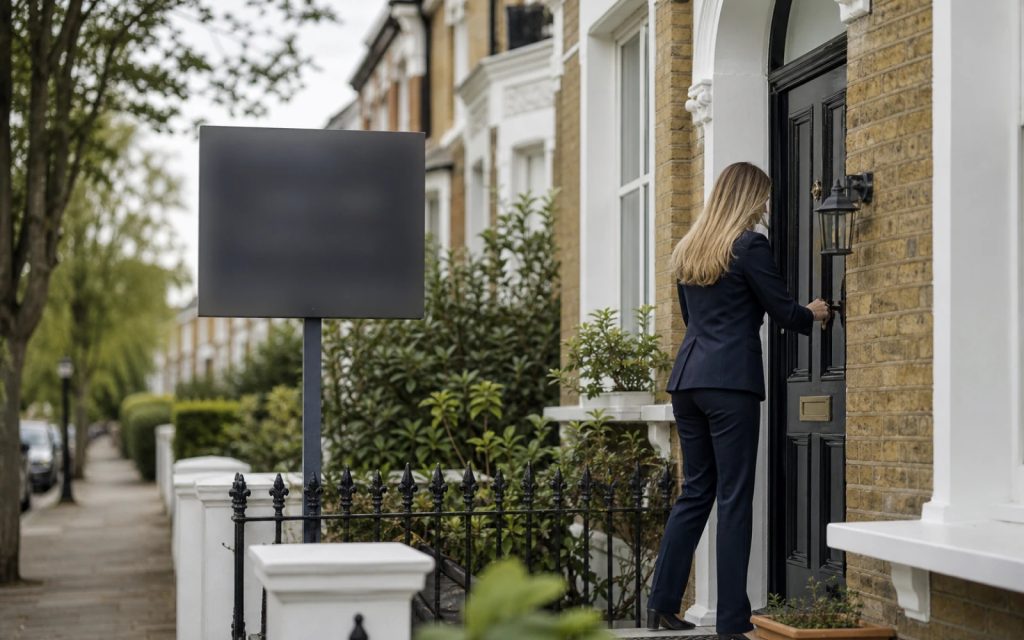
For an estate or letting agent, your logo isn’t decoration — it’s the first impression a homeowner forms before you’ve said a word. It sits on the For Sale board outside the property, on the Rightmove and Zoopla thumbnail, in the window display on a busy high street and on every brochure and valuation letter. Vendors choosing who to trust with their biggest asset are reading those marks subconsciously, deciding whether you look like the established, premium agent worth a higher fee, or one of the cheaper boards down the road. We’ve built identities for UK estate and letting agents, and the brief is consistent: look premium and trusted, and stand out on a street full of competitor boards.
Quick answer
A strong estate agent logo is bold, high-contrast and instantly legible from across a street. A clean wordmark or simple combination mark in a confident, premium palette works best: it must stand out on a For Sale board, stay sharp as a tiny Rightmove and Zoopla thumbnail, and look established in a window display. Balance modern polish with the trust of a long-standing firm, and avoid generic house-and-roof clip-art. Budget from £129 for a clean mark with full vector files.
What an estate agent logo actually has to do
Unlike most small businesses, an estate agent’s logo competes in public, side by side with rivals, on a board planted in someone’s front garden. It has one demanding job: be the most confident, most legible mark on the street. That gives three priorities, in order:
- Standout from distance. A For Sale board is read from a moving car or across the road. If your mark blurs into the hedge while the agent next door pops, you’ve lost the comparison before it began.
- Trust and permanence. Vendors are handing over a six-figure asset. The mark must feel established and dependable — not like a start-up that might fold mid-sale.
- Premium without snobbery. It should justify your fee and feel high-end, while staying approachable enough that ordinary homeowners feel welcome walking in.
Premium vs traditional: styles and colours that work
Estate agency branding splits broadly into modern-premium and established-traditional, and the right choice depends on your market and pricing.
- Bold, clean wordmarks: a confident agency name in a strong, legible typeface is the workhorse of the sector. It reads instantly on a board and scales to a thumbnail without losing identity.
- Confident, high-contrast palettes: deep navy, forest green and charcoal signal trust and heritage; a single sharp accent (gold, teal or a brand cyan such as #0DC6EB) adds modern lift. Avoid pale, low-contrast colours that vanish outdoors.
- Modern, premium look. Generous spacing, a refined sans-serif and a restrained monogram suit higher-value sales and lettings aimed at younger buyers.
- Established, traditional look: a serif typeface, a crest or a subtle emblem signals longevity and gravitas, which reassures vendors of premium and period homes.
- A subtle icon, if any. An abstract monogram, key, doorway or rooftop line reads far more premium than a literal cartoon house with a sun and a chimney.
The For Sale board test
Before approving any concept, hold it to the board test, because the board is where your brand works hardest. Mock the logo up at full board scale, then ask:
- Can you read it from across the street? Squint, or step back six metres from the screen. If the name turns to mush, the type is too thin or the contrast too weak.
- Does it survive weather and distance? Boards live outdoors for months. High-contrast, solid colours hold up; gradients, fine detail and pale tones fade and blur in rain and low light.
- Does it beat the boards either side? Imagine three competitor boards in a row. The most legible, most confident mark wins the vendor’s eye — and that should be yours.
A logo that passes the board test almost always works everywhere else, because no other application is as unforgiving.
Where your agency logo gets used
An estate or letting agent’s mark appears in more high-stakes places than most owners realise, and it has to hold up in every one:
| Application | What it demands of the logo |
|---|---|
| For Sale & To Let boards | Large-scale, high-contrast, weatherproof; a vector file that prints crisp at full board size |
| Rightmove & Zoopla portal thumbnails | Stays legible and recognisable shrunk to a tiny branded thumbnail beside rivals |
| High-street window display | Commands attention at glass scale; a strong mark against backlit property cards |
| Brochures & valuation packs | Clean print version that elevates premium property photography, not competes with it |
| Website & social | Works small in a header and as a favicon and avatar; clear at any size |
| Single-colour print | Crisp monochrome version for stamps, letterheads and faxed documents |
Mistakes estate agents make with their logos
Most weak agency logos fail in the same predictable ways:
- House-and-roof clip-art. A cartoon house, a sun over a rooftop, a generic key: overused, forgettable, and indistinguishable from every other board on the street.
- Too detailed for a board. Fine lines, gradients and intricate crests look fine on screen but collapse into a smudge at board scale or thumbnail size.
- Low contrast. Pale-on-pale or grey-on-white might feel tasteful indoors, but outdoors it disappears against hedges, brick and sky.
- Trying to look corporate-cold. All-grey, all-angles branding reads impersonal — homeowners want a firm that feels trustworthy and human, not a faceless chain.
- No simplified or monochrome version. Portal thumbnails, embroidery and single-colour print all need a stripped-back mark, not your full detailed logo squeezed down.
What you should pay, and what’s included
For most UK estate and letting agents, a professional logo costs from £129. At that level you should receive a clean primary mark plus everything needed to deploy it across boards, portals and print without paying extra later:
- Primary logo and a simplified secondary mark for small uses (favicon, portal thumbnail, social avatar, embroidery)
- Full vector files (SVG/AI/EPS) that scale to full board size without pixelation
- Monochrome and reversed (white-out) versions for single-colour print and dark backgrounds
- Print-ready CMYK and web RGB exports
- Unlimited revisions and full copyright transfer, so the agency owns the mark outright
Multi-branch agencies or firms building a full identity (board templates, brochure systems, brand guidelines) typically invest £299 to £999 for a complete system. For the full picture across every sector, see our UK logo cost guide, and our small-business logo guide covers building the wider brand around the mark.
What to do next
If your current logo blurs on the board, vanishes in the Rightmove thumbnail or simply looks dated next to a smarter rival, it’s quietly costing you instructions. The sensible sequence is: commission a bold, high-contrast mark with full vector files, run it through the board test before approving, then roll it onto your boards, portal branding, window display and brochures together so the brand feels deliberate and established everywhere a vendor looks.
Logo design for estate & letting agents
Premium, board-ready agency logos from £129
High-contrast vector files, portal-ready thumbnails, monochrome versions, full ownership. Unlimited revisions, 48-hour first concepts.
Get the UK Branding Cost Calculator (free)
A 1-page worksheet that estimates what your business should realistically spend on branding based on revenue stage, sector and timeline.
No spam. Unsubscribe any time. UK GDPR compliant — your email is only used to send this resource.
Frequently asked questions
What makes a good estate agent logo? +
A good estate agent logo is bold, high-contrast and instantly legible from a distance. It must stand out on a For Sale board across the street, stay sharp as a tiny portal thumbnail, and feel premium and trusted without relying on generic house-and-roof clip-art.
Why does my logo need to work on a For Sale board? +
Your board is where the logo works hardest, read from a moving car or across the road, in all weather, beside competitor boards. If it blurs or fades at full board scale, you lose the vendor's attention before they ever phone, so high contrast and legibility are essential.
Should an estate agent logo look modern or traditional? +
It depends on your market. Modern, premium marks with refined type suit higher-value and younger buyers, while traditional serifs or a subtle crest signal heritage and reassure vendors of period and premium homes. Either way it must read clearly and feel trustworthy and established.
How much does a logo for an estate agent cost? +
A professional estate agent logo costs from £129, including a primary and simplified mark, full vector files that scale to board size, monochrome versions and full ownership. Multi-branch agencies building board templates and brand guidelines typically invest £299 to £999.


