Quick answer
An electrician’s logo has one job: make you look safe, qualified and established in the two seconds a homeowner spends scanning a Checkatrade listing or a passing van. That means a bold, simple mark that stays legible at 40mm on an embroidered polo and at 2 metres on a van door, not a detailed illustration of a lightning bolt circuit board.
The four places your logo has to work
1. Van livery: your hardest-working advert
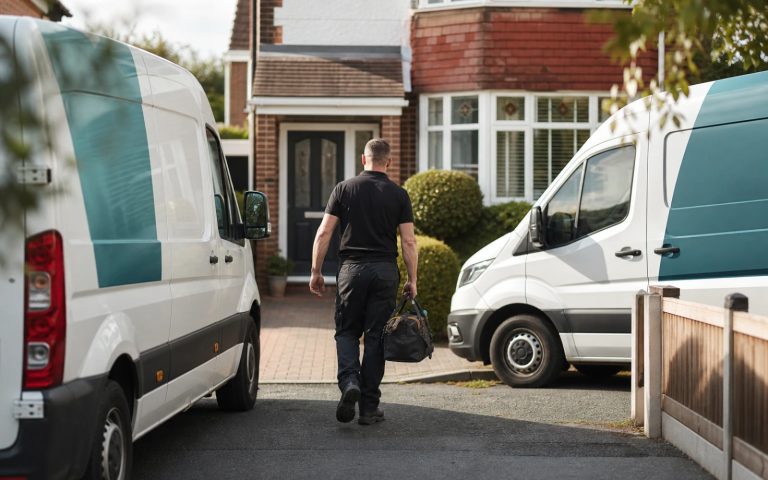
A sign-written van generates roughly 30,000 impressions a day in urban UK areas. Your logo needs to be readable at a glance from 20 metres: strong silhouette, high contrast against the van colour, and a wordmark that doesn’t collapse when scaled across a door panel. Thin script fonts and gradient effects die here: they either vanish at distance or cost a fortune in printed wrap detail nobody sees.
2. Workwear and embroidery
Embroidery has a resolution floor: fine lines under about 1mm of thread simply disappear, and gradients can’t be stitched at all. If your logo needs a “simplified version” for polos, it wasn’t designed for the trade in the first place. A properly built electrician logo ships with a one-colour variant that stitches cleanly at 40 to 60mm wide.
3. Directory profiles: Checkatrade, MyBuilder, TrustATrader
On directories your logo renders as a small square avatar next to dozens of competitors. Square-friendly layouts (icon above name, or a strong monogram) outperform wide horizontal lockups that shrink to an unreadable strip. This is where most DIY logos quietly lose quote requests.
4. Quotes, invoices and certificates
Electrical work is trust-critical: customers are letting you into their consumer unit. A clean logo on your quote PDF, next to your NICEIC or NAPIT registration, signals an established business rather than a bloke with a Transit. Keep certification body marks separate from your own logo; combining them breaches most schemes’ brand rules.
Colour psychology for electricians
| Colour | Signal | Watch out |
|---|---|---|
| Blue | Trust, safety, competence: the default for good reason | Crowded: differentiate with a second accent |
| Yellow/amber | Energy, voltage, visibility; pairs well with dark navy | Poor legibility on white backgrounds alone |
| Red | Urgency, strong for emergency/24hr electricians | Can read as “danger” for domestic work |
| Green | Eco, EV-charger and renewables specialists | Blends in if your work is general domestic |
Symbols: the lightning bolt problem
Roughly half of UK electrician logos use a lightning bolt. That’s not automatically wrong (it communicates instantly), but a generic bolt makes you interchangeable. The fix is either a distinctive treatment (a bolt integrated into your initial letter, a negative-space bolt inside a plug pin) or skipping the cliché entirely in favour of a strong wordmark with an electrical accent. In our portfolio of trade logos, the marks that clients report the most van-enquiries from are almost all bold wordmark-led designs.
What a professional electrician logo costs in the UK
Budget marketplaces run £20 to £80 but recycle templates across hundreds of trades, a real problem when a rival electrician two towns over has your logo in green. A professional bespoke logo from a UK studio typically runs £150 to £500 for a trades-focused package, and £500 to £1,500+ from larger agencies. Full numbers by tier are in our UK logo cost guide, built from real project data.
What you should receive
- Vector master files (AI/SVG/EPS/PDF), required by sign-writers and embroiderers
- One-colour and reversed (white) variants for workwear and dark van colours
- Square avatar version for directory profiles and social
- PNG exports at web sizes, plus a favicon set for your website
- Basic usage sheet: minimum sizes, clear space, colour codes
We’ve designed logos for electricians, EV-charger installers and electrical contractors across the UK. See the logo design service for packages and turnaround, or browse our guide to logo design for tradespeople for the wider picture across the trades.
The real spend: logo versus everything it goes on
The logo is the cheapest line in the branding budget, and the one most electricians agonise over longest. What decides the total is the application: a mark that needs four colours, fine detail and a gradient multiplies the cost of every van, polo and sign for as long as the business exists. Here is where the money actually goes for a one-van sole trader kitting out properly in 2026.
| Item | Typical UK cost | How logo design affects it |
|---|---|---|
| Logo design, trades-focused package | £129 to £500 | One-off |
| Van graphics, partial vinyl (doors, rear, panels) | £350 to £800 per vehicle | Extra spot colours and detail cutting add £50 to £200 |
| Full van wrap | £1,500 to £3,000 | Complex marks need artwork rework before printing |
| Embroidered polos and softshells | £12 to £35 per garment, plus £20 to £60 digitising setup | Detailed logos need a separate stitch file and may re-digitise per size |
| Business cards, 500 | £40 to £120 | Negligible |
| Site board or shop sign | £150 to £600 | Poor contrast means redesign or reprint |
Two numbers in that table are worth dwelling on. Digitising is a one-off charge per logo per size range, so a mark that needs a simplified variant for chest embroidery and another for cap fronts pays it twice or three times. And any van graphic cut from vinyl rather than printed charges by complexity, a two-colour bold wordmark is a cheap cut, an illustrative bolt with a shaded gradient is not. A £129 logo that saves £150 on each of three vehicles and £60 on digitising has already paid for itself before you have quoted a single job. The wider vehicle numbers, including per-panel breakdowns, sit in vehicle wrap and signage design costs.
Testing a concept before you commit
Ask for these five checks before you sign off. They take a designer ten minutes and catch almost every expensive mistake.
- The 40mm test. Print the logo at 40mm wide on ordinary paper. If any element blurs into a smudge, it will not stitch on a polo either.
- The photocopy test. Convert to pure black and white with no greys. Certificates, invoices printed on a customer’s home printer and faxed job sheets all live in this world. If the mark collapses, it is not finished.
- The van-colour test. Mock it on white, silver, dark grey and blue panels. Most vans on UK forecourts are white or silver, but the second-hand Transit you buy in three years might not be, and a logo with no reversed variant will cost you an emergency redesign.
- The squint test at distance. View it on screen from three metres. What survives is your silhouette; that is what a driver behind you actually reads.
- The circle crop. Drop it into a circular avatar frame. Directories, WhatsApp Business and Google profiles all crop to circles or squares, and a wide lockup loses its ends.
What goes on the van besides the logo
Livery fails more often on hierarchy than on artwork. A driver at 30mph has roughly two seconds and can absorb three things. Rank them: the trade and the phone number are the message, the business name is identity, and everything else is decoration. In practice that means the phone number set larger than the company name, “Electrician” or “Electrical Contractor” in plain readable type because a clever name tells nobody what you do, one town or region rather than a list, and accreditation marks (NICEIC, NAPIT, Part P) grouped in one clean strip rather than scattered. Leave the website URL small unless it is short and memorable; nobody types a long domain from a moving vehicle, but they will search your business name if the van made an impression.
Resist the temptation to list services down the side panel. Six bullet points at motorway speed read as a grey block. If you must, put the list on the rear doors, where drivers sit stationary behind you at lights.
Questions to ask before you pay
Whether you go to a marketplace, a freelancer or a studio, four questions separate a usable asset from a JPEG.
“Which files do I get, and do I own them outright?” You want vector masters and written confirmation that the copyright transfers to you on payment. A designer who supplies only PNGs, or who retains ownership, has sold you a licence to a picture. The distinction between the formats and what each is actually for is set out in logo file formats explained.
“Has this mark been checked against other electricians?” Ask for a basic search of trade directories and the trade mark register in your region. Discovering a near-identical logo on a rival’s van two years in means paying twice.
“What does it look like stitched, and how many revisions do I get?” A designer who has supplied trade clients will already have a one-colour stitch-ready variant in the pack; one who has not will hand you a mark your embroiderer redraws badly, at your expense. Fixed-fee packages should also state concepts and revision rounds up front.
When to spend more, and when not to
A sole trader working domestic rewires and consumer unit changes does not need brand guidelines or a colour system, a solid mark, a one-colour variant and a usage sheet is the whole requirement. Spend more in three situations: when you run three or more vans and consistency across vehicles, workwear and paperwork starts to compound; when you are moving into commercial or contractor work where a tender document sits next to national competitors; and when you are building toward selling the business, where a transferable name and mark is an asset rather than your personal reputation. Kitting out a growing team is also where the ordering question shifts from design to production, which is covered properly in branded workwear and merch, and where getting the artwork specified correctly for vehicle wrap and signage design saves the sign-writer redrawing your logo from a screenshot.
Get the UK Branding Budget Worksheet (free)
A printable worksheet: decide what your brand needs now and price it against fixed published prices and the IPO trademark fee.
No spam. UK GDPR compliant. We only use your email to send this resource, unless you tick the box to hear from us.
Sources & Further Reading
- NICEIC Certification, NICEIC
- Checkatrade Trade Directory, Checkatrade
- UK Business Demography, Office for National Statistics
Frequently asked questions
How much does an electrician logo cost in the UK? +
Template marketplaces: £20-£80 (non-exclusive, recycled across trades). Bespoke from a UK studio: £150-£500 typical for a trades package. Larger agencies: £500-£1,500+. You should always receive vector files and a one-colour variant for embroidery.
Should my electrician logo have a lightning bolt? +
Only with a distinctive treatment: about half of UK electrician logos already use one. Integrating the bolt into your initials or using negative space keeps the instant recognition without looking generic. A strong wordmark with an electrical accent often outperforms a symbol.
What colours work best for an electrician logo? +
Navy/blue for trust (the sector default), amber/yellow accents for energy and visibility, red for 24hr emergency positioning, green for EV-charging and renewables specialists. High contrast matters more than the specific hue. The logo must read on a van at 20 metres.
What files do I need for van sign-writing and workwear? +
Vector files (SVG, EPS, AI or vector PDF) for sign-writers, plus a one-colour version for embroidery. Embroidery cannot reproduce gradients or lines finer than ~1mm of thread, so your logo needs a simplified single-colour variant designed in from the start.
Can I put the NICEIC or Checkatrade logo inside my own logo? +
No. Certification bodies and directories have brand rules that prohibit merging their marks into yours. Display them alongside your logo on vans, quotes and your website instead, using the official artwork they supply to registered members.