Choosing a logo for a construction company isn’t decoration. It’s the first proof that you’re a firm worth trusting with a contract. Before a client reads a tender, before a homeowner signs off an extension, the mark on your hoarding, your hi-vis and your van has already told them whether you look established and capable, or like a one-job outfit assembled last week. We’ve built identities for UK builders, groundworks contractors, M&E firms and developers, and the brief rarely changes: look solid, established and built to scale.
Quick answer
A good construction logo reads as solid, established and trustworthy. Strong wordmarks or bold combination marks in a confident palette (deep blues and greys for dependability, safety yellow or orange for visibility) work best. It must stay legible at hoarding and vehicle scale, survive a single-colour stamp on a tender, and sit cleanly beside accreditation marks like CHAS and Constructionline. Budget from £129 for a sharp mark with full vector files.
What a construction logo actually has to do
Unlike a boutique or a cafe, a construction logo has a hard, practical job: signal that you are safe, capable and here to stay. A client awarding work, or a homeowner letting a crew onto their property, is taking a risk, and every visual cue either builds confidence or quietly erodes it. That means three priorities, in order:
- Solidity. The mark should feel weighty and permanent, the visual equivalent of a firm that has been delivering on time for fifteen years, not one that might vanish before snagging.
- Legibility at distance. Site hoardings and vehicle livery are read from across a road or a busy site. Thin, intricate marks disappear; bold, simple ones carry.
- Credibility under scrutiny. On a tender document or a pre-qualification questionnaire, your logo sits next to bigger competitors and regulator marks. It has to look like it belongs in that company.
Styles and colours that work for construction
- Bold wordmarks or strong combination marks: a confident company name in a heavy, square-shouldered sans-serif, often paired with a simple geometric symbol. Stability over flourish.
- Dependable palettes: deep navy and slate grey signal reliability and engineering rigour; safety yellow and orange add visibility and a nod to PPE and plant. Use the high-vis colour as an accent, not the whole identity.
- A restrained, structural icon: an abstract chevron, a clean geometric monogram or a subtle structural motif reads as far more established than literal hard-hat, brick or crane clip-art.
- Weight and contrast. Heavier strokes and strong colour contrast hold up when the mark is shrunk to a phone screen or blown up to a fifteen-metre hoarding.
Where your construction logo gets used
A construction mark lives in far more demanding places than most owners expect, and it has to hold up in every one of them:
| Application | What it demands of the logo |
|---|---|
| Site hoardings & signboards | Large-scale clarity; a vector file that stays crisp at several metres wide |
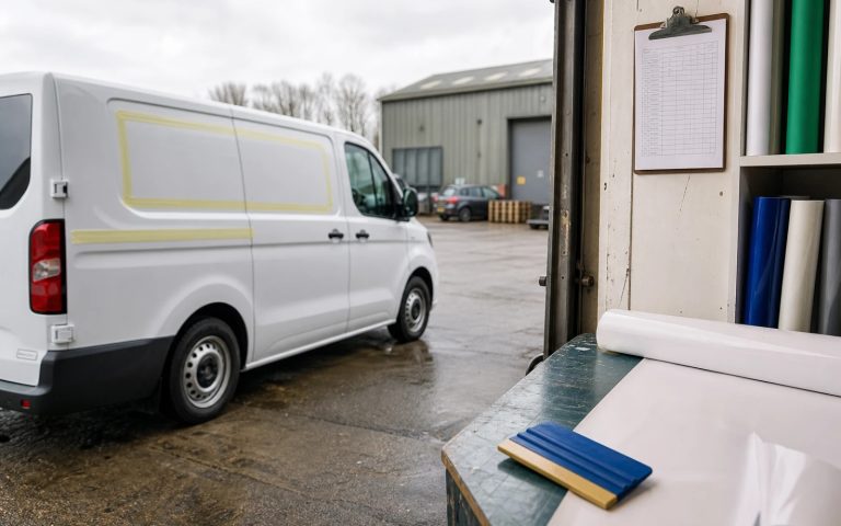
| Vehicle & plant livery | Reads at speed on a moving van; works across awkward panel shapes |
| Hi-vis & workwear | Simple, embroidery- and print-ready form that survives a small chest badge |
| Tender & PQQ documents | Clean monochrome version that prints sharp in single colour |
| Beside accreditation marks | Sits neatly alongside CHAS, Constructionline, Gas Safe and ISO logos |
Mistakes construction firms make with their logos
Most weak construction logos fail in the same predictable ways:
- Literal clip-art. A cartoon hard hat, a stock crane, a brick wall or a roof outline: overused, generic and instantly forgettable. It marks you as small.
- Too much detail. Fine lines, gradients and tiny text vanish on a hoarding or a van seen at thirty miles per hour. Complexity is the enemy of large-scale legibility.
- No monochrome version. Tenders, stamps, invoices and faxed certificates all need a clean single-colour mark. Plenty of firms only have a full-colour file and improvise badly.
- All high-vis, all the time. Yellow-and-black everything can read as cheap and shouty. Used as an accent it signals safety; used as the whole identity it undermines credibility on a tender.
- A mark that fights the accreditations. If CHAS, Constructionline or Gas Safe logos always sit beside yours, your palette and weight should complement them, not clash.
What you should pay, and what’s included
For most UK construction firms, a professional logo costs from £129. At that level you should receive a strong primary mark plus everything you need to deploy it across site, vehicles and paperwork without paying extra later:
- Primary logo and a simplified secondary mark for small uses (favicon, chest badge, social avatar)
- Full vector files (SVG/AI/EPS) that scale to hoarding size without pixelation
- Monochrome and reversed (white-out) versions for single-colour stamps and dark backgrounds
- Print-ready CMYK and web RGB exports, plus formats your signwriter and embroiderer can use directly
- Unlimited revisions and full copyright transfer, so the firm owns the mark outright
Larger contractors (multi-division firms, developers, or businesses scaling toward a full identity with brand guidelines, document templates and livery specs) typically invest £299 to £999 for a complete system. For the full picture across every sector, see our UK logo cost guide.
Trades, contractors or developers: does it change the logo?
It changes the tone more than the structure. A domestic-facing trade (a builder, roofer or groundworker chasing local homeowners) benefits from a mark that feels approachable and dependable, the firm you’d happily let work on your house. A principal contractor or M&E firm bidding for commercial and public tenders needs to look corporate and engineering-led: restrained palette, strong typography, room to sit beside ISO and Constructionline marks without looking outclassed. A developer or housebuilder can carry more polish, because the logo also has to sell aspiration on a marketing suite and a sales board. In every case the underlying rules hold: solid, legible, professional and ownable.
How the logo quietly affects winning work
Most clients now size you up online before any call, and many tenders are won or lost on first impressions of capability. Your logo appears on your website, your van as it parks on a job, your hoarding as the neighbours watch, and at the top of every quote and tender you submit. A dated or homemade mark doesn’t lose you contracts dramatically; it loses them quietly, as a client picks the firm that simply looks more established and better organised. A strong, professional logo won’t win a job on its own, but it removes a silent reason to award the work to someone else.
What to do next
If your current logo feels dated, generic, or like it was knocked together when the firm started, it’s quietly costing you credibility on every tender and every street where your van parks. The sensible sequence is: commission a solid, scalable mark with full vector files, roll it onto your hoardings, vehicles, workwear and tender templates, then update your website and any directory or accreditation listings to match. For a wider view of building a trusted brand beyond the logo, our small-business logo guide covers the next steps.
Logo design for construction companies
Solid, trusted construction logos from £129
Hoarding- and vehicle-ready vector files, monochrome versions, full ownership. Unlimited revisions, 48-hour first concepts.
Get the UK Branding Budget Worksheet (free)
A printable worksheet: decide what your brand needs now and price it against fixed published prices and the IPO trademark fee.
No spam. UK GDPR compliant. We only use your email to send this resource, unless you tick the box to hear from us.
Sources & Further Reading
Frequently asked questions
What makes a good logo for a construction company? +
A strong construction logo looks solid and established, stays legible at hoarding and vehicle scale, works in single colour on tenders, and sits cleanly beside accreditation marks like CHAS and Constructionline. Bold type and a confident, dependable palette do the heavy lifting.
What colours work best for a construction logo? +
Deep navy and slate grey signal reliability and engineering rigour, while safety yellow or orange add visibility and a nod to PPE and plant. Use the high-vis colour as an accent rather than the whole identity, or it can read as cheap on a tender.
Will my logo work on hoardings and vehicle livery? +
It will if it is supplied as scalable vector files and built bold enough. Thin, detailed marks vanish at distance or at speed, so a construction logo needs heavy strokes, strong contrast and a simple form that stays crisp from a chest badge to a fifteen-metre hoarding.
How much does a construction company logo cost in the UK? +
A professional construction logo starts from £129, which should include vector files, monochrome and reversed versions, print and web exports, and full ownership. Larger contractors needing a full identity with guidelines and livery specs typically invest £299 to £999.
Does a construction logo need a hard hat or crane? +
No. Those symbols are used so widely that they make you look like everyone else. A bold name and a simple distinctive mark read better on hoardings, vans and PPE, and are easier to protect.