Quick answer
Keep your main menu visible on desktop and, on mobile, keep the call button and one or two key links outside the hamburger; it is how we build every £499 custom website. Nielsen Norman Group testing found that hidden-only navigation was used less often, and found later, than visible or combined menus.
The hamburger menu, the three-line icon that opens a hidden list of links, is everywhere, and it is often the first thing a web designer reaches for. It saves space, but it also hides your options from visitors. For a small business, where one missed tap can be one missed enquiry, it is worth getting this right. This guide explains what the research found, what to keep visible, and how to make a hidden menu work when you do use one.
What the hamburger menu is (and is not)
A hamburger menu is a button, usually three horizontal lines, that reveals the site’s navigation when tapped. On a phone, it solves a real problem: there is not enough width to show six or seven links across the top of the screen.
What it is not is a free choice. Anything behind the button is out of sight, and people tend to use what they can see. The question is not “hamburger or no hamburger”, but which links deserve to stay visible and which can sit behind the button.
What the research found
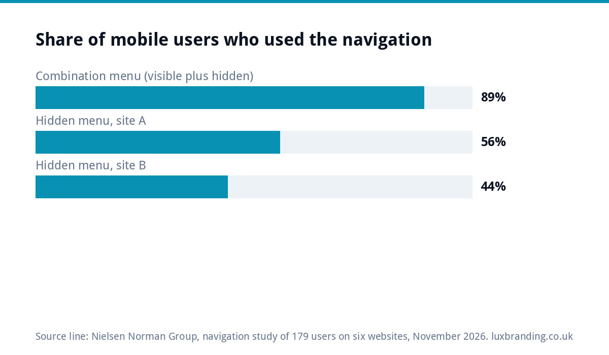
The usability research firm Nielsen Norman Group tested hidden, visible and combination navigation with 179 people across six websites on desktop and smartphones. Its write-up, Find navigation on mobile, even with a hamburger, reports that hiding navigation hurt the user experience on both desktop and mobile, with a smaller effect on mobile.
On mobile, the sites that combined visible links with a hidden menu performed best. On one combination design, 89% of participants used the navigation, compared with 44% on a site that hid it behind a low-key icon, and they reached it sooner, after 24 seconds rather than 33. Another hidden-menu site saw 56% use. The recommendation was to consider visible or combination navigation instead of hiding everything, and, if you must hide it, to make the menu button prominent, clearly tappable and labelled.
Desktop: keep it visible
On a laptop or desktop screen there is plenty of room across the top for five to seven links. Hiding them behind a hamburger icon on a wide screen saves nothing and costs clicks, and the research above found the penalty for hidden navigation was larger on desktop than on mobile.
A visible desktop menu also tells visitors in a glance what you do: Services, Areas, Gallery, Reviews, About, Contact. That instant summary is part of what makes a small business site feel trustworthy.
Mobile: the combination approach
On a phone, the practical answer for most small businesses is a combination: a small number of things always visible, and the full list behind a menu button. A typical trades header on mobile might be your name or mark on the left, a tap-to-call button, and a clearly labelled “Menu” button on the right.
The aim is that the most common reason someone visits, usually to call you, get a quote or check you cover their area, never needs the menu at all.
A related choice is whether the header stays on screen as the visitor scrolls. A slim “sticky” header that keeps the call and Menu buttons in reach is useful on long service pages, because nobody has to scroll back to the top to get in touch. Keep it slim, though. A tall sticky header with a big logo, a strapline and a row of social icons eats a large slice of a small phone screen on every page, which pushes your actual content down and makes the site feel cramped. Test it on the smallest phone you can find, not just your own.
What to keep outside the menu
| Item | Where it should be on mobile | Why |
|---|---|---|
| Phone number or call button | Always visible in the header | For trades, calling is often the main action |
| Quote or booking button | Visible in the header or straight after the first screen | The second most common action |
| Main services | On the homepage itself, as tappable cards or links | Visitors scan the page before opening menus |
| Areas covered, reviews | On the page, and in the menu | Answers trust questions without a tap |
| About, FAQs, blog, policies | Behind the menu and in the footer | Useful, but rarely the first thing people need |
This is why the homepage itself is part of your navigation. If your main services appear as clear sections near the top, many visitors never need the menu.
How many menu items is too many
There is no fixed rule, but most small business sites work best with five to seven top-level items. Long menus usually mean the site structure needs simplifying: ten separate service pages listed at the top level, or near-identical pages for every town you cover.
If you have many services, group them under one “Services” item that opens a short list, and give each main service its own page. If you are planning the structure from scratch, start from what customers search for and ask about, then build the menu from that, not the other way round.
Making a hamburger menu work if you use one
- Label it. The word “Menu” next to or instead of the icon removes any doubt.
- Make it look like a button. Nielsen Norman Group found that a menu icon placed beside the logo and styled like part of the banner was often missed entirely.
- Put it in the same place on every page, usually top right.
- Keep the opened menu short and readable, with large tap areas and no tiny sub-menus.
- Show the call button inside the opened menu too, so it is never more than one tap away.
- Repeat key links in the footer, so someone who scrolls to the bottom finds their way without scrolling back up.
Accessibility basics
Navigation has to work for everyone, including people using screen readers, keyboards or larger text. The W3C’s menus tutorial advises marking up menus so their structure is clear and labelling them properly, making the current page easy to identify, and remembering that touch screen users and people with limited dexterity need larger targets.
On size, the Web Content Accessibility Guidelines set a minimum: the target size (minimum) criterion says tap targets should be at least 24 by 24 CSS pixels, with some exceptions such as enough spacing around smaller targets. In practice, generous menu buttons and well-spaced links are easier for everyone, especially someone tapping with one thumb on a building site.
Patterns by type of site
| Type of site | Desktop | Mobile |
|---|---|---|
| Trades and local services | Visible menu plus phone number | Call button and Menu button visible; services on the homepage |
| One-page website | Short visible menu jumping to sections | Menu button plus a visible contact button |
| Landing page for an advert | Little or no menu, to keep focus | No menu; one clear action |
| Online shop | Visible categories, search and basket | Search and basket visible; categories behind Menu |
| Larger service business | Visible menu with grouped drop-downs | Combination: key links visible, full list behind Menu |
A landing page is the one place where removing navigation is often right: when someone has clicked an advert, every extra link is a way out of the page.
Testing your own menu
- Hand your phone to someone who has not seen the site and ask them to find a specific service and then call you.
- Watch where they tap first, without helping.
- Repeat with two or three people.
- If anyone hunts for the menu, label it or move it. If anyone opens the menu to find the phone number, put the number in the header.
Five minutes of watching real people beats any rule of thumb, including the ones in this guide. Our website launch checklist includes this test alongside the other pre-launch checks.
Where we fit
Navigation is designed in from the start on our hand-coded custom WordPress websites, which start at £499 for up to eight pages and are built mobile-first. For smaller needs, our one-page website is £299 and a landing page is £199. If your current site has grown messy, our guide to an outgrown DIY website covers when a rebuild makes sense. All our prices are on the pricing page; order online or email us at support@luxbranding.co.uk.
Get the UK Website Project Brief Template (free)
A two-page template for briefing any UK web designer: sitemap, integrations, audience and deliverables. Cuts revision rounds in half.
No spam. UK GDPR compliant. We only use your email to send this resource, unless you tick the box to hear from us.
Frequently asked questions
Are hamburger menus bad for websites? +
Not bad, but costly when used for everything. Nielsen Norman Group testing found hidden navigation was used less and found later than visible or combined menus, on both desktop and mobile. On a phone, a hamburger is fine for secondary links, as long as your call button and key actions stay visible outside it.
Should my website have a hamburger menu on desktop? +
Usually not. A desktop screen has room for five to seven visible links, and hiding them saves nothing. The research found hiding navigation hurt more on desktop than on mobile. A visible menu also tells visitors at a glance what you offer, which helps a small business site feel clear and trustworthy.
What should be visible in a mobile header? +
For most trades and service businesses: your name or mark, a tap-to-call button and a clearly labelled Menu button. If quotes or bookings are your main action, show that button too, or place it straight after the first screen. Main services work best as tappable sections on the homepage itself.
Should I write Menu next to the hamburger icon? +
Yes, it helps. A label removes any doubt about what the icon does, and research found that menu icons styled like part of the banner were often missed. Make the button look tappable, put it in the same place on every page and give it a generous tap area so it works with one thumb.
How many items should be in a website menu? +
Most small business sites work best with five to seven top-level items. If you have more, group related pages, such as putting individual services under one Services item, and repeat useful links in the footer. A very long menu usually means the site structure itself needs simplifying.