Quick answer
For most small business websites in 2026: full-width hero images 1920 pixels wide, content images 1200 pixels, product photos 1200 by 1200, thumbnails 600 pixels, and social share images 1200 by 630. Save photos as WebP or JPG at 75 to 85% quality, aiming for under 300KB each, and use SVG for logos and icons.
The cheat sheet below gives the size for every common image slot, the format to use, and a sensible file-size target. It is written for owners and in-house teams uploading their own images, not for developers building responsive image systems from scratch.
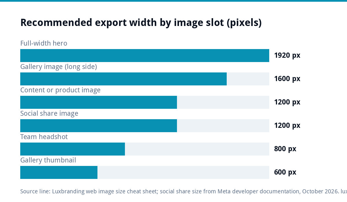
The cheat sheet: every slot in pixels
Widths are the size to export your master image at. Your website or theme will usually create smaller copies for phones automatically, so upload one good master, not several sizes.
| Image slot | Export size (pixels) | Shape | Format | Aim for under |
|---|---|---|---|---|
| Full-width hero or banner | 1920 wide | About 16:9, or 3:1 for a slim banner | WebP or JPG | 300KB |
| Half-width hero (image beside text) | 1200 wide | 4:3 or square | WebP or JPG | 200KB |
| Image inside page content | 1200 wide | Any, keep it consistent | WebP or JPG | 200KB |
| Blog featured image | 1200 by 675 | 16:9 | WebP or JPG | 200KB |
| Gallery or portfolio image | 1600 on the long side | As shot | WebP or JPG | 300KB |
| Gallery thumbnail | 600 wide | Square or 4:3 | WebP or JPG | 80KB |
| Product photo (online shop) | 1200 by 1200 | Square | WebP or JPG | 200KB |
| Team or headshot | 800 by 800 | Square | WebP or JPG | 100KB |
| Logo in the header | Vector | As designed | SVG | 20KB |
| Icons | Vector | Square | SVG | 5KB |
| Social share image (link preview) | 1200 by 630 | About 1.91:1 | JPG or PNG | 300KB |
| Email header | 1200 wide (shown at 600) | Slim, about 3:1 | JPG or PNG | 150KB |
The file-size targets are practical guides rather than hard rules. A detailed photo of a finished kitchen may need a little more; a simple graphic should need much less.
Why these widths, and not bigger
Modern phones and laptops have high-density screens, so an image shown 600 pixels wide on screen often needs around 1200 pixels of real data to look sharp. That is why the content width above is 1200 rather than the 600 or 800 the page appears to use.
Going bigger than that rarely helps. A 6000-pixel photo straight off a modern phone or camera can be several megabytes, and almost nobody’s screen can show the extra detail. Every unnecessary kilobyte slows the page down, and images are often the heaviest thing on a page. Google’s own image best practices make the same point: high-quality images matter, but images are often the largest contributor to overall page size.
Which format to use
| Format | Best for | Avoid for |
|---|---|---|
| WebP | Photos and most website images; smaller than JPG at similar quality | Email, where support is less reliable |
| JPG | Photos, especially in email and on older systems | Logos, text and graphics with sharp edges |
| AVIF | Photos where your website platform supports it | Anywhere you cannot test it first |
| PNG | Graphics with transparency, screenshots, diagrams | Large photos (files get very big) |
| SVG | Logos, icons and simple illustrations | Photographs |
Google Search supports all of these formats, and its guidance also suggests keeping the file extension matched to the actual file type. If you are unsure what your logo files are for, our guide to logo file formats explains SVG, PNG, EPS and the rest.
How to resize and compress without losing quality
- Start from the original. Never enlarge a small image; it will look soft. Resize down from the biggest version you have.
- Crop first, then resize. Crop to the shape in the table, then set the width.
- Export at 75 to 85% quality. Below about 70%, photos start to show blocky patches; above 90%, files grow with little visible gain.
- Compress once. Each re-save of a JPG loses a little more detail. Keep an uncompressed master and export fresh copies when you need them.
- Name the file sensibly. “oak-kitchen-worktop-bristol.webp” is more useful to you and to search engines than “IMG_4482.jpg”.
- Write the alt text. Describe the image for someone who cannot see it. Google calls alt text the most important attribute for image metadata and warns against stuffing it with keywords.
Background images, sliders and text on images
Three situations catch people out. Background images set behind a section are often stretched to fill very wide screens, so they need the full 1920-pixel width even when they look decorative. Sliders multiply the problem: five 300KB slides at the top of a page is 1.5MB before a visitor has read a word, so one strong image usually serves you better. And text baked into an image cannot be read by search engines or screen readers, goes blurry when the image is resized, and cannot be edited without the original file, so put headlines in the page itself and keep images for pictures.
What your website does with the image after upload
Most modern platforms, including WordPress, Shopify, Wix and Squarespace, create several smaller copies of each upload and let the visitor’s browser pick the right one. This is called responsive images. MDN’s guide to responsive images shows the idea with a simple example where a phone loads a 480-pixel version of 63KB instead of an 800-pixel version of 128KB.
That is why the master size matters most. Upload a 1920-pixel master and the platform can make sensible smaller copies. Upload a 6000-pixel original and some themes will still serve something far too large on certain pages. Upload a 400-pixel image and nothing can make it sharp again.
Speed: how images affect your Core Web Vitals
The largest thing on most pages, often the hero image, is what Google measures as Largest Contentful Paint. The guidance on web.dev says this should happen within 2.5 seconds of the page starting to load. An oversized hero image can, on its own, push a small business home page past that target on mobile data.
Three image habits that help:
- Keep the hero image under about 300KB, and do not put a slideshow of five large images at the top of the home page.
- Let images further down the page load lazily, which most platforms now do by default.
- Set width and height on images so the page does not jump as they arrive; jumping layouts are measured too.
Our guide to website speed for small businesses covers the causes that are not images, such as heavy plugins and slow hosting.
Social share images and link previews
When someone shares a page on Facebook, LinkedIn or WhatsApp, the preview uses your social share image (often called the Open Graph image). Meta’s developer documentation recommends at least 1200 by 630 pixels, an aspect ratio of about 1.91:1, and says 600 by 315 is the minimum for the larger preview style. Keep important content away from the edges, because some apps crop the preview.
Sizes for posts inside each social platform change more often than website sizes, so check the platform’s own help pages before a big campaign. If you post regularly, a set of branded templates saves resizing every time; our social media design service produces them.
Product photos for online shops
Product images have one extra rule: consistency. Shoot every product on the same background, at the same distance, and export every image at the same square size. Mismatched shapes make a shop grid look untidy and push product names out of line. If you are planning a new shop, our e-commerce website is £499 for up to 20 products, built on WooCommerce or Shopify with Stripe and PayPal, and the product templates are set up for square images from the start.
A quick check before you publish
- Is every photo under the size in the table, and no wider than 1920 pixels?
- Are logos and icons SVG?
- Does every image have a sensible file name and alt text?
- Does the page look sharp on your phone, and load quickly on mobile data?
- Does a test share on WhatsApp show the right preview image?
For the wider pre-launch list, see our website launch checklist.
When the images are not the whole problem
If you have resized everything and the site is still slow, the cause is usually elsewhere: hosting, plugins, scripts or the theme. Our website speed optimisation is £99 and deals with images and the rest together. If the site is old enough that fixing it costs more than rebuilding it, our custom WordPress website is £499 for up to eight pages, hand-coded with no page builders and mobile-first. Every fixed price is on our pricing page.
Get the UK Website Project Brief Template (free)
A two-page template for briefing any UK web designer: sitemap, integrations, audience and deliverables. Cuts revision rounds in half.
No spam. UK GDPR compliant. We only use your email to send this resource, unless you tick the box to hear from us.
Frequently asked questions
What size should images be for a website? +
For most small business sites, export full-width hero images at 1920 pixels wide, content images at 1200 pixels, product photos at 1200 by 1200, thumbnails at 600 pixels and social share images at 1200 by 630. Save photos as WebP or JPG at 75 to 85% quality and use SVG for logos and icons.
What file size should website images be? +
Aim for under about 300KB for a full-width hero image and under 200KB for most content and product images. Thumbnails can be far smaller. These are practical targets rather than hard limits: a detailed photo may need slightly more, a simple graphic much less. Oversized files are a common cause of slow mobile pages.
Is WebP better than JPG for websites? +
For most website photos, yes: WebP files are usually smaller than JPG at similar quality, and Google Search supports WebP. JPG is still the safer choice for email, where support for newer formats is less reliable. Use SVG for logos and icons, and PNG for graphics that need transparency.
Why do my images look blurry on phones? +
Phones have high-density screens, so an image shown 600 pixels wide often needs about 1200 pixels of real data to look sharp. If you uploaded a small image, the screen stretches it. Upload a larger master, around 1200 pixels for content or 1920 for full-width, and let your website create smaller copies.
What size is a social share image? +
Meta's developer documentation recommends at least 1200 by 630 pixels for the image used in link previews, an aspect ratio of about 1.91:1, with 600 by 315 as the minimum for the larger preview style. Keep important content away from the edges, as some apps crop the preview.