
Quick answer
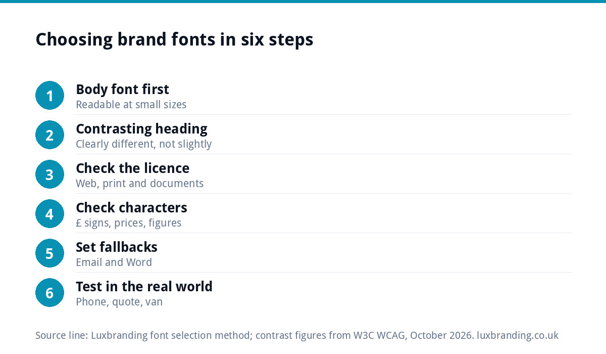
Most small brands need two fonts: a heading font with some character and a plain body font that stays readable at small sizes. Pick the body font first, choose a heading font that contrasts with it, check both are licensed for web, print and documents, and test them on a quote, a web page and a van panel.
This guide is about the fonts that sit around your logo: the ones on your website, quotes, social posts and signage. The lettering inside the logo itself is a design job of its own. Here we cover how to choose a working pair, the checks most people skip, and how to write the choice down so everyone uses it.
What a brand font system actually is
A brand font system is a short set of rules: which typeface is used for what, in which weights, at which sizes. For a small business it usually has three parts:
- Heading font. Used for page titles, headlines, van lettering and social post headlines. It carries personality.
- Body font. Used for paragraphs, quotes, invoices, menus and small print. It carries readability.
- Fallback font. A common font already installed on most computers, used in emails and documents where your chosen fonts may not load.
Two families is the sweet spot. A third rarely adds anything and makes it more likely that someone picks the wrong one. When fonts drift across your materials, the business starts to look like several different firms, which is the problem our guide to a brand that looks inconsistent everywhere deals with.
Step 1: choose the body font first
Most people start with the exciting heading font. Start with the body font instead, because it does far more work: it is what customers read on every page, quote and email.
Look for these qualities:
- Generous lowercase letters, so text stays clear when small.
- Open shapes in letters such as a, e and c, which hold up on cheap printers and low-quality screens.
- Clear figures, because your prices, phone numbers and measurements need to be unmistakable.
- A full set of weights, at least regular and bold, ideally with italics.
Size matters as much as choice. The GOV.UK Design System, which is built to be read by everyone in the country, uses 19px for its standard body text with a 25px line height. You do not have to copy that exactly, but it is a useful reminder that body text on many small-business sites is set too small.
Step 2: pick a heading font that contrasts
The heading font should look clearly different from the body font, not slightly different. Two similar fonts side by side look like a mistake. Common pairings that work:
- A strong, slightly condensed sans serif for headings with a friendly, open sans serif for body text. Practical and modern; suits most trades.
- A classic serif for headings with a clean sans serif for body text. Feels established; suits professional services and hospitality.
- One family used in two very different weights, such as a heavy weight for headings and a regular weight for body. The safest option when in doubt.
If you already have a logo, your heading font should sit comfortably beside it without imitating it. Copying the logo lettering for every headline usually cheapens the logo and makes long headings hard to read.
Limit the weights as well as the families. Two or three weights per font, such as regular, bold and perhaps a heavy weight for big headlines, is plenty. Every extra weight is another choice someone can get wrong, and on a website each weight is another file for the browser to download before the text looks right.
Step 3: check the licence before you commit
A font is software, and it comes with a licence. A font that is free for personal use may not be free for your business, and desktop, web and app use are often licensed separately.
The simplest route for a small business is a font released under the SIL Open Font License, which covers many fonts in the Google Fonts library. The OFL FAQ says such fonts can be used for logos, posters, business cards and stationery with no additional licence or permission, and can be embedded in documents. For any paid font, keep the licence receipt and check it covers web use and the number of computers that will use it.
Step 4: check weights, characters and figures
A font can look perfect in a sample and fall apart in real use. Before deciding, type out the text your business actually uses:
- The pound sign and prices, such as £1,250.00.
- Phone numbers, postcodes and VAT or company numbers.
- Ampersands, apostrophes and quotation marks.
- Bold and italic versions in the same sentence.
If you send quotes with columns of figures, check whether the font has figures of equal width so totals line up. Many good text fonts do; many decorative ones do not.
Check accented letters too if your business name, street or menu uses them, such as a café or a supplier with a French or Polish name. A font missing those characters will swap in a different font for that one letter, which looks careless on a sign or a printed menu.
Step 5: set fallback fonts for email and documents
Your carefully chosen fonts will not appear everywhere. Many email apps ignore custom web fonts, and a Word document opened on a computer without your fonts installed will substitute something else. Decide in advance which common font stands in, so the swap is deliberate rather than random.
Pick a widely installed font that is close in feel to your body font, such as Arial or Verdana for a sans serif brand, or Georgia for a serif one. Use it in your email signature, quote templates and any document other people will edit.
Step 6: test it in the real world
Do not sign off fonts from a screen preview. Put them where customers will meet them:
| Test | How to run it | Fail sign |
|---|---|---|
| Phone test | Set a paragraph and a heading on a web page and read it on your phone outdoors | You zoom in or squint |
| Quote test | Lay out a real quote with prices and print it on an office printer | Figures blur or misalign |
| Distance test | Print your business name in the heading font at A3 and read it from across a yard | Letters run together |
| Small print test | Set terms and company details at the smallest size you will use | Text turns to grey mush |
| Contrast test | Check text against your brand colours | Light text on mid-tone backgrounds |
For the contrast test, the W3C’s accessibility guidance on minimum contrast asks for a ratio of at least 4.5:1 for normal text and 3:1 for large text, which it defines as at least 18 point, or 14 point bold.
Which font goes where
Once you have the pair, write down where each one is used. This is the table to share with anyone who designs for you:
| Where | Font | Notes |
|---|---|---|
| Website headings | Heading font, bold | Two or three sizes only |
| Website body text | Body font, regular | Large enough to read without zooming |
| Quotes and invoices | Body font, or fallback if edited in Word | Check figures line up |
| Van and signage | Heading font for the name or strapline | Contact details in the body font, bold |
| Social posts | Heading font for headlines, body for captions on images | Keep text short on images |
| Email signature | Fallback font | Avoid images of text |
Signage brings its own constraints on size, spacing and viewing distance. Our guide to shopfront signage design covers those, and our vehicle wrap and signage design starts from £99.
Record it so it sticks
Font choices fade unless they are written down. A single page in your brand guidelines should list the two font names, where to download or buy them, the weights you use, the fallback, and the table above. Our guide to brand guidelines explains what else belongs in that document. For trades firms, the same consistency across vans, workwear and quotes is a theme of our guide to branding for trades businesses.
When to hand it to a designer
You can choose a sensible pair yourself with the steps above. It is worth getting help when the fonts need to work closely with a logo, a colour palette and a set of templates at the same time, because those decisions affect each other.
Our brand identity design is £299 and covers the logo, colours, typography, imagery and brand guidelines together. If you only need the font inside an existing logo changed, a logo edit is £50 and keeps the mark recognisable. All our prices are on the pricing page; order online or email us at support@luxbranding.co.uk.
Get the UK Branding Budget Worksheet (free)
A printable worksheet: decide what your brand needs now and price it against fixed published prices and the IPO trademark fee.
No spam. UK GDPR compliant. We only use your email to send this resource, unless you tick the box to hear from us.
Frequently asked questions
How many fonts should a brand use? +
Two is right for most small businesses: a heading font with some character and a body font that is easy to read at small sizes. Add a widely installed fallback font for emails and documents. A third display font rarely adds much and makes it more likely that people mix up which font goes where.
Can I use Google Fonts for my business branding? +
Many Google Fonts are released under the SIL Open Font License, and the licence FAQ says those fonts can be used for logos, posters, business cards and stationery without extra permission, and embedded in documents. Always check the licence of the specific font you pick, as a few fonts elsewhere are free for personal use only.
Should my brand font be the same as my logo font? +
Not necessarily. The lettering in a logo is often customised and works at one size, while brand fonts need to work in paragraphs, prices and small print. A heading font that sits comfortably beside the logo, plus a readable body font, usually works better than using the logo lettering everywhere.
What font size should body text be on a website? +
Large enough to read on a phone without zooming. The GOV.UK Design System uses 19px for its standard body text with a 25px line height, which is a sensible reference point. Many small-business sites set body text noticeably smaller than that, which makes pages harder to read for many visitors.
Can Luxbranding choose fonts for my brand? +
Yes. Our brand identity design is £299 and includes typography alongside the logo, colours, imagery and brand guidelines, so the fonts are chosen to work with everything else. If you only need the font in an existing logo changed, a logo edit is £50. Order online or email support@luxbranding.co.uk.