Quick answer
Test every text and background pair in your palette with a free contrast checker. Normal text needs a ratio of at least 4.5:1; large text, buttons, icons and form borders need 3:1. Your logo is exempt, and a brand colour that fails for text can still be used for backgrounds, shapes and accents.
Many small-business palettes contain at least one colour that is lovely on a logo and nearly unreadable as text: a bright orange, a sunny yellow, a fresh mid-green, a pale grey. The problem only shows when those colours end up on a website button or as the text on a flyer. This guide explains what the contrast ratios mean, shows how common brand colours perform, and gives practical fixes that keep your brand recognisable without a rebrand.
What the ratios mean
Contrast is measured as a ratio between the lighter and darker colour, from 1:1 (the same colour) to 21:1 (black on white). The web accessibility standard, WCAG, sets minimums. The W3C’s explanation of contrast (minimum) and of non-text contrast gives the figures:
| Element | Minimum ratio (level AA) | Enhanced (level AAA) |
|---|---|---|
| Normal body text | 4.5:1 | 7:1 |
| Large text (at least 18pt, or 14pt bold) | 3:1 | 4.5:1 |
| Buttons, form borders, icons and chart elements | 3:1 | No higher level |
| Logos and brand names | No requirement | No requirement |
The W3C notes that these are thresholds and should not be rounded: a ratio of 4.499:1 does not meet 4.5:1. Level AA is the usual target for business websites.
Your logo is exempt, brand-coloured text is not
The W3C states plainly that text which is part of a logo or brand name has no contrast requirement. That exemption exists because brands are bound by their own colour rules. It does not cover everything else in brand colours. A heading set in your pale brand green, a button with white text on your yellow, or a price in light grey all need to meet the ratios.
There is one nuance worth knowing. If your logo acts as a link, such as the logo in a website header that takes visitors home, the W3C suggests using a higher-contrast version where brand rules allow. Low contrast chosen for style, rather than required by the brand, is not exempt.
How common brand colours perform
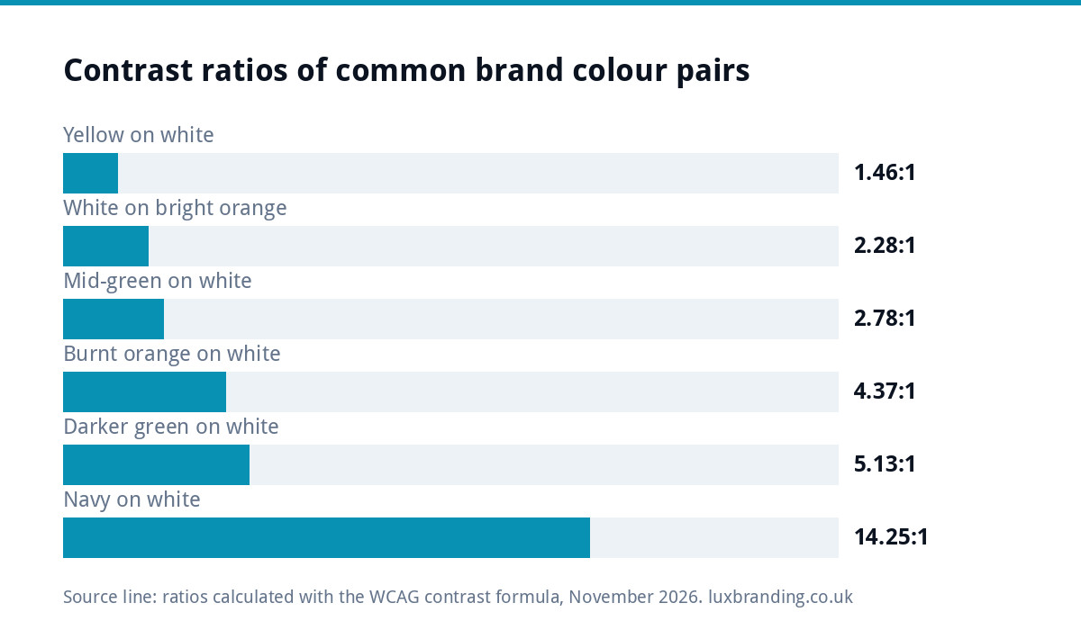
We calculated these ratios with the WCAG formula for some typical brand colours. Your exact shades will differ, so check your own, but the patterns are reliable:
| Text colour on background | Ratio | Normal text (4.5:1) | Large text and UI (3:1) |
|---|---|---|---|
| White on bright orange (#F7941D) | 2.28:1 | Fails | Fails |
| Navy (#1B2A49) on the same orange | 6.25:1 | Passes | Passes |
| Yellow (#FFD100) on white | 1.46:1 | Fails | Fails |
| Black on the same yellow | 14.37:1 | Passes | Passes |
| Mid-green (#4CAF50) on white | 2.78:1 | Fails | Fails |
| Darker green (#2E7D32) on white | 5.13:1 | Passes | Passes |
| Burnt orange (#C45A00) on white | 4.37:1 | Fails | Passes |
| Light grey (#999999) on white | 2.85:1 | Fails | Fails |
| Grey (#767676) on white | 4.54:1 | Passes, just | Passes |
| Navy (#1B2A49) on white | 14.25:1 | Passes | Passes |
Two lessons stand out. Bright, warm colours such as orange and yellow work brilliantly as backgrounds with dark text, and badly as text or with white text on top. And the difference between failing and passing is often a slightly deeper shade of the same colour, not a different colour.
How to test your palette in ten minutes
- List your colours with their HEX codes, including white, black and any greys you use for text.
- Open a free checker such as the WebAIM Contrast Checker, which takes a foreground and background HEX code and reports the ratio with pass or fail results for normal text, large text and graphical objects.
- Test every pairing you actually use: body text on background, button text on button colour, links, headings, text on coloured panels.
- Mark each pair as approved for body text, large text only, or decoration only.
- Write the results into your brand guidelines, so whoever builds your next flyer or web page uses approved pairs without guessing.
Fixes that keep your brand recognisable
A failing colour rarely means a rebrand. These fixes usually solve it:
- Swap the text, not the colour. Use dark text on your bright colour instead of white. The orange stays; the button becomes readable.
- Add a deeper text shade. Introduce a darker version of your brand colour used only for text and links, alongside the original for shapes and backgrounds.
- Use the colour for big things. Backgrounds, bands, icons with a dark outline, illustrations and photography styling carry a brand colour without text needing to sit on it.
- Retire light grey body text. It is one of the most common readability failures; a darker grey keeps the soft look.
- Check text over photos, adding a solid or tinted panel behind it when the photo is busy.
If the logo itself needs a slightly deeper shade to sit comfortably beside the new text colour, that is a small adjustment rather than a redesign. Our Logo Edit is £50 for colour, font, spacing and layout changes to a logo you already own.
A worked example: a cleaning company palette
Picture a domestic cleaning firm whose brand uses a fresh mid-green (#4CAF50), white and a pale grey for small print. On the old website, the “Book a clean” button is white text on the green, the prices are in the green on white, and the footer is grey on white. Every one of those pairings fails for normal text: white and green score about 2.78:1, and the light grey about 2.85:1.
The fix keeps the brand intact. The green stays as the colour of the header band, the icons and the van livery. A deeper green (#2E7D32), which scores about 5.13:1 on white, is added to the palette for text, links and the button background, so the button keeps white text and now passes. Footer text moves to a darker grey such as #767676, which just clears 4.5:1. Customers still see a green, fresh brand; they can now read every word of it.
The same exercise takes about an hour for most small palettes, and the new rules go straight into the brand guidelines so the next flyer and the next social post follow them too.
Do not rely on colour alone
Contrast is one half of the picture. The other is never using colour as the only signal. A form that marks errors only in red, a price list where the green items are “available” and the grey ones “sold out”, or a chart that relies on two similar shades all leave some customers guessing, including the many people with colour vision deficiency. Add a word, an icon or an underline alongside the colour: “Sold out” in text, a cross icon beside an error, underlined links in body copy. Brand colour then becomes decoration and emphasis, not the only carrier of meaning.
Print needs readable contrast too
WCAG is a web standard, but the logic applies on paper. Yellow text on a white flyer is as hard to read in print as on screen, and print adds its own problems: uncoated paper softens colours, and small reversed text fills in. Keep small text dark on light, and save pale brand colours for large shapes and backgrounds.
Build it into your brand guidelines
The most effective fix is preventive. Good guidelines list each colour’s role and its approved pairings, for example “Orange: backgrounds and highlights; text on orange must be navy” and “Deep green: approved for body text and links on white”. Our guide to brand guidelines costs explains what different levels of guidelines include, and if your materials already look inconsistent, read why your brand looks different everywhere.
Does this matter for a small business?
Yes, for a practical reason as much as a legal one. Readable text is text customers can act on. A phone number in pale yellow, or a “Get a quote” button in white on light green, is easier to miss for everyone, not only people with low vision: think of a customer reading your site on a phone in bright sunlight, or an older customer without their glasses. Good contrast quietly improves every page and every leaflet.
Getting an accessible palette
When we design a brand identity, £299 for the logo, colours, typography, imagery and brand guidelines, the palette should work for text as well as for the logo. If you are building or rebuilding a website, our custom WordPress website is £499 for up to 8 pages. Every fixed price is on our pricing page.
Get the UK Branding Budget Worksheet (free)
A printable worksheet: decide what your brand needs now and price it against fixed published prices and the IPO trademark fee.
No spam. UK GDPR compliant. We only use your email to send this resource, unless you tick the box to hear from us.
Frequently asked questions
What contrast ratio do brand colours need? +
Under WCAG level AA, normal text needs at least 4.5:1 against its background, and large text, meaning at least 18pt or 14pt bold, needs 3:1. Buttons, form borders, icons and chart elements also need 3:1 against adjacent colours. Logos and brand names have no contrast requirement.
Does my logo have to meet contrast rules? +
No. The W3C states that text forming part of a logo or brand name has no contrast requirement. There is a nuance: where a logo acts as a link, such as the home link in a website header, it suggests using a higher-contrast version if your brand rules allow it.
Why does white text on my orange or yellow brand colour fail? +
Bright, light colours such as orange and yellow are close to white in lightness, so white text on them has very little contrast. White on a bright orange such as #F7941D scores about 2.28:1. Switching to dark text, such as navy or black, on the same colour usually passes comfortably.
How do I check my brand colour contrast? +
Use a free tool such as the WebAIM Contrast Checker. Enter the HEX codes for the text colour and the background, and it reports the ratio with pass or fail results for normal text, large text and graphical objects. Test every pairing you actually use and record the approved pairs in your guidelines.
Do I need a rebrand if my brand colour fails contrast? +
Rarely. Most fixes are small: put dark text on the bright colour instead of white, add a deeper shade of the colour for text and links, and use the original for backgrounds and shapes. If the logo needs a slightly deeper shade, our Logo Edit is £50 for changes to a logo you already own.