

Quick answer
UX (user experience) design is about whether your website helps visitors do what they came for, such as finding a price or booking a quote. UI (user interface) design is how each screen looks and behaves: layout, buttons, colours and type. A small business website needs both, usually from one web designer rather than two specialists.
Agencies use “UI/UX” as if it were one word, and job adverts treat them as separate careers. If you are a business owner commissioning a website, neither helps much. This guide explains the difference in plain terms, shows what each looks like on a real small business site, and gives you a checklist for judging whether the site you are paying for has been designed for your customers or just made to look nice.
UX and UI in plain English
The Nielsen Norman Group, one of the best-known research firms in this field, defines user experience as all aspects of the end-user’s interaction with the company, its services and its products, and stresses that the total experience should be distinguished from the user interface, even though the interface is an important part of it.
Put simply:
- UX is the journey. Can a homeowner with a leaking boiler find your number in five seconds on a phone? Does the quote form ask the right questions? Do they know what happens after they press send?
- UI is the surface. Is the call button big enough to tap? Is the text readable on a sunny day? Do the colours and type match your van and business cards?
A site can look beautiful and still lose enquiries because the journey is wrong. It can also be easy to use and still look untrustworthy because the surface is careless. You need both.
The difference at a glance
| UX design | UI design | |
|---|---|---|
| Main question | Does this help the visitor get what they need? | Is each screen clear, consistent and attractive? |
| Typical work | Customer research, page structure, user journeys, form design, testing | Layout, typography, colour, buttons, icons, spacing, states |
| Output | Site map, wireframes, journey notes, test findings | Finished page designs and a component style guide |
| Measured by | Enquiries, bookings, sales, fewer drop-outs | Clarity, consistency, accessibility, brand fit |
| Goes wrong when | Pages are organised around you, not the customer | Design trends beat readability |
What good UX looks like on a small business site
For most local and service businesses, good UX is unglamorous. It means:
- Your phone number and main action visible at the top of every page on mobile.
- Services organised the way customers describe their problem, not the way you price jobs internally.
- One clear next step on each page: call, request a quote, or book.
- A short form that asks only what you need to reply well, such as postcode and job type.
- Prices or price guides where you can give them, so visitors do not leave to find out.
- A confirmation message that says what happens next and when.
A worked example
Picture a hypothetical Leicester electrician whose old website opened with a large photo slider, then a paragraph about the company’s history, then a menu split into “Domestic”, “Commercial” and “Industrial”. The phone number sat in the footer. Visitors on phones, most of whom wanted an emergency callout or a quote for an EV charger, had to scroll past three screens before finding anything useful. The redesign changed the journey, not just the look: a tappable number and a “Get a quote” button at the top, services named the way customers search for them (fuse board upgrades, EV chargers, rewires, emergency callouts), and a four-field quote form. The colours and type barely changed. The UX did.
Where UX and UI meet: the contact page
The contact page shows why the two cannot really be separated. UX decides what the form asks, how many fields it has and what the visitor sees after pressing send. UI decides whether the fields are large enough to tap, whether error messages are clear and readable, and whether the send button stands out. Get either wrong and the page leaks enquiries, which is why it deserves more design attention than any other page on a service business website.
What good UI looks like
- Text large enough to read on a phone without zooming, with strong contrast against the background.
- Buttons that look like buttons, with enough space around them for a thumb.
- One accent colour used for actions, so visitors learn what is clickable.
- Consistent headings, spacing and image styles from page to page.
- Your brand colours and typefaces applied with restraint, so the site matches your van, uniforms and stationery.
Consistent UI is where brand work pays off. If your logo, colours and type are already defined in brand guidelines, the designer has a head start and the site will feel part of the same business.
Do you need a separate UX designer?
For a typical small business website of five to fifteen pages, no. A competent web designer covers both: they plan the structure and journeys, then design the pages. Separate UX specialists earn their keep on larger digital products such as booking platforms, customer portals and apps, where many screens and user types interact.
| Project | Who you need |
|---|---|
| Brochure site for a trade or service business | One web designer covering UX and UI |
| Single landing page for an ad campaign | One designer, with clear goals and tracking |
| Online shop of a few dozen products | One designer experienced in e-commerce journeys |
| Customer portal, booking platform or app | Dedicated UX research and design alongside developers |
A five-minute UX test you can do yourself
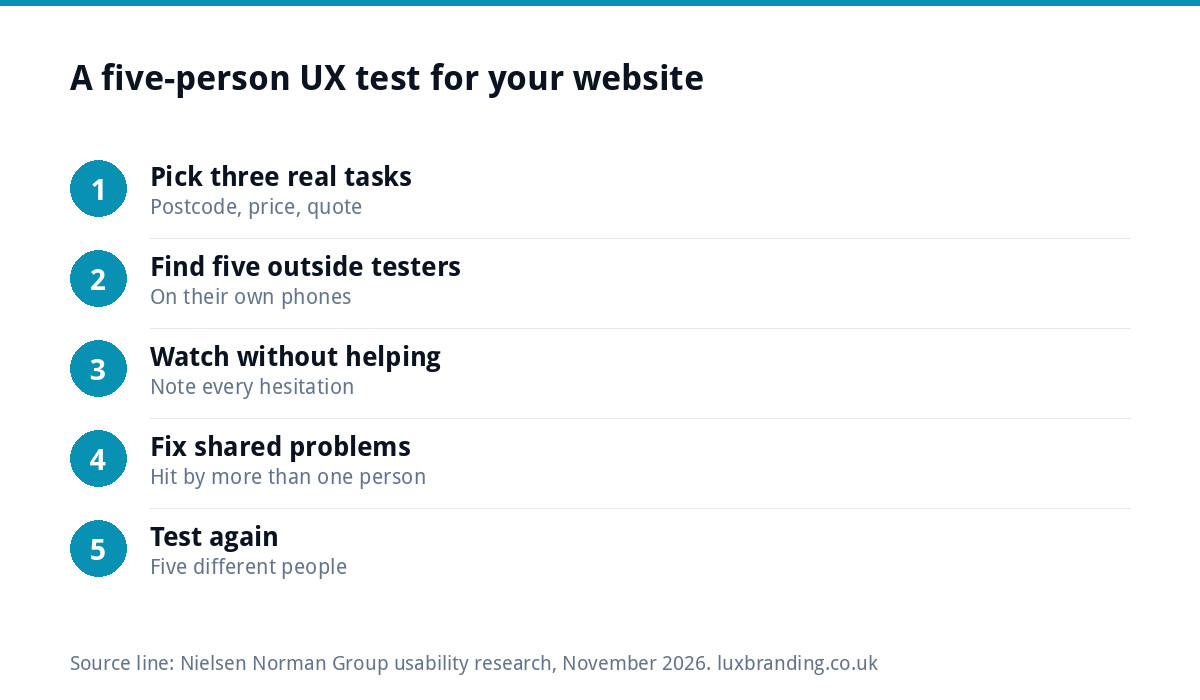
You do not need a research budget to find the worst problems. NN/g’s well-known article on testing with five users argues that elaborate tests waste resources, and that a first study with five participants found 85% of the usability problems in its analysis. For a small business, that translates into a simple routine:
- Pick three real tasks, such as “find out if they cover my postcode”, “find a rough price” and “ask for a quote”.
- Ask five people who are not in your business to try them on their own phones.
- Watch without helping, and note where they hesitate, scroll back or give up.
- Fix the problems that more than one person hits.
- Repeat with five different people after the changes.
The UK government’s Service Manual makes the same point at a larger scale: its guidance on user research treats understanding users as an ongoing part of building any service, not a one-off.
Questions to ask a web designer about UX and UI
- How will you decide what goes on each page and in what order?
- What is the main action on the homepage, and why?
- Will I see the page structure before you design the look?
- How will the site work on a phone, and will you test it on real devices?
- How will the design use my brand colours and typefaces?
- How will we know after launch whether the site is producing enquiries?
Vague answers to these questions are a warning sign, whatever the portfolio looks like.
Common mistakes that hurt both
- Sliders and autoplay videos at the top that push the phone number off the first screen.
- Light grey text on white, which looks elegant and reads badly.
- Contact forms with ten required fields for a simple callback.
- Menus organised by your internal departments rather than customer problems.
- Pages you cannot update yourself, so prices and photos go stale. Our guide to when you cannot update your own website covers that problem.
- Broken forms nobody notices; see our guide to a website contact form not working.
Before launch: a UX and UI checklist
Run through the essentials in our website launch checklist, and add these design checks:
- Phone number tappable and visible on every page on mobile.
- Every page has one obvious next step.
- Forms tested end to end, with the confirmation message checked.
- Text readable outdoors on a phone at full brightness and at half.
- Pages load quickly on mobile data; slow pages undo good design. Our Website Speed Optimisation is £99 if they do not.
Websites designed around your customers
Every custom WordPress website we build, from £499 for up to eight pages, starts with your customers’ main tasks and is hand-coded with no page builder, mobile-first, with contact forms connected to your inbox and a written CMS walkthrough. For a single campaign page, our Landing Page is £199. You can see every price on our pricing page.
Get the UK Website Project Brief Template (free)
A two-page template for briefing any UK web designer: sitemap, integrations, audience and deliverables. Cuts revision rounds in half.
No spam. UK GDPR compliant. We only use your email to send this resource, unless you tick the box to hear from us.
Frequently asked questions
What is the difference between UI and UX in simple terms? +
UX, or user experience, is whether a website helps visitors get what they came for, such as finding a price or booking a job. UI, or user interface, is how each screen looks and behaves: layout, buttons, colours and type. UX is the journey and UI is the surface. A good small business site needs both working together.
Do I need a UX designer for my small business website? +
Usually not as a separate role. For a brochure site, landing page or small shop, a competent web designer plans the structure and journeys and designs the pages. Dedicated UX specialists earn their keep on larger products such as booking platforms, customer portals and apps, where many screens and user types interact.
How can I test my website's UX without a budget? +
Pick three real tasks, such as finding a price or requesting a quote, and ask five people outside your business to try them on their own phones while you watch without helping. Note where they hesitate or give up, fix problems more than one person hits, then repeat with five different people.
Does good UI design mean a modern-looking website? +
Not necessarily. Good UI is clear, consistent and readable first: text large enough for a phone, strong contrast, buttons that look like buttons and one accent colour for actions. Fashionable effects such as sliders and pale grey text often make sites harder to use. Matching your brand matters more than following design trends.
How do I know if my website has a UX problem? +
Common signs are visitors leaving the contact page without sending anything, customers phoning to ask questions the site should answer, and people saying they could not find your number. Watching a handful of real people try simple tasks on their phones will usually show the cause within minutes.


