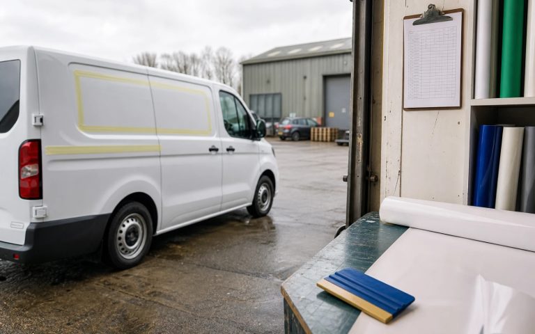
A logo is the one piece of your brand that turns up everywhere: your website, your van, your invoices, a tiny social avatar, a stitched polo shirt. Which is exactly why the small mistakes hurt so much: they get repeated across every touchpoint, often for years. After designing marks for UK businesses since 2019, we see the same avoidable errors again and again. Here are the twelve most common logo design mistakes, and a concrete fix for each, so you get a mark that works the first time and keeps working as you grow.
Quick answer
The most common logo design mistakes are over-complication, chasing trends, poor scalability, weak font choices, having no vector files, using too many colours, copying competitors, ignoring black-and-white, illegibility at small sizes, no clear space, DIY clip-art, and cramming phone numbers or straplines inside the mark. The fix for nearly all of them is the same discipline: keep it simple, design in vector, test it tiny and in mono, and own proper source files. A professional logo with full vectors starts from £129.
The twelve mistakes (and how to avoid each one)
Each of these crops up across every sector, from trades to tech start-ups. Work through them and you’ll have caught the faults that quietly make a logo look amateur.
- Making it too complex. Intricate illustrations, gradients and fine detail look impressive on a big screen and fall apart everywhere else. Fix: aim for a mark you could roughly sketch from memory after one look: simple shapes survive shrinking, embroidery and faxing.
- Chasing trends. Whatever is fashionable this year (gradient meshes, overly geometric “tech” marks, the swoosh) dates fastest. Fix: design for the next ten years, not this year’s Dribbble feed. Timeless beats trendy because rebrands are expensive.
- Ignoring scalability. A logo that only looks right at one size is broken. Fix: design it to read clearly at both a 16px favicon and a shop fascia. If detail disappears when small, simplify until it doesn’t.
- Choosing the wrong font. Overused free fonts, joke typefaces and ultra-thin display fonts undermine credibility instantly. Fix: pick type that matches your sector’s tone, avoid clichés like Comic Sans or Papyrus, and make sure it stays legible when reversed out on dark backgrounds.
- Having no vector files. If your logo only exists as a JPG or PNG, it cannot scale up cleanly and will pixelate on signage and print. Fix: insist on vector source files (SVG, AI, EPS) from your designer: these are infinitely scalable and the single most important deliverable.
- Using too many colours. A five-colour logo costs more to print, weakens recognition and rarely reproduces consistently. Fix: limit yourself to one or two core colours. The strongest brands (think the big retailers) are often one colour. Restraint reads as confidence.
- Copying a competitor. “Make it like theirs” produces a mark that’s forgettable at best and legally risky at worst. Fix: research your competitors to deliberately look different from them, not the same. Standing out is the entire point of a logo.
- Ignoring black-and-white. Designing only in full colour hides problems that appear in single-colour print, stamps and faxes. Fix: make sure your logo works in pure black and white from the start. If it relies on colour to be legible, the underlying shape is too weak.
- Illegibility at small sizes. Tiny text, fine lines and tight detail vanish in a social avatar or app icon. Fix: test your logo at the size of a thumbnail before approving it. If you can’t tell what it is, neither can a customer scrolling past.
- No clear space. Cramming a logo right up against other text, edges or images makes it look cheap and crowded. Fix: define a minimum clear space (a simple rule: keep a margin equal to the height of one letter around the mark) and protect it everywhere the logo appears.
- DIY clip-art and free generators. Stock icons and AI generator output are unlicensed, generic and frequently used by hundreds of other businesses. Fix: commission original artwork. A bespoke mark is unique to you, legally yours, and won’t turn up on a rival’s website.
- Stuffing the mark with phone numbers and straplines. Burying a phone number, web address or tagline inside the logo means it can never be reused cleanly and dates the moment your details change. Fix: keep contact details out of the logo entirely. Put them on the stationery and website, where they belong.
Quick reference: mistake to fix
If you only skim one thing, skim this. Run your current or proposed logo against the right-hand column.
| Common mistake | How to avoid it |
|---|---|
| Too complex | Simplify to memorable basic shapes |
| Trend-chasing | Design for the next decade, not this year |
| Doesn’t scale | Test at favicon size and signage size |
| Weak font | Match sector tone; avoid cliché typefaces |
| No vector files | Get SVG/AI/EPS source files |
| Too many colours | Limit to one or two core colours |
| Copies a competitor | Research rivals to look different |
| No mono version | Make it work in pure black and white |
| Illegible when small | Approve only after a thumbnail test |
| No clear space | Set and protect a minimum margin |
| DIY clip-art | Commission original, owned artwork |
| Phone/strapline in mark | Keep contact details out of the logo |
Most of these failures share a single root cause: a logo built quickly and cheaply, without source files or proper testing. That’s also why a homemade or generator-made mark so often needs redoing within a year or two: the upfront saving turns into a more expensive rebrand. For a clear breakdown of what you should actually pay, see our UK logo cost guide, and for the wider picture our small-business logo guide covers building an identity around the mark.
What to do next
Run your existing logo through the twelve points above. If it stumbles on more than two or three, and most homemade marks do, it’s quietly working against you every time it appears. The sensible sequence is: get a clean, simple mark designed in vector; test it at thumbnail size and in black-and-white before you approve it; make sure you receive full source files and own the copyright outright; then roll it out consistently with proper clear space across your website, signage and stationery. Do that once, properly, and you won’t need to think about your logo again for years.
Avoid every mistake on this list
Professional logo design from £129
Simple, scalable marks with full vector files, monochrome versions and full ownership. Unlimited revisions, 48-hour first concepts.
Get the UK Branding Budget Worksheet (free)
A printable worksheet: decide what your brand needs now and price it against fixed published prices and the IPO trademark fee.
No spam. UK GDPR compliant. We only use your email to send this resource, unless you tick the box to hear from us.
Sources & Further Reading
- Search for a trade mark, GOV.UK
- Scalable Vector Graphics (SVG), W3C
Frequently asked questions
What is the most common logo design mistake? +
Over-complication. Intricate detail and gradients look fine on screen but fall apart on signage, embroidery and small icons. The fix is to simplify to memorable basic shapes that survive being shrunk right down.
Why do I need vector files for my logo? +
A JPG or PNG cannot scale up without pixelating, so it fails on signage and print. Vector source files (SVG, AI, EPS) are infinitely scalable and are the single most important deliverable from any logo project.
How many colours should a logo have? +
Ideally one or two core colours. Too many colours raise print costs, weaken recognition and reproduce inconsistently. Many of the strongest, most recognisable brands use just a single colour, which reads as confidence.
Why should a logo work in black and white? +
Single-colour print, stamps, faxes and engraving all need a mono version, and designing in black and white first exposes weak shapes. If a logo only reads when in full colour, its underlying form is too weak.
Is using a stock icon in a logo a mistake? +
Usually, yes. Stock icons can be licensed by anyone, so other businesses may use the same one, and you may not be able to register the logo as a trade mark. A custom mark avoids both problems.