

The brief
A website that wins quotes, and print that looks like the same business on every doorstep.
One team covering four trades has a messaging problem. Lead with air conditioning and the heating customers think you are the wrong firm; list everything and nothing stands out. The brief was a brand system that says air conditioning and heating first, makes the other two trades easy to find, and puts the phone numbers where a customer can tap them in one move.
The approach
Print built from the logo, not from a template
We rebuilt the logo from the client's vector file so every print piece uses the exact artwork, then drew the colours from it: the logo's blue and red alongside the navy and red already on their website. The ripple rings on the cards and leaflet come from the logo's own snowflake and sun, so the decoration belongs to the brand instead of being a generic swoosh.
A leaflet that works through a letterbox
The front leads with a seasonal promise, Warm in winter. Cool in summer., over the client's own photo of a Fujitsu install, graded to the brand navy so the headline stays readable. The four trades follow as equal tiles, then a red banner and a white strip with large phone numbers and a QR code.
A website that sells four trades without losing the lead
The website opens on air conditioning and heating, with the call and quote buttons in the first screen. Each of the four trades gets its own page and its own place in the menu, and the areas they cover have a page of their own, so a search for any of the four can land on the page that answers it.
In 2026 we moved the site onto WordPress with a custom theme, keeping the design unchanged, so the business can edit its own text and swap its own photos. Eighteen of the business's own job photos replaced stock images, with the location data stripped from the files because it held the positions of customers' homes.
The deliverables
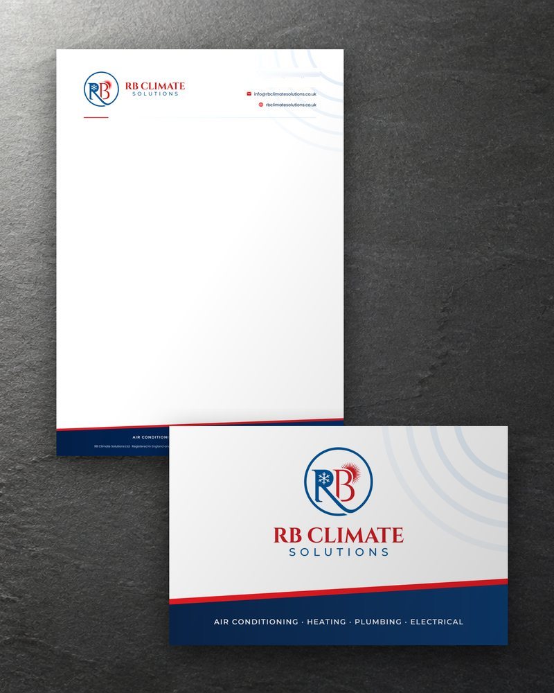 Letterhead and business cardVector artwork with embedded fonts and CMYK images; 5 mm safe margin on every side of the cards. A compliments slip was made to match.
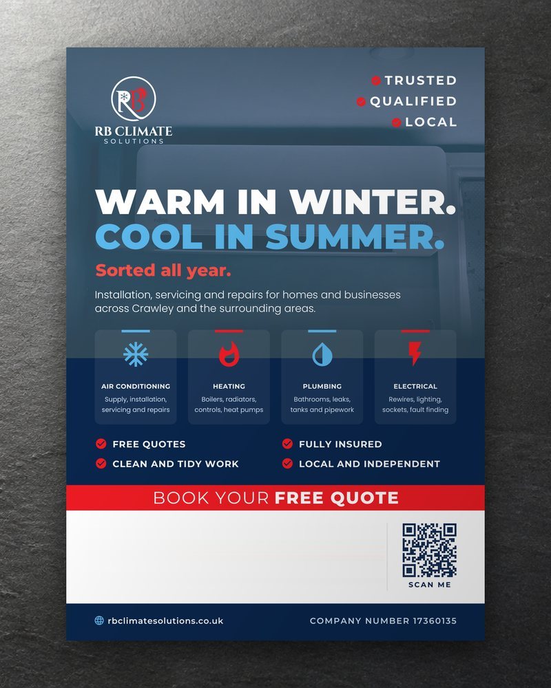 A5 leaflet10 mm safe margin; vector QR code that scans from the print PDF; the back finishes on REFCOM, F-Gas and Gas Safe registrations.
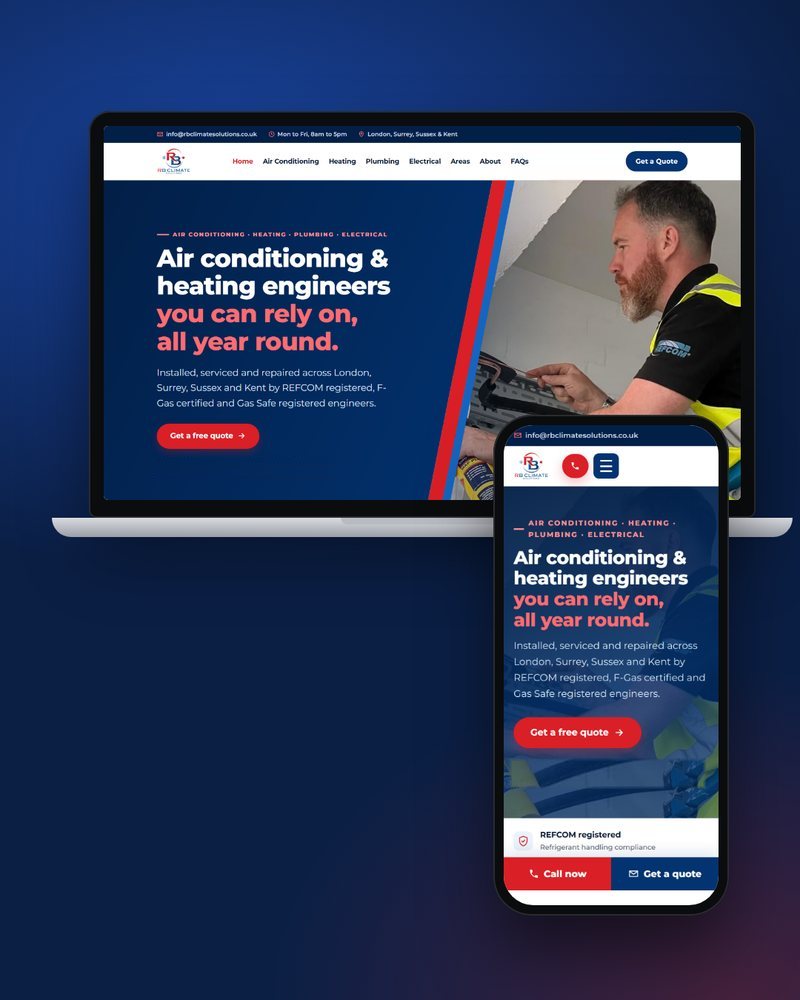 WebsiteWordPress with a custom theme (2026), a page per trade and an Areas page with a coverage map drawn in code.
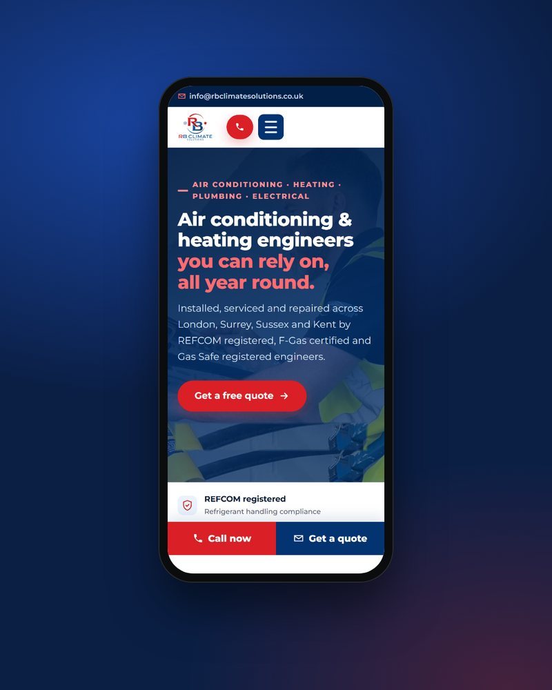 Phone viewCall and quote buttons in the first screen; the enquiry form keeps what a visitor typed if a field needs fixing.


Trade context
General trade background, and what this project did about it.
Air conditioning work involves refrigerant gases. REFCOM runs an F-Gas certification scheme and keeps a searchable register of certified companies, which is something a customer can check for themselves, so the back of RB Climate's leaflet ends on its REFCOM, F-Gas and Gas Safe registrations rather than on a slogan.
Demand in this trade swings with the seasons: heating calls in winter, cooling enquiries in summer. One headline that covers both, Warm in winter. Cool in summer., lets the same leaflet work all year instead of being reprinted for each season.
Questions about this project
Why does the leaflet open on the seasons rather than a list of trades?
Air conditioning and heating are the two trades the business leads with, and Warm in winter. Cool in summer. says both in one line. The four trade tiles then set out the rest, so plumbing and electrical are easy to find without crowding the headline.
Where do the rings on the print come from?
From the logo itself. The ripple rings on the cards and leaflet are drawn from the logo's own snowflake and sun, so the decoration belongs to the brand rather than to a template, and the coverage map on the website uses rings too, spreading out from Crawley and Gatwick.
A bespoke WordPress website, mobile-first and built to win enquiries, with print to match from £59.
